Descanso Gardens Teahouse Watercolor Painting – California Landscape Art Gallery
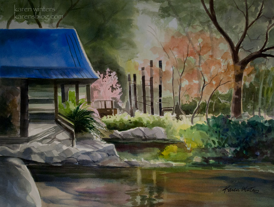
Descanso Gardens Japanese Teahouse
22 x 30 watercolor on Arches paper
SOLD (painted on commission)
This painting has a history. Several years ago, I painted a smaller version of it, and it was exhibited for sale at a local store in La Canada. One day in April a few years ago, a car transport trailer lost its brakes on the Angeles Crest Highway and crashed through the store. Two people lost their lives in the accident, and one of the most minor casualties was that watercolor painting, of which I still have a remnant.
A very lovely woman contacted me a few months ago and asked if the original painting was for sale (it was not) but I offered to paint it again for her in a size to suit her home, and this is the result. She and her husband were married at Descanso Gardens many years ago, and the painting will be a memory of that very special day. And it makes me especially happy to know that the destroyed painting survives in a unique way. It became a study for this one, which will be in their family for years to come.
Because of my concentration on oil painting, I haven’t been painting watercolor as frequently. But I enjoyed this return to the medium so much that I will probably try to devote a little more time to it in the coming year.
Merry Christmas to all those who are celebrating it tonight and tomorrow.
Arroyo Seco Path – California watercolor sketch
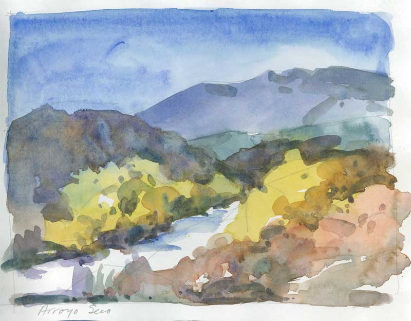
Arroyo Seco Path
7″ x 5.5″ watercolor sketch
For more information about my work, please write
One of the most frequent questions I get about my paintings is whether they are all done plein air style (no) and, if not, what I use for reference. Although I do use photos to catch specific details of trees and structures, especially when painting architecture, one of my most valuable tools is my sketchbook. Because my roots are in watercolor, I usually do plein air sketches using that medium. This is a quick way to get color notes and the general layout of a landscape subject without having to fuss with too much detail.
General color areas are indicated with a quick wash. The colors of the shadows can be added when those are dry (and outdoors, watercolor dries fast!)
Using watercolor as a plein air medium has a long history among 19th century painters, and noteworthy is John Constable. His field work formed the basis for his later oil paintings. Eugene Delacroix followed the same practice.
Watercolor painting has the benefit of being quick and portable, and it is a good way to capture the mood with few strokes. Although I love plein air oil painting and do it as often as I can, it’s not always easy to set up an easel. But a watercolor sketchbook can be opened and put to use in a few minutes. A portable watercolor palette, a spray bottle, a collapsible water bucket and a few brushes, some paper towels and I’m good to go. And I can carry a kit in the car so it’s handy at any opportunity.
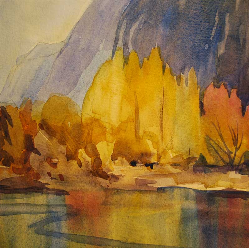
Yosemite Painting – Autumn, Merced River Fall Color
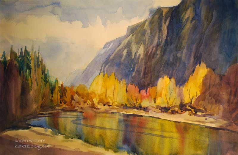
“Yosemite Autumn”
15″ x 22″ watercolor on paper
SOLD
See more of my Yosemite paintings here
Interested in this painting? Please write by clicking this link
The colors of fall dazzle when caught, reflected in the serene waters of the Merced River. This large (half-sheet) watercolor takes advantage of the range of Yosemite’s beauty and is a preview of some new work I’ll be showing this year, both in watercolor and in oil.
When I’m exhibiting at a public show, one of the questions that people ask me most frequently is “which do you prefer painting, watercolor or oil?” It’s a hard question because the two media are so different in some ways, yet so similar in fundamental ways. For the sheer excitement of painting with all the unpredictability and opportunity for “happy accidents” you just can’t beat watercolor. Take a look at the luminous reflections in the water, for example, they were created with a wet into wet technique. You can certainly paint water in oil (and I do it all the time) but you can’t get a look exactly like that. Oil allows you the luxury of correcting mistakes more easily. Watercolor (especially when working with staining colors) can be very unforgiving. The short answer is, I love them both, for different reasons and I find that what I learn in one medium can often be applied to the other even though paint handling is different. The basics … color, line, shape, value, feeling, interpretation, composition … these things do not change and translate easily from medium to medium.
Here’s a closeup of just a detail of one of the trees. This would actually make a nice painting, enlarged, all on its own. Hmmmm, wheels turning … stay tuned.
South Pasadena Watercolor Painting – Buster’s Coffeehouse
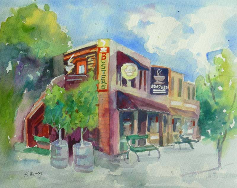
Buster’s Coffeehouse – South Pasadena Landmark on Mission Street
11 x 15 watercolor on paper
SOLD
See more of my Pasadena area paintings here
This is the third painting that I submitted for the Rialto Visions benefit art show and sale, proceeds of which will help restore the Rialto Theater on Fair Oaks Avenue in South Pasadena.
Buster’s is a favorite hangout of ours when we’re in South Pasadena. Not only do they have great coffee and the small neighborhood atmosphere you can’t find in the ubiquitous ChainBucks stores, but they sell Fosselman’s ice cream, which is truly wonderful. It’s sort of like the Cheers of coffeehouses – you always run into someone you know when you go there.
About 100 paintings were submitted for the show. Tonight at 7 pm, there’s a Collector’s Preview at the South Pasadena Library Community Room on El Centro Street. The $25 admission fee (for non-participating artists) will help support the theater’s restoration. Come meet the artists and see a lot of art, fresh off the easel.
My Secret – My Confession – Artists Reception Saturday at The Marengo Collection
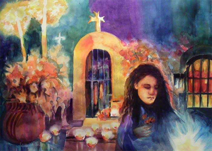
This Saturday, October 4, please join me at The Marengo Collection on 494 S. Marengo Ave. in Pasadena from 2-6 pm for the opening of the 25th annual Day of the Dead event, jointly presented by The Folk Tree and the Marengo Collection.
This painting “My offering – my confession” will be on display at the Marengo Collection for the month leading up to El Dia de Los Muertos, concluding Nov 2.
Today, our local newspaper, The La Canada Valley Sun, did an Entertainment Section feature on me and the artwork, and I’m absolutely thrilled!
The online article is here: Karen Winters Day of the Dead Watercolor
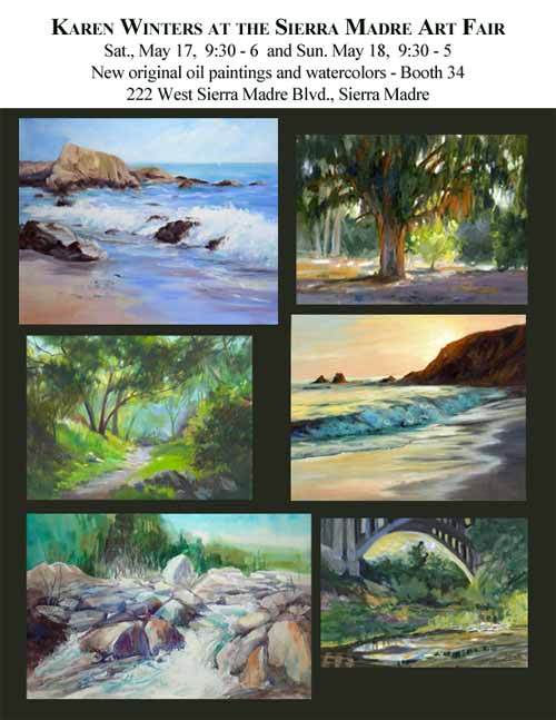
Sierra Madre Art Fair this weekend
nodp
Come see me this weekend if you’re in the Pasadena area. I’ll be bringing more than 40 original oil paintings and watercolors, plus some prints and cards. The park is shady so don’t let the weather keep you away! If you love art you won’t want to miss this once a year event!
Strength is Beautiful – California Art Club Show at Pasadena Women’s City Club
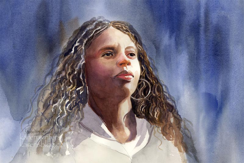
“Strength is Beautiful” 15 x 22 watercolor
Yesterday I got the very good news that this painting (and an oil painting landscape, which I will post soon) has been accepted into the next California Art Club show at the Women’s City Club in Pasadena. The show will run for six months beginning Saturday, June 23 with an artists’ reception on July 12.
I am absolutely thrilled to have this portrait included. The theme of the show is Natural Beauty and I love the look of beauty and strength in her face, which I attempted to capture in transparent watercolor. I found it challenging to paint African-American skin tones because there is such a wide range of values. The light-struck side of her face is quite pale, but the deep shadowed side is rich with color. Making the transition work was the objective, without resorting to using many small brushstrokes and ‘overworking’ it. Her beautiful wavy hair was the most fun to paint as I used negative painting to separate the tendrils. I chose a blue background for this lovely woman because I thought the blue would be a good complement to the rich warm browns of her complexion. Her garment was left understated as all the attention is really on her face.
Well, that’s about all I can think to say about it, but if you have any questions about it, please feel free to ask.
And don’t forget – this weekend … The Sierra Madre Art Fair in Sierra Madre’s Memorial Park 9:30 -6 Sat and 9:30-5 Sunday.
Spring Medley – Anza Borrego Desert Painting – Karen Winters

Spring Medley – 11 x 15 – mixed media
SOLD
Here’s a painting that combines both watercolor and acrylic – one for its transparency, the other for its opacity – each used to its best advantage (in my opinion!)
It was inspired by a photo I took at the Anza Borrego State Park in N. San Diego County when we went there to look at the wildflower bloom several weeks ago (better make that months ago!) What attracted me to this scene was the contrast of textures – the hard rocks and the soft desert flowers, plus the contrast of shadows and bright sunlight.
Right now I’m in final preparations for the Sierra Madre show. All of the pictures (more than 35!) are in their frames, although I don’t think I have enough space in my booth to display them all at once – so I’m going to have to make some hard choices.
In addition I have a number of matted but unframed watercolors, like this one, which will be in a bin for people to look through.
Eaton Canyon Swift Water – Karen Winters Watercolor
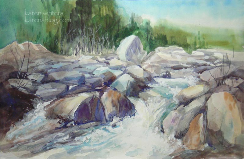
“Swift Water – Eaton Canyon” SOLD
15 x 22 watercolor on paper
Well, today was the day from computer hell. Once in a very long time my Mac system gets corrupted and I need to reinstall system. However it got balky it now seems resolved. I painted this yesterday but didn’t have time to put any finishing touches on it until I got the puter back in order today. Many thanks to my dear husband for helping with the troubleshooting.
This painting was inspired by the winter and spring rain we had at Eaton Canyon in Altadena (near Pasadena.) Although the water wasn’t deep it was abundant in the wide ravine and fun to paint.
Poppy Patch – Pasadena – Karen Winters Daily Painting

“Return to the Poppy Patch” 9 x 12 watercolor
SOLD
It’s another walk around the Arlington street poppy garden, but this time in a more decorative, somewhat abstract mood. I abandoned any attempt to be realistic and considered the landscape as a decorative tapestry, with different colors and textures woven through. With some modifications, this might scale up well into a larger painting. But then I’d have to fight the temptation to put in all sorts of fiddly realistic details. Can’t you just imagine Dorothy, Toto and the gang taking a nap back there between the poppies and the irises? We’re not in Kansas anymore. We’re in Pasadena.