Chinese cup – Japanese persimmons
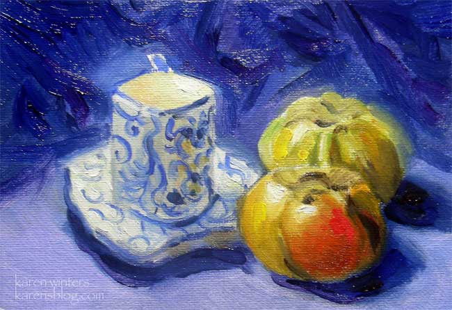
“Chinese-Japanese” 5 x 7 oil on canvasboard
I had a square cornered Chinese demitasse cup and some Japanese persimmons – and thought they looked good together in a primary color sort of way. It seemed like a good get together for a still life. and the colors are even more vivid in person. Somehow they never look as striking on a monitor as they do in real life. If you want to see how much of a difference vivid color makes, take your little finger and cover that small stroke of bright red. The whole painting changes, doesn’t it? That one small area, the size of a fingertip, really has a big effect. Did you try it?
Speaking of which, I had a very good time this morning going around to garage sales and picking up some props for future still life setups – silver plated vessels – colorful ceramics – and I really don’t know where I’m going to stow them – but they sure are fun to look at and to arrange into interesting combinations.
Let’s Play – Daily Painting
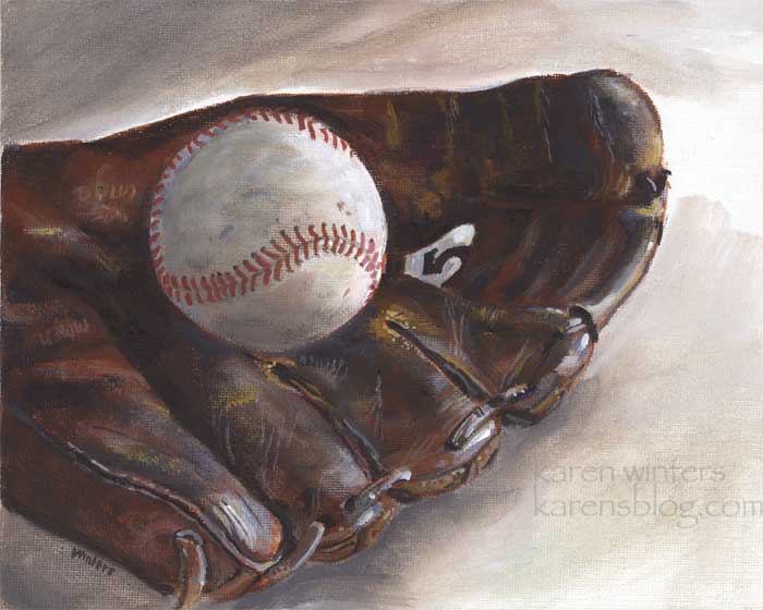
“Let’s Play” – 8 x 10 acrylic on canvasboard
A few days ago, at an art gathering, one of the people mentioned that a local art club was having a show on the theme “Americana” and invited me to submit something. I realized that it was too late to paint something in oils, due to the drying time, and I wanted more of an oil look instead of watercolor. So I decided to paint this in acrylic instead. I don’t often paint in acrylic but I have to say that the convenience of having something done and ready to show quickly is really appealing.
I’ll also consider this something for the Everyday Matters “Draw some sporting goods” challenge.
The more different media I explore, the more I come to realize that painting is just painting. Although there are specifics that are pertinent to the particular medium (painting from light to dark in watercolor, vs. dark to light in oil … having to ‘save whites’ in watercolor vs. the freedom of painting white over other layers in oils) … a great deal of painting is much the same. Brush handling, painting values and shapes, composition, modeling forms – these things are very much the same no matter the medium. The other day I picked up one of Charles Reid’s books on flower painting and I was amazed at the consistency between his watercolor and oil painting. They both portray Reid’s characteristic style and flair, even though rendered in completely different media.
So if you’ve been avoiding experimenting in a different medium, give it a try. You might be pleasantly surprised that it’s not as difficult a stretch as you might think.
Lemons and Silver – California still life oil painting
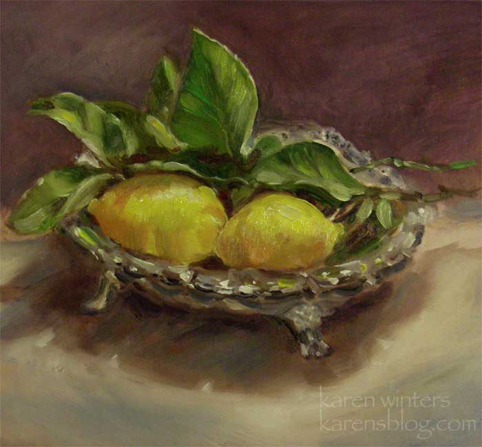
“Lemons and Silver” – 8 7/8″ x 7 7/8″ – oil on masonite –
Gloriosas and Delphiniums
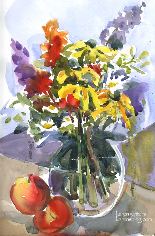
9 x 12 – watercolor on Canson cold pressed paper – Gloriosas and delphiniums
Well, here it is 1:50 am again. I was drifting off to sleep when Ripley (who sleeps at the foot of our bed) suddenly barked once and woke me up. If I am awakened as I am making that first descent into sleep, it seems to take the edge off my sleepiness and I might as well get up and do something. Which I did (exhibit A, above.) I think these yellow gloriosa daisies are called “Irish Eyes” because the centers are as green as the emerald isle.
I got a pretty cool new brush the other day and I was eager to try it out. So I clipped a piece of paper to my easel, vertically, did a quick sketch and painted this as only a half-awake, half-asleep person can do. This Davinci Cosmotop is just dreamy – it holds a lot of paint and releases it smoothly.
Now that this is done I feel a little sleepier – I hope.
Peonies Plein Air
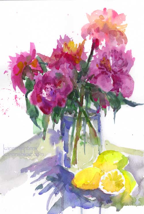
Plein Air Peonies – 11″ x 15″ (quarter sheet) Arches 140# watercolor paper
SOLD
Well, the show was a success in every way and I have lived to tell the tale. Kudos to Lori and her family for not only organizing the event but offering their home as our gallery and creating an atmosphere of conviviality and creativity. We all arrived an hour before the studio tour began to set up our easels and help with last minute details … but everything was in perfect order so there was little we needed to do. Tour guests began arriving promptly at 1 and continued throughout the afternoon with only a few lulls and many surges. The organizing committee asked if artists might have some sort of demo set up at their studios, and several of were happy to oblige, setting up our easels around a beautiful still life arrangement artfully presented by painter Carolyn Jean. I haven’t done very many floral still lives but I loved the challenge of these peonies – which we cannot grow in Southern California. These buxom blooms came from Whole Foods market, and I understand from my artpal Nan that Trader Joes is carrying them as well.
The light changed quite radically during the hour or so that I was painting these, but I tried to keep the memory of the glow even while they slipped into the shade of the umbrella and grapefruit tree. I invoked the muse that speaks to Charles Reid to please give me a hand with the looseness – that is to say, to please stay my hand if I should try to get too fussy. Because I paint landscapes more than arranged flowers, this experience has given me the incentive to do more painting out on my back patio this summer.
All in all, we had a good day. I sold this painting of the garden at Casita Del Arroyo
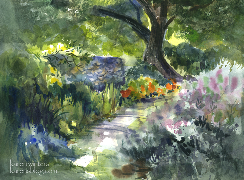
to a lovely collector, and Robin, Ginny, Carolyn, Louisa and others in our group had sales as well. It was an auspicious beginning. But the best part was being in the company of good painting friends, family and art lovers on a perfect late spring day. Assuming the stars all align correctly, I can hardly wait until we do it next year.
Illo Friday – Citrus
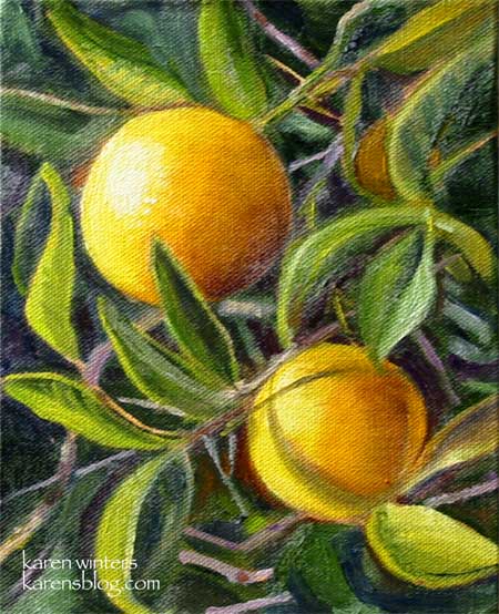
“Twin Oranges” – 6 x 8 – oil on canvas panel, mounted on hardboard – SOLD
These small oranges were spotted at the Old Mill in San Marino, home of the California Art Club.
I loved the way they were shining in the sun, so reminiscent, to me, of the California I remember from my childhood when the northern end of the San Fernando Valley was still filled with orange groves, not strip malls.
This is my entry for this week’s Illustration Friday theme – “Citrus”
Monster Radishes – Daily Painting
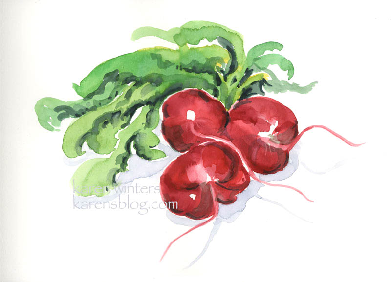
“Monster Radishes” – 10″ x 14″ watercolor on 140# paper
Purchase from the artist: karen@karenwinters.com
When we go to the Farmers Market on the weekend, we are often delighted to see unusual vegetables from regional truck gardens. This week I was astounded to see these Radishes of Unusual Size (with a tip of the hat to Princess Bride.) These vegetables are between three and four inches in diameter and one alone would be sufficient to populate a salad with piquant red and white medallions.
Because time was short before preparing dinner, this was direct-painted without any pencil underdrawing, an experience I have compared at other times (like working on Yupo) to skiing downhill on ice. With staining pigments like these you get one chance to make the stroke, for good or bad, and then let it be.
A lot of people don’t like radishes because they can be hot, but I like them for crunch and flavor, but I’m going to have a hard time cutting up these proud beauties.
Art thought of the day from Matisse:
“It is feeling that counts above all. It is not physical matter one renders, but human emotion.”
Asparagus – Watercolor painting
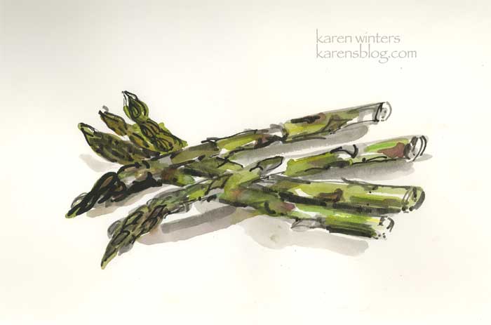
Asparagus 9 x 12 – 100 lb. paper
From my sketchbook …. When asparagus shows up in stores it’s a sure sign of spring, even if it comes from Chile or who knows where. My dear husband knows how much I love the vegetable and when it appears for a good price at Trader Joe’s or one of our other local markets, he brings it home when he’s out doing errands. I like it simply prepared, like most of the fresh vegetables we enjoy around here. Steamed or microwaved briefly, with a little butter and salt.
This was painted directly with ink and brush and watercolor. Simple and quick, just like asparagus should be prepared.
Mums on the Table
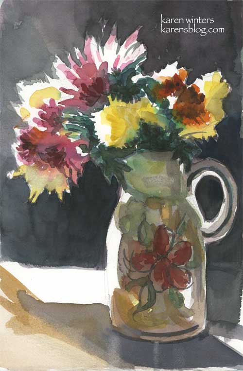
“Mums on the Table – 6.5″ x 10” (approx.) – watercolor
Purchase from the artist
Being in Southern California, even with occasional cold days, my chrysanthemums don’t know when to stop blooming. They start around late October but there are always some stragglers that manage to put out a few more blooms unless I cut them back – hard – in December.
Our oak dining room table is becoming one of my favorite places for a still life setup. You’ve seen it in the eggshells and in the black and white study of the pear/grape and bottle … and now the dining room window provides the rimlight for these blooms, casually tossed in a glazed ceramic vase we picked up a few years ago at a garage sale.
Communicating Pairs – Illustration Friday

“Communicating Pairs” 9″ x 7 3/4″
Watercolor and mixed media on board
$150 + shipping …
Purchase from the artist
For Illustration Friday on the theme of “Communication.”