Casita Del Arroyo Garden Plein Air

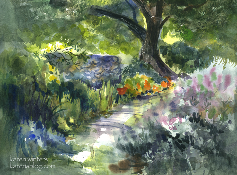
SOLD Casita Del Arroyo Garden – 15″ x 11″ quarter sheet 140# D’Arches coldpressed paper
Today our Wednesday paintout group went to a charming location in the Pasadena Arroyo Seco area called Casita Del Arroyo. This little clubhouse was built in 1933 as a way to provide employment during the Depression. The stones came from the arroyo and the wood came from bicycle tracks used in the 1932 Olympic Games. The casita was made a cultural landmark in the 70s and a drought-tolerant garden was put in not too long ago.
This view is down a few steps from the driveway, looking toward a small path in the garden. The nasturtiums caught my eye in the morning sun, and I also liked the look of the cool stone retaining wall.
To say this was a challenge would be an understatement. Although the scene is shady, my viewpoint was out in the bright sun – which has been pretty hot lately in LA. In order to keep the sun off the paper, I needed to tip the paper to a near vertical position, which is a different way of working for me. (But that’s ok, I find that when nature throws me a curve it sometimes leads to new discoveries.)
The breeze and sun conspired to dry out my palette within minutes, so I found myself misting it with my spray bottle quite frequently. The puddles of paint would literally dry in the mixing area as I was watching!
This was painted between 9:20 and 11 in the morning, and the light was changing quite rapidly, meaning that shadows were moving and areas were coming into light that had previously been in shade. To accommodate that, I did several large background washes to block in areas of light and shade, and I painted the basic dark tree shape at the same time.
On the right is a honeysuckle vine and a clump of purple sage. Instead of getting caught up in a lot of small detail, I let gravity help me and I laid in several washes of soft mauves, blues and grays and let them run on the paper. I think this helped to suggest the softness of the large mass.
My painting friend Ginny said that that area looked like the light was coming through the paper, and when I stood back for a long look I think it does look quite bright in that region.
There’s a lot of negative painting in this one – on the tops of the honeysuckle bush, between the different kinds of foliage on the left.
If you look closely you’ll see evidence of:
wet into wet painting on the path
spatter – in the clump of foliage on the right
saving whites and other light areas – behind the tree and at the top of the wall where the rose is climbing
calligraphy – defining the stones of the wall and in the rose climbing over it and the slashed shadows of weeds across the path
scraping out – the textured highlights on the bark of the tree
the use of warm against cool, cool against warm
use of diagonals to add movement
Edited to add (in response to comments)
Where I usually begin is with a value sketch, if there’s time, but in this case, there wasn’t, so I needed to hold the image of the lights and darks in my head where I worked. In my faint underdrawing on the paper I placed the tree offset from the middle, on a line about 1/3 of the way from the right margin. I made the path to the tree diagonal because it’s more dynamic than straight ahead. With those two landmarks I drew in the wall but tilted it so that I could see more of it – I wanted it to be a place for roses to climb over. I made the nasturtiums much more prominent because that was what attracted me to the scene in the first place – the contrast of deep cools vs. hot bright colors where the sun came through.
I broke some rules here by having things in sharp focus all around the paper rather than confining them to one center of focus. If I had it to do over, I would correct that.
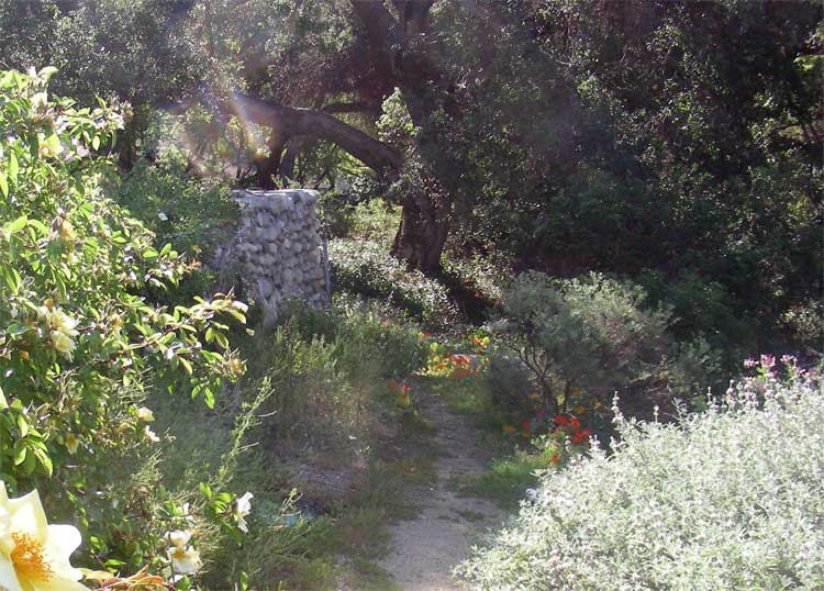
In case you are curious … this is what the scene actually looked like in real life. I didn’t paint from a photo, however …

Don West
May 9, 2007
Your version is much more beautiful.
I really like this one.
The light is and depth is very nice.
wendy
May 9, 2007
Magical light and shade. You are on a roll at present and have so much energy to produce so many lovely paintings.
w.
Jo Castillo
May 9, 2007
This is just great. Did I already say that? A favorite for me.
Jo
Amy
May 9, 2007
very lovely,peaceful feeling
Creekhiker
May 9, 2007
Karen, I agree. Your version is better! It’s just lovely. I love the stones and play of light and dark. You captured the coolness under the trees in a bright California setting perfectly. It’s a really lovely piece! Holly
Casey
May 9, 2007
What’s impressive here, is that there’s so much going on, and yet the painting pulls together beautifully. Faced with a scene like that, I wouldn’t know where to start.
Karen
May 10, 2007
Thank you, all and I’m glad everyone is enjoying this work in progress/field notes series.
Casey, I think it’s color dominance that helps pull it together. When I painted this I started with layers of green underneath most of it – except where I saved whites or used light yellow. The colors I used are analogous … blue, blue-green, green, yellow-green and yellow. Only the bright orange and soft pink in the sages are complements
Claudia
May 10, 2007
A really nice watercolour! The light is captured so well! Keep up the good work!
Rita (soulcomfort)
May 10, 2007
I agree with Casey, I wouldn’t know where to start! I also agree that I like your painting better than the actual photo. As a novice, just seeing the photo helps me–to reinforce that I don’t have to be confined by trying to be realistic and can use more artistic license. More–any at all, I should say–hehe! My differences have just been due to lack of ability to create what I see when I am trying to–ha! I have been absorbing a lot from your art blog. Thanks so much for taking the time to explain and describe for us.
Always, Rita
jules
May 10, 2007
Oh gosh – I would have been overwhelmed with so much going on – but this is beautiful – especially the dazzling light on the path and tops of flowers. Lovely, as always.
Jules
Katherine
May 10, 2007
What a lovely painting Karen – and not an easy one to do judging by the photo and your description of your placement and set-up. Well done!
Annie
May 10, 2007
Oh, Karen, I agree with Ginny–the light looks so much as if it is coming through the paper that it reminds me of stained glass.
Annie
Kate (Cathy) Johnson
May 10, 2007
Wow. You would hardly know it’s the same place–you’ve captured its soul on paper. It just GLOWS.
Ronell
May 11, 2007
great work you did Karen. you’ve captured thw whole scene beautifully and your viewpoint is gorgeous!
Ronell
susan hosken
May 11, 2007
I didn’t realise you commented on your paintings and gave painting tips. i was thrilled to read all about this painting. I will revisit again soon.
Lots of love from Susan in Australia
Renate
May 13, 2007
It looks like you have a special brush to paint “sunlight” on your paintings. Lovely!
Jana Bouc
May 15, 2007
Your painting is so much more beautiful than the beautiful photo! I love the strong values, bright lights and rich colors that are so evocative of a shady glen in a sunny place. Really lovely and one of your best!
Sherie
May 18, 2007
I like your painting much more than the photo. Your work is so beatuiful! Thanks for sharing your technique and challenges. You sure make it look easy!