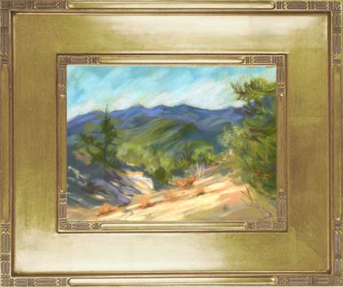
California Landscape Spring Pastel Painting – Quiet Spring Reflections – Western Sierra Foothills – by Karen Winters
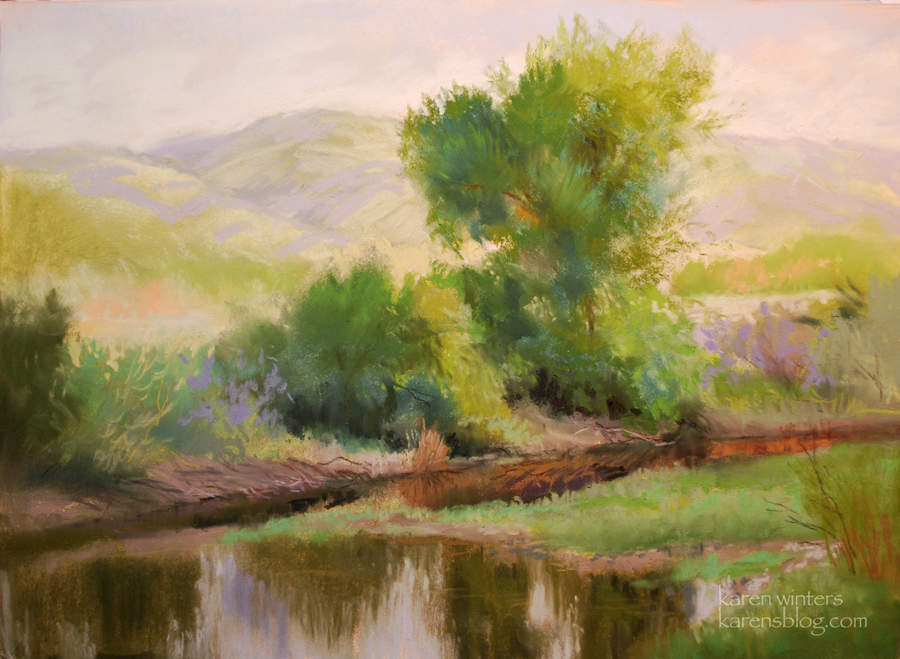
Quiet Spring Reflections
9 x 12 pastel on sanded paper
Western Sierra Foothills, near Visalia
Interested in this painting? Click this link to write me.
See more of my California landscapes here
I enjoy pastel painting although I don’t do it as often nowadays as oil. But I’m getting back into it. For this subject, I thought the soft spring foliage lent itself to the soft buttery texture of the pastel on sanded paper. I toned the paper first with a warm under painting, then let it dry, then painted into it directly with hard, then soft pastels, finally accented with pastel sticks.
Pastel has advantages over oil: there is less opportunity to make mud when working in layers alla prima. But there is the disadvantage of not being able to use transparent layers in the same way one can with watercolor and oil.
Surprisingly, I use many of the same techniques that I do in oil. Instead of doing drybrush, I drag the side of the pastel horizontally over a layer. Negative painting is much the same as with oil. Edges can be lost and found in much the same way. Getting the color right is the most difficult part. Virtually any color can be mixed with a warm and cool of each primary, plus black and white, in oil. In pastel you need to have a kaleidoscope of sticks unless you mix and blend some on the paper.
Whichever medium I choose, it’s still California impressionism and I think it still looks like something painted by me.
Catalina Painting – Catalina Harbor Painting – pastel – at Two harbors
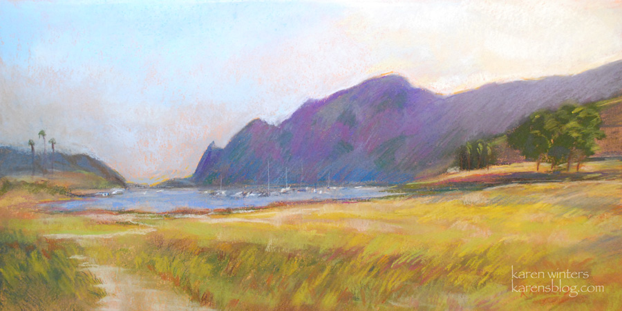
Catalina painting
Pastel
Catalina Harbor sunset
(at Two Harbors)
8 x 16 inches
See more Catalina Island paintings here
This is another of my paintings that will be exhibited at Segil Fine Art Source Gallery in Monrovia – reception is Saturday, September 11 from 5 – 7 pm
Catalina Harbor is also known as “Cat Harbor” – it’s on the opposite side of the island from Avalon, and faces south, out to sea, rather than the mainland. The warm and cool colors in this scene made it an interesting challenge to paint in pastel.
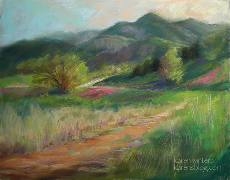
Wildflower Sunset – San Luis Obispo Pastel Painting near Santa Margarita
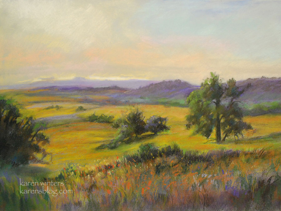
Wildflower Sunset
12 x 16
soft pastel on archival paper
SOLD
See more of my wildflower paintings here
I just found out that this painting, Wildflower Sunset, will be exhibited with the Segil Fine Art Source First Annual Works on Paper show, with opening reception Saturday July 10, 2010. This landscape is from my recent trip to San Luis Obispo County, on the road to Lake Santa Margarita, just before sunset. The lupine and yellow flowers were mixing in the warm sunset light – incredible color. Nature has a way of bedazzling us with the most wonderful complements.
My posting of paintings has been less lately because it’s difficult to post while on the road. But I’ve been doing a lot of work which will all be shared in due time.
This Sunday, if you’re in town for Memorial Day, come see me at La Canada’s Memorial Park (Foothill Blvd. at La Canada Blvd.) where I’ll be showing my work, and most likely painting, from 11-6. I’ll have original paintings, cards, prints, and so on.
The following weekend, June 5-6 I’ll be exhibiting work at Rancho Santa Ana Botanical Garden in Claremont. If you think you might be able to attend, please email me for a special invitation that gives you a break on the admission price.
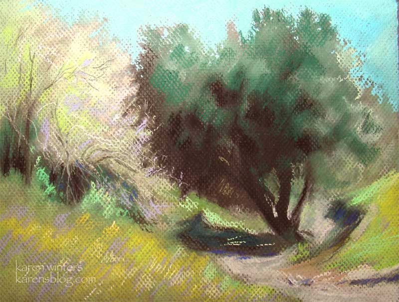
Fallbrook Hillside – California Pastel Landscape Painting
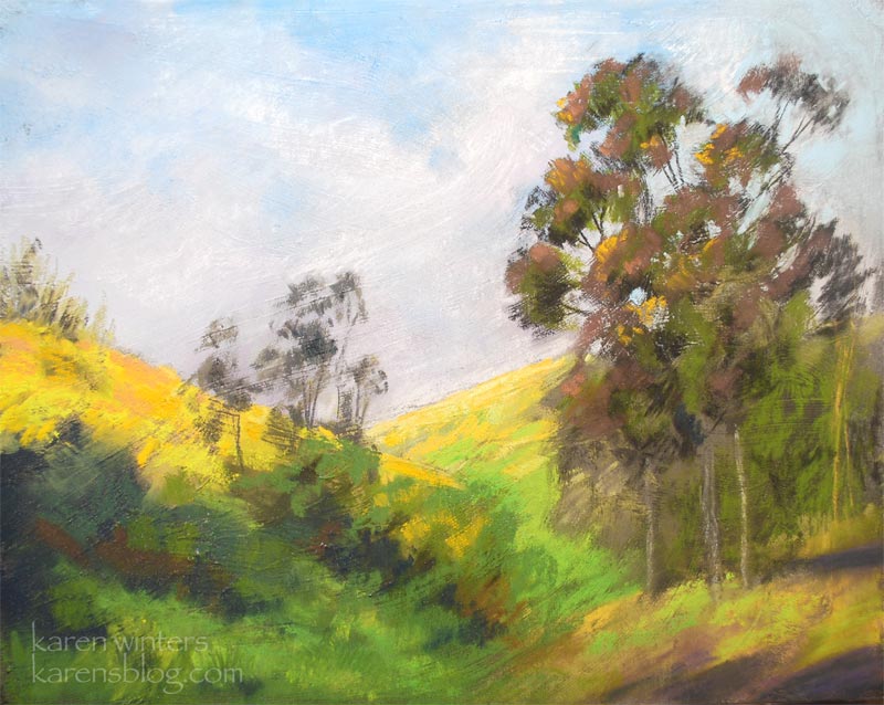
Fallbrook Hillside
8 x 10 pastel painting
Now that spring has come, we’re making a concerted effort to get out and explore new areas in our general vicinity, within a 2- 3 hr (or so) drive. One of our recent forays took us to Fallbrook, which is in North San Diego County. This hillside attracted me, with its stately eucalyptus trees and colorful wildflowers.
This pastel was painted on a ground that I prepared. The irregular texture (see enlargement) can often add movement and drama to the finished work.
Yellow rose pastel painting
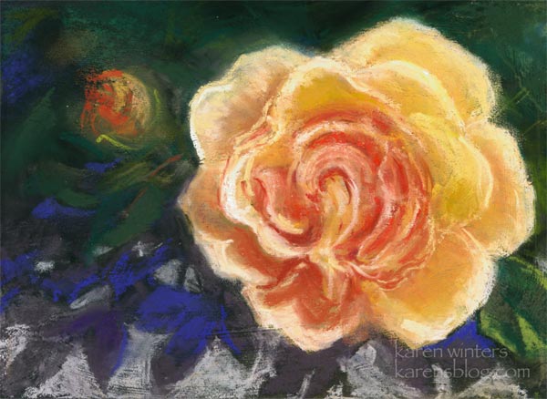
Yellow Rose with Leaf Shadows
5 x 7 inches
pastel on board
On the occasions that I paint in pastel, I mostly do landscapes. But I thought it would be an interesting experience to do a study of a rose using that medium. In retrospect, it might have been a little easier if I had worked larger, but I was mostly just having a good time, experimenting and keeping a loose feeling while enjoying the patterns and complementary colors. I used both hard and soft pastels in this, working my way from the Rembrandts and Holbeins to the Senneliers and Unisons.
The rose is an old rose in the Descanso Gardens Rosarium.
The Sunday show in Malibu was a really fun event. Not only did one of my landscapes (a pastel) go home with a new collector, but I had the pleasure of meeting a lot of new people who expressed interest in seeing more of my work, something very nice to look forward to.
May at Malibu Creek – Karen Winters Daily Painting – Art
“May at Malibu Creek”
11 x 14 pastel on board
SOLD
This week has been another week of preparation for a show – this Sunday, June 1 at Rancho Santa Ana Botanic Garden. So I haven’t had a lot of extra time for painting but I will try to make up for it, soon.
This is another favorite scene of mine from Malibu Creek State Park. The long lazy trail winds back through the spring grasses, which are beginning to turn golden here and there. Wildflowers decorate the hillsides with swaths of color, and the afternoon glow kisses the chapparal-covered mountainsides.
I was reading a website recently that was extolling the beauty of the Santa Monica Mountains. This area is so close to urban Los Angeles, yet it might as well be out in the wilderness. There is so much natural texture and beauty here – a painter’s delight.
The other day I was sitting in the car in the parking lot while my husband ran into OSH for a few hardware bits. Rather than wrap myself up in an art magazine, I just gazed for a long time at the Verdugo Hills and the clouds drifting above it. I challenged myself to see as many colors and values as I could. Art is not only made with brush or pastel in hand. Sometimes it gestates by just our attentive seeing.
Dreamy Drifting at Malibu Creek – new painting art by Karen Winters

“Dreamy Drifting at Malibu Creek” – 11 x 14 – pastel on board
SOLD
Today I had the pleasure of taking a workshop with master pastellist Bruce Trentham, and this was the result. I had missed a demo by him several months ago, so this was a good opportunity to see him at work.
It was surprisingly similar to working in oil – much more than watercolor. The pigment is formed into sticks rather than being applied with a brush, but the manner of working – from dark to light and using opaque layers in a series of refinements and corrections – felt very familiar.
I think that I will be exploring pastel more – not to the exclusion of oil and watercolor, of course – but as a way to treat a subject quickly and in a painterly way.
When it comes right down to it, most of painting is about composition, value, shape, color and so forth. Whether one uses a brush or a pastel stick is not the main thing – and the principles of painting are the same for all color media that I’ve experienced so far.
For this painting I used a variety of different brands of pastel – from hard square ones to extremely soft and buttery ones. Pastel pencils helped with ome of the fine line work of the branches.
And yes, a pastel work is generally called a painting, not a drawing!
Oak Byway – Pastel by Karen Winters
Oak Byway – 11.5″ x 9″ – pastel on paper
After working almost exclusively in oil for the past year (with a few sidetrips into watercolor,) I felt like taking out my pastels for a little experimentation. I’m going to be doing a larger pastel painting in the near future, so this is a bit of a warmup.
No matter what the medium, some things remain the same: color, shape, value, composition, edge definition, stroke, perspective and techniques like negative painting. It’s different holding a stick of pigment between one’s fingers rather than wielding a brush, but much of the experience is quite similar to oil painting. In this project I started with a coffee colored paper which you can see peeking through here and there. I selected the paper to provide a mid-tone starting point for the large tree mass.
Desert Hills – Daily Painting
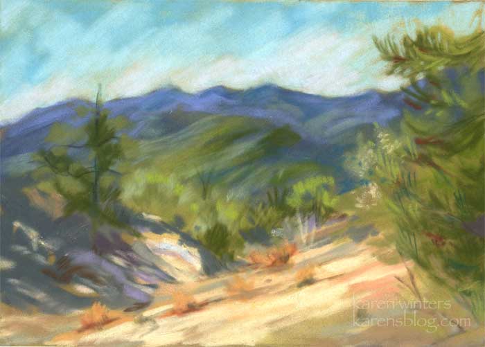
“Desert Hills” – 5″ x 7″ pastel
The colors of the desert near Palm Springs provided the inspiration for this small pastel painting, which I worked on today. It was quite gray and drizzly today at the show, but it didn’t seem to dampen the spirits of our visitors.
Just to give you an idea of what a difference a frame can make, here’s an example of how this little painting might look with a simple gold frame
Fall guys
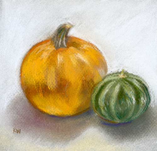
“Fall Guys” 6″ x 6″ pastel on paper.
A good art buddy brought me this lil punkin last week when she came over to visit, and I thought it was so cute i paired it with a little striped gourd that I had hanging around. It has a Mutt and Jeff quality that I like and it was fun to paint (in pastel.)
This was done on a dark brown Mi-Tientes paper, which shows through in the texture here and there. I used the rough side.