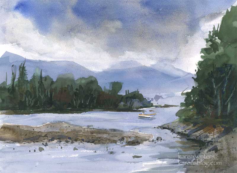
Arcadia – Fantasy Island House
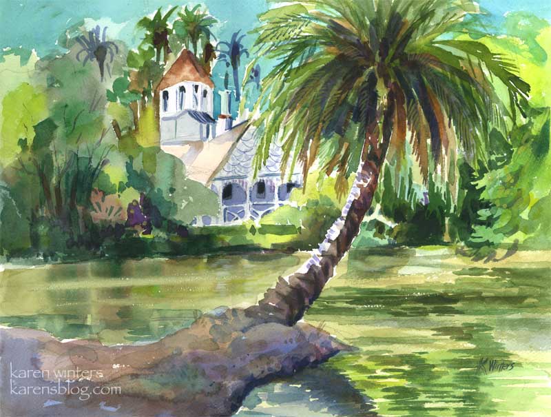
“Queen Anne Cottage” 15″ x 11″ (quarter sheet) – SOLD
Today my art pal Wendee and I went to the LA Arboretum in Arcadia for some plein air sketching and painting. We found a shady relatively cool spot in the tropical lagoon area, made famous by the 70s anthology series “Fantasy Island”
(Alright, let’s just say it and get it out of our systems, shall we? “Da Plane, Da Plane.”)
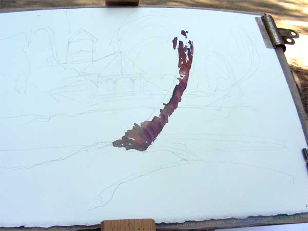
I took some digipix of the work in progress this time. After doing a quick value sketch, I drew some light outlines on the paper of where I wanted the main features to go. In this picture I’ve already started putting in the trunk of the palm, which I knew would be the featured item. I’m using burnt sienna and a mauve to get that warm/cool feeling where the trunk turns from light to shade.
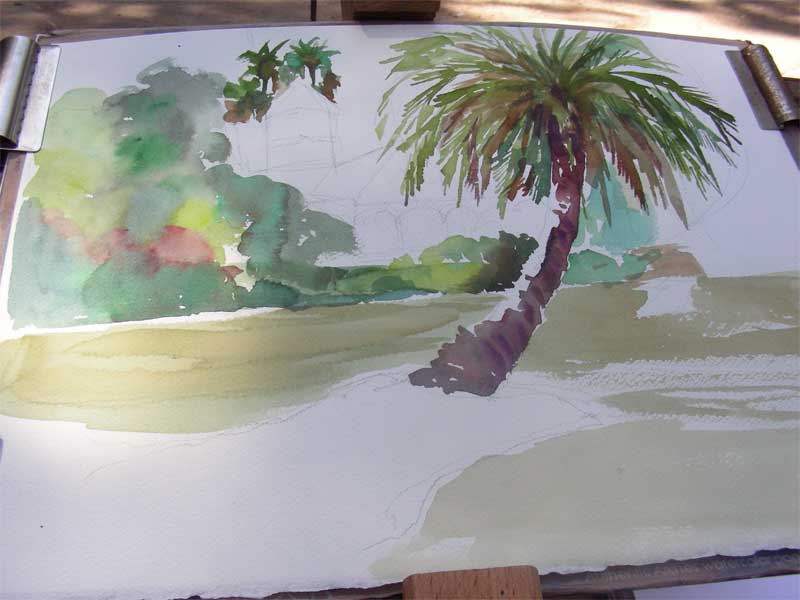
Next , I’m moving around the page with a big round brush, putting in some of the background colors, and making up quite a few also. I’ve done a lot of work on the palm, not only because it was fun but because the light was changing and I wanted to get it to some degree of completion so I could evaluate the values of other things in the picture.
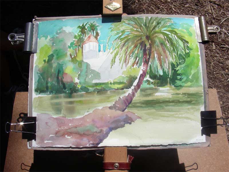
At this point it was probably an hour and a half after I began, give or take a bit, and the morning sun had become overhead noontime sun. It was time to call it a day on location. I took the painting home to check the photo I had taken at the beginning of the day, and to decide where the reflections would go. Most of the hard work is done at this point – what remains are putting in the darkest darks, details and calligraphic brushstrokes.
Cobb Estate Cypresses
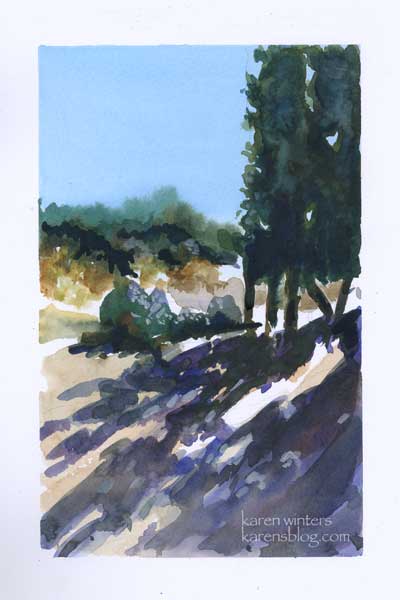
Cobb Estate Cypresses 5″ x 8″ – watercolor
The Cobb Estate in Pasadena is a wonderful resource for artist, hiker and nature lover (also dog walkers.)
These evergreens line the old driveway which is now crumbling slowly.
The plants were not my main interest here – it was the strong pattern of lights and darks created by the shapes of the italian-looking trees.
I can only imagine how stately they looked before the land was reclaimed by the chapparal.
This was painted with a limited palette of raw sienna, burnt sienna, prussian blue and mauve, with a swath of thalo blue for the sky wash.
The illusion of bright sunshine is all about value – the strong contrasts that happen during mid day when the noon sun washes out surfaces to white, and creates the deepest darkest shade.
Santa Barbara Botanic Garden Cottage
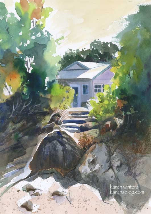
“Santa Barbara Botanic Garden Cottage” 11 x 15″ 140 lb. paper
These past few days have been very busy, and I have not been painting quite as many pieces as usual, but I did spend quite a bit of time with this one on Sunday, experimenting with a variety of techniques and concepts to come up with what I hope is a pleasing composition.
This painting was inspired by a scene I saw last summer when visiting the Santa Barbara Botanic Gardens. We walked down a path to a Japanese teahouse, and on the way back saw this view of a small cottage through the trees. I loved the contrast between the dazzling sun and the deep shade under the trees.
I’d like to highlight a few different things, for those readers who like to know details. I’m one of them, too. I like to get into the painter’s head when I can.
First off, I did a very light sketch on the paper with a 2H pencil. This was little more than the general shape of the trees, the roofline of the house, the shape of the steps area and the prominent foreground rocks.
I started painting in the upper left hand corner, painting the trees on dry paper with a juicy brush loaded with leaf green paint. Immediately, while the paint was still wet, I rinsed my brush and picked up some orange, and then some deeper green, letting them mix on the paper. I continued painting down the left side in this way, paying attention to variety of color and leaving some skyholes here and there.
Next, I put some initial light washes under the large foreground boulders, reserving a white edge for the sun highlight, then started at the top right and painted a solid medium green wash for the large mass of trees. Notice that I didn’t mirror the two tree shapes. The edge of the tree mass on the right is ragged, making use of the roughness of the paper with a drybrush technique.
When these layers were all dry, I went back in and glazed some other colors over them. Dark tones for the shadowed bushes on the left, and medium greens into the small bushes on the right. I started molding the shape of the rocks at this time, also, using a “palette” gray composed of the leftovers of other colors I’d been using. I put in the foreground color very loosely.
About this time I started laying in the first washes of the house, cool blues and lavenders to contrast with the warms of the foliage. I “saved” the whites of the roof and the tops of the steps to suggest the hot mid day sun.
When all of this was dry, I went back in to carve out detail in the shadows, model the different shapes of the rocks with a variety of neutral washes. I added some splatter to the foreground to suggest dry crumbling granite and sand.
Toward the end of the painting I added details of the windows and doors on the house, I “lifted out” the shapes of some bushes in the underbrush on the left, added deep crevices to the rocks and a few grasses and twigs here and there with a ‘rigger’ brush.
Finally I decided on a very light warm sky wash, instead of blue. I think that it adds to the feeling of sunny California warmth. Skies don’t have to be blue – they can be any color you like.
I used a number of different colors in this, including new gamboge, prussian blue, orange, mauve, ultramarine blue, burnt sienna, leaf green and raw sienna.
Did you find this interesting? Helpful?
Best of Show update
“Hard Rock Cafe” 9″ x 13″ watercolor – framed 16 x 20
May 4 Update
I submitted this painting to an annual show at the local college where I’m attending the watercolor class I’ve mentioned from time to time. I was delighted to find out today that it won Best of Show. So, I’m a happy camper tonight and each small victory just fuels my creative fire to keep studying, keep practicing, keep working harder, day by day.
====================================================
previously posted
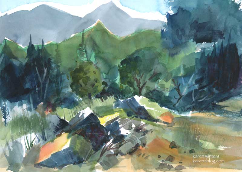
We live in the foothills of the San Gabriel Mountains – a seismically active range which is crossed at one place by the famous San Andreas Fault. It’s not near us, thankfully, but any movement on that fault would certainly be felt far and wide. The “basement rock” of the San Gabriels is said to be more than a billion years old. Through those eons it has intruded, metamorphosed and sedimented into gneiss, basalt, limestone, marble, shale, quartzite, sandstone, slate and all kinds of good schists. If there’s any sort of rock you want, you can probably find it up there. This scene is of a rocky clearing in the Angeles National Forest, where enormous broken rocks, not yet worn down by erosion, lay tumbled in casual disarray .
The evergreens keep things looking verdant year round, and the chapparal is abloom with every kind of native shrub and flower. It’s absolutely gorgeous any time of year, but spring is the best.
Because I’m an insatiably curious person about art, nature, science – well, just about anything – I found a link on the geology of the San Gabriels for any locals who might be interested.
http://seis.natsci.csulb.edu/deptweb/SkinnyCalSites/TrnsverseRng/SanGabriels/SanGablOview2.html
My favorite part was the discussion of the Precambrian Basement. I have a feeling there aren’t any good bargains there, though. I kept hoping with a billion years of compression and folding there’d be a diamond or two to talk about – but no luck.
Oh, and this is my entry for this week’s “Draw or paint something green” challenge.
Malibu morning
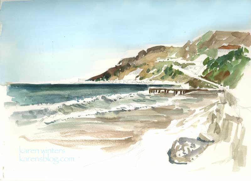
“Malibu Morning” 9 x 12 watercolor on paper
This morning I had a reason to be in Malibu while my husband was taking care of some business nearby. The sky was clear and a light breeze was blowing on a picture-perfect day. After taking a brisk walk up and down the shore a few times, I settled to paint this view in my Raffine sketchbook, en plein air. It might become the basis for a larger oil painting back in the studio. I used a large Niji waterbrush for everything but the sky, which was added with a wash brush when I got home. The slight discoloration in the sky is from the unevenness of my journal on the flatbed scanner. In fact it’s a nice even thalo blue all the way across.
The location of this watercolor is about a quarter mile north of Gladstone’s – along Pacific Coast Highway. The headlands in the distance is close to where Topanga Canyon comes out to the coast, I think.
Seed Fields

Seed Fields – sketchbook page – SOLD
There was no time to paint today, so before I head off to bed I did this quick watercolor sketch of one of the seed growers field that we pass by on our way up the coast to Santa Maria. The agricultural economy is changing and many of the growers now grow for seed (I think these are marigolds) instead of growing cut flowers.
This is another of those abstraction experiments, just playing around with color and shape – and pushing the intensity as far as I could. It’s in my Raffine sketchbook, but is not a full page. I managed to get in some time today for spring cleanup in our yard, so I’m really tuckered out – there was a lot of digging, clipping, ivy removal and weed pulling to do. I’m going to get some sunflower seeds strewn tomorrow so I’ll have material for cutting and painting later in the season.
Dawn Fishing
“Dawn Fishing” – 11 x 15 watercolor – SOLD
After a landscape or two that were quite giddy with fauve color, here’s one in a quieter more contemplative mood. Fishing friends through the years have told me that dawn and twilight are the best times for fishing. Except, of course if there’s a mid-day hatch of damselflies or something else, and then noon to afternoon is best. I think what they were saying is that any time of day is great if you’re in the mood, the conditions are right and the fish are hungry.
Kind of like painting, I think.
A watercolorist friend of mine says that early morning and early evening are the best times because the colors are most intense. The arc of the midday sun washes the colors out – and unless you want that brilliant bleached out look you’ll find better plein airing at “golden hour.”
Today’s art tip comes from an article by Brian Freeman in Artist Magazine: “Artist Dan Goozee’s advice was that you should stop working when you think you’re about 80 percent done. At that point, he said, you’re actually 90 percent done. Stop before you’re finished. Goozee’s words resonated with me. A big part of art is walking away – then coming back and looking at the work with a fresh eye.”
Or as my wc teacher says – every art kit should come with a guy with a hammer – to hit you on the head when you should stop.
Looks Like Rain
We’re hoping it will be rain, that is. Tonight we may see showers and tomorrow there’s a 90% chance of real, honest to God RAIN. This has been the driest winter in recent years which means the fire danger will be even more extreme as the sparse bits of grass and growth on the hillside dry out. The sierra snowpack has been less as well, so I’ve heard. Our water bills are out of sight so I’m hoping for at least one good soak before we head into the dry season that extends to November.
Tomorrow afternoon I’ll be posting a new painting for Ebay’s Nibblefest – that’s the one where we all try to get the highest number of very small bids from different people. Bidding will start at 99 cents and go up in 50 cent increments. They haven’t posted the winners for March yet, but I thank everyone who bid on the baby bird in the man’s hands and I’m keeping my fingers crossed that it competed well. That painting went to a loving home and the collector is someone who raised a baby bird by hand, so it was quite special to her. I love to paint things that strike emotional notes, whether it’s one of joy, nostalgia, hope, even wistfulness or turmoil.
I guarantee that the painting to be posted tomorrow will be an emotional one, too. If you’ve been reading this blog for a year or so, you’ll know why the moment you see it.
Sycamore Creek
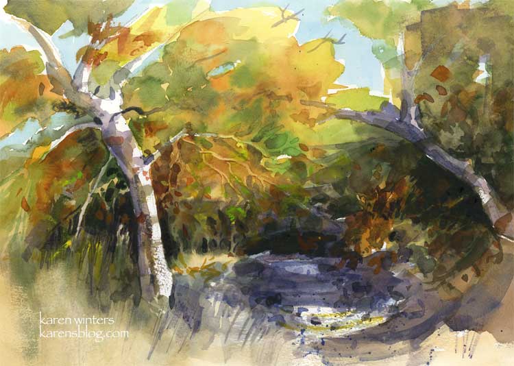
Sycamore Creek – 11 x 15 – watercolor on 140# paper
SOLD
Now this is a little more my speed. Some abstraction and impressionism, but some realism, too. I painted this picture twice today. The first one used more glazing, more overlapping patches of color in the main tree. I put that aside and tried another where the leaf patterns were painted more wet in wet. This seasonal creek is really at the Placerita Canyon Nature Center. The trees are beautifully green now, but I liked them better when they were decked out in reds and golds along with the green.
Thanks to everyone for all your thoughtful and insightful comments about the abstract exercise and the experience of coming under the influence of a teacher, or a artistic friend with a distinctive style.
A propos of that, today’s art advice is a quote from Frank LaLumia, plein air painter, as quoted in the January 2006 American Artist magazine.
“When you are responding to the subject rather than painting in a preconceived manner, you will find yourself doing things spontaneously, differently. In this way, every year your painting will look more like itelf and less like that o your teachers or other influences.”
Abstract sycamore
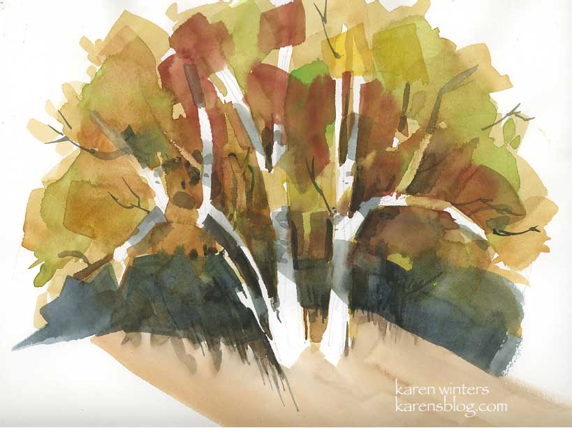
This was an exercise in abstracting natural forms in my watercolor class. Our teacher, who paints marvelously, is encouraging us to think more in terms of abstraction and symbol rather than literally painting what we see in front of us. I ‘get it’ and am doing the exercises and such, but there’s still a part of me that wants a tree to look like a tree with all the leafy bits (although not TOO fussy.) I’m guessing that my style will even out somewhere between the two, under the influence of my own predilections, likes and dislikes and gentle influence of other teachers yet to come. I love the California school painters with their abstraction and wild colors, but I also love Sargent and his beautiful loose renderings that simultaneously reveal and suggest. And I adore the crisp geometric patterns of Dong Kingman and the sweeping emotional scenes of Emil Kosa and the controlled wildness of Charles Reid. All of them – they all touch my heart, much as I like early music like that of Talis as well as jazz (but only if it swings.) Must we fit in only one mold?
Synchronistically, I opened a random art magazine to a random page and came up with an interview with Tony Pro an oil painter. Pro relates how he had the opportunity to meet Richard Schmid (author of Alla Prima and many other outstanding books.) Pro says that Schmid was kind but honest in reviewing his work, and advised him to be true to himself and not to copy others. Pro concluded with what what is today’s art advice: “Don’t paint like someone else to impress someone – work only to impress yourself.”
Geometric trees may be sophisticated, but for now they just don’t swing. Maybe they will some day – I’ll have to wait and see.