Santa Barbara Botanic Garden Cottage

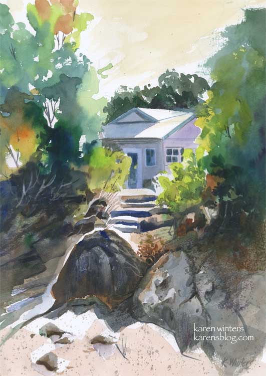
“Santa Barbara Botanic Garden Cottage” 11 x 15″ 140 lb. paper
These past few days have been very busy, and I have not been painting quite as many pieces as usual, but I did spend quite a bit of time with this one on Sunday, experimenting with a variety of techniques and concepts to come up with what I hope is a pleasing composition.
This painting was inspired by a scene I saw last summer when visiting the Santa Barbara Botanic Gardens. We walked down a path to a Japanese teahouse, and on the way back saw this view of a small cottage through the trees. I loved the contrast between the dazzling sun and the deep shade under the trees.
I’d like to highlight a few different things, for those readers who like to know details. I’m one of them, too. I like to get into the painter’s head when I can.
First off, I did a very light sketch on the paper with a 2H pencil. This was little more than the general shape of the trees, the roofline of the house, the shape of the steps area and the prominent foreground rocks.
I started painting in the upper left hand corner, painting the trees on dry paper with a juicy brush loaded with leaf green paint. Immediately, while the paint was still wet, I rinsed my brush and picked up some orange, and then some deeper green, letting them mix on the paper. I continued painting down the left side in this way, paying attention to variety of color and leaving some skyholes here and there.
Next, I put some initial light washes under the large foreground boulders, reserving a white edge for the sun highlight, then started at the top right and painted a solid medium green wash for the large mass of trees. Notice that I didn’t mirror the two tree shapes. The edge of the tree mass on the right is ragged, making use of the roughness of the paper with a drybrush technique.
When these layers were all dry, I went back in and glazed some other colors over them. Dark tones for the shadowed bushes on the left, and medium greens into the small bushes on the right. I started molding the shape of the rocks at this time, also, using a “palette” gray composed of the leftovers of other colors I’d been using. I put in the foreground color very loosely.
About this time I started laying in the first washes of the house, cool blues and lavenders to contrast with the warms of the foliage. I “saved” the whites of the roof and the tops of the steps to suggest the hot mid day sun.
When all of this was dry, I went back in to carve out detail in the shadows, model the different shapes of the rocks with a variety of neutral washes. I added some splatter to the foreground to suggest dry crumbling granite and sand.
Toward the end of the painting I added details of the windows and doors on the house, I “lifted out” the shapes of some bushes in the underbrush on the left, added deep crevices to the rocks and a few grasses and twigs here and there with a ‘rigger’ brush.
Finally I decided on a very light warm sky wash, instead of blue. I think that it adds to the feeling of sunny California warmth. Skies don’t have to be blue – they can be any color you like.
I used a number of different colors in this, including new gamboge, prussian blue, orange, mauve, ultramarine blue, burnt sienna, leaf green and raw sienna.
Did you find this interesting? Helpful?

wagonized
May 7, 2007
I love how you can master the flood of light and the shaded parts. And you’re right. Who says a sky has to be blue. The color you chose is real.
nina johansson
May 7, 2007
This is great! I love hearing the details of a painting process too – the more the merrier! It´s a gorgeous painting too, with the light coming through the greenery from behind. Thanks for taking the time to describe your way of working with this one!
Donn
May 7, 2007
Karen, this is just great! Very nice instruction on how you did it too. You should do more of these instructional paintings and publish them. I could use more help like this!
Kate (Cathy) Johnson
May 7, 2007
That is just GORGEOUS, and so much fun to read the process…thank you, girl! The colors are stunning.
Brenda Yarborough
May 7, 2007
Karen, this is a gorgeous scene, an outstanding painting and a superb instruction. THANK YOU!! I absolutely love your sky and you’ve inspired me to try a “not blue” sky real soon!
Natalie Ford
May 7, 2007
Both interesting (fascinating!) and useful as well as beautiful and inspiring! Thank you!
Annie
May 7, 2007
There is so much to learn here, as well as to enjoy, Karen. You show the process so wonderfully and I agree with the others that we would appreciate more and more of it. . It certainly helps me at my newbie stage, but I think even the experienced people here will enjoy your sharing how you did it. And I LOVE that sky.
Nancy
May 8, 2007
Karen – thanks for all your extra effort- I learn something from you regularly!
carole
May 8, 2007
Karen, this is very helpful! I’ve just finished a watercolour, and I wish I’d read this post before I started. I like the way you didn’t use blue for the sky, and the way the trees glow orange. It creates such an impression of heat and strong sunlight. It’s really generous of you to share the process, and I’ve learned a lot from it so thank you for taking the time.
Robyn
May 8, 2007
I found it really interesting and helpful, Karen. I had already loved the painting, so your description of how you got there was a bonus. Beautiful!
Rita (soulcomfort)
May 9, 2007
Thanks so much for taking the time to explain your process. Yes! It is helpful and greatly appreciated!
Always, Rita
Linda
May 10, 2007
Karen — this is beautiful (and a wonderful description of your process.) I really love the thought that you always put into your work — the bits of white left in the middle foreground (just in front of the dark shadow) are perfect, and your comment about skies made me laugh and laugh! So true, so true!
😀 GREAT stuff!