Sunday Sunshine – Karen Winters daily painting

Sunday Sunshine – 6″ x 6″ – watercolor with colored pencil accent
SOLD to a collector from Texas
Rather, this is the sunshine we WISH we had right about now. It’s been cold, wet and lightning is promised tonight. But I really can’t complain because this sort of weather is such a rare event and the gushing streams and wildflowers that follow will be glorious. In the meantime we’ll just snuggle up with an extra comforter and umbrella and wait until the sun breaks through.
This afternoon I painted this to remember the warmth of spring days yet to come. The lemon is from our tree and is presently full of new buds (if the rain doesn’t knock them off.)
Doing a painting like this is an entirely different experience from some of the bolder more expressive things I’ve posted recently. I’m not abandoning any style at the moment, I’m just exploring a range of techniques and looks. Painting something like this is a very quiet, meditative experience – using a smallish brush and taking quite a bit of time. Painting something like “Tumbling Down” for example, is an invigorating emotional experience, using a large brush and painting impulsively in a short period of time. They’re just … different experiences and sometimes one fits my mood more than another. You think maybe it has to do with caffeine? Hmmm … now there’s one to think about.
Edited to add: an art friend asked how I got the spotted effect in the lemon and how I did the edge of the lemon where the white of the paper is the bright spot.
The lemon was painted with multiple glazes of transparent watercolor – up to 5 layers, if I recall correctly. (Sometimes I forget when I’m in the flow of the moment.) The final glaze was a very pale orange and the uppermost spots were touched in with the tip of a small brush. The rougher spotty texture (toward the bottom of the lemon) comes from using a very light layer of colored pencil in the darks. The edge at the top of the lemon, where it meets the crystal, was just “painted around.” No masking was used.
Winter Reflections – Daily Painting
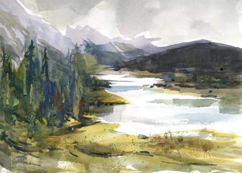
Winter Reflections – 10.8 x 7.8 inches – watercolor on paper
A subdued day – quiet colors under a grayed sky. Could a few drops of rain be ready to fall?
Early this morning, when there was a break in the storm, I went to Hahamongna Park to see how the Arroyo Seco river was flowing. There was certainly a volume of water, but nothing approaching dangerous. The stream was about a foot deep, I’d estimate, and about 15 feet wide at its widest. And there was snow in the mountains above. I would have liked to have painted but another storm started, so I just took photos instead.
Later today we spent some time at the Pasadena Museum of California art where a celebration is being planned to honor Milford Zornes, a celebrated watercolorist who is 100 years old – and still painting! Although Milford suffers from macular degeneration, he continues to produce remarkable works of art. We should all be so fortunate to have so many years to pursue our passion. They were hanging the Zornes show while we were there and what I saw of it looked spectacular. There were paintings from many private collections, from the 50s up to more recent times. His use of graduated washes is quite incredible and I look forward to seeing his works in more detail.
Tumbling Down – Karen Winters daily painting
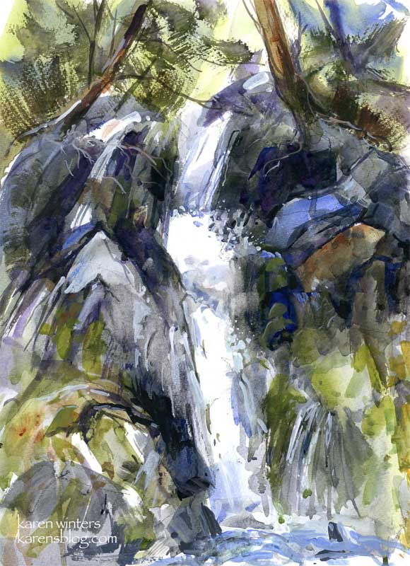
“Tumbling Down” – 10 x 14 – mixed media on watercolor paper (wc and acrylic)
Last night, after I decided to stop working on an oil painting (for the moment), I took out a watercolor pad and thought I’d experiment with some of what I heard Jerry Stitt talking about – painting what things are “doing” rather than literally what they look like. This was the result.
I started with big bold washes with a wide hake (goat hair?) brush, and then started layering with other watercolor washes. I dropped thick paint into wet areas and let it run. I used the edge of a flat brush to sculpt some of the rocks. Dry brush was added here and there for foliage. Most of the white of the waterfall was the reserved white of the paper.
After the watercolor was dry, I went back in with acrylic (both diluted and full strength) to add more crevices to the rocks and to add to the spray effect over dark rocks. Knowing that I was going to include acrylic, I didn’t use any masking.
I only vaguely used a reference photo as a starting point and to understand the flow of the cascade. Most of the rocks were made up as the paint did its own thing and I needed to respond to it. That’s something else that I found fascinating from Stitt’s demo – he did his paintings completely out of his head based on his response to a very quick gestural drawing and what the paint was doing on the paper. Stitt has been painting for so many years that his knowledge of land forms is vast, so in a sense he’s relying on an internal reference library and a near photographic memory. But what he says is true. At a certain point in a particular painting you need to make the painting work and forget trying to match a scene “out there” in reality. I observed the same ability with watercolorist Barbara Nechis who invented landscapes as she painted … again building upon years of experience as a painter and observer of nature. This is yet another reason to keep a sketchbook and draw nature wherever you go. By this simple act you are committing nature to memory.
Peppertree Road – Karen Winters Daily Painting
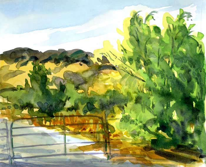
Peppertree Road – watercolor sketch
Here’s another watercolor vignette from my sketchbook while I’m working on another large oil seascape. (To be posted as soon as it’s done.) My cold/flu bug is gone (at least enough) that I can contemplate painting in oils again, and so I am.
This little sketch was derived from color notes and photos I took on a trip to northern California. No matter what the season, peppertrees are evergreen here – always brightening the scene with their greens and yellows gleaming in the sun. I see them lining our highways and rural roads, gracefully nodding with every breeze. I love to paint them!
Here’s something I’d like you painters to think about: before you started painting did you look at trees and bushes, mountains and clouds in the same way that you do now? Do you find yourself drifting into a reverie when you see the sun coming out in a certain way and thinking … hmmm … is that sky blue cobalt or more toward cerulean? Do you paint with your eyes even when you’re away from your easel?
No Mail Today – Karen Winters Daily Painting
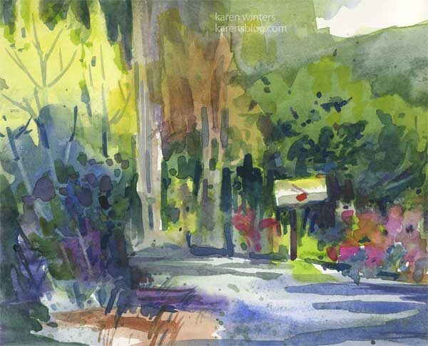
No Mail Today – 8 x 6.25 – watercolor sketch
I painted this little vignette this morning as a way to get some art practice no matter what the rest of the day would include (chores, an art association meeting and demo, car-shopping, housework, etc.) I’m very disciplined about making sure that I paint daily – and now I know why. At yesterday’s Watercolor West demo featuring Elaine Harvey (watercolorist) she said it’s essential to practice frequently because painting is not just an intellectual activity – it’s a physical activity. If you don’t paint for awhile she says, you lose some of your dexterity in brush handling, color mixing, just the way you move your hand and move paint around. I hadn’t really looked at it that way but I can see the wisdom in it and will continue making time for at least one painting or sketch a day – more if I can afford the time.
This little sketch is a bit of a fantasy based on a little picture I took last summer of a country road. It looks nothing like this in real life but it does capture a little bit of a peaceful, cheerful country feel, in a completely romanticized way. Every now and then it’s sort of fun to escape from the mud and muck of reality. Like, during the US election season, you know?
Sunset Panorama

Sunset panorama
Watercolor on paper Approx 8″ x 5″
A simple composition using intense color and a limited palette
I’m still in flu-recovery mode and trying to clean up my office to clear the decks for a batch of new projects in the works.
A distant view – daily painting
“A distant view” – watercolor sketch on paper
The cold and flu season has left me a sniffling, coughing, Vicks-laden mess, so I’m trying to not exacerbate the situation by inhaling copious quantities of odorless mineral spirits without a window open for ventilation. (It’s cold outside.) So instead, I’m keeping warm, drinking lots of tea and doing some watercolor studies in preparation for larger paintings, to be completed at a later time. But it still fits within my yearly goals, and I’m content with that.
A word about goals and plans. Many of our art friends are making goal lists this time of year, and I see at least two different types of plans. Some goals are highly specific and detailed, often including numbers of types of works to be drawn or painted, or lists of subjects to be tackled. I think that this can work very well for people who enjoy structure and thrive on that – and you are to be congratulated for having thought through your plans in such detail. And there are others, myself included, who work better with a few broad guidelines and plenty of room for variety. I also find that I produce more when I set my goals low and try to exceed them than when I set them too high and then feel internally nagged to do “too much.”
So whether you’re a wonderfully detailed goal-setter or a ‘big umbrella’ goal setter, I encourage you to be thoughtful about your plans and allow room for the unexpected to happen. You may have intended to work on pen and ink drawing – but then you synchronistically meet a pastellist whose work just blows you away – and who is offering a workshop within driving distance. Sometimes these chance meetings can have extraordinarily wonderful consequences, so leave room in your plans for serendipity, without judging yourself for changing mid-stream.
Fixed forecasts may work in the financial sector but artists need to have room to course correct as the muse moves them. Now, I’m not saying you should “change your major” with every passing whim – that’s a good way to end up going in circles. But do allow yourself the freedom to be inspired by new ideas, and to follow those interests where they lead – even if they weren’t on your radar in January.
Fall in Winter – in La Canada
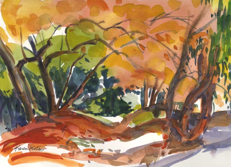
Fall in Winter – 9 x 12 watercolor
SOLD
Today is the winter solstice and here in La Canada, California, the sycamores finally decided to show some fall color. All I can say is “it’s about time!” This is an impressionistic painting of Flint Canyon – an equestrian trail that borders a small creek here in our town. Due to the recent rains the water was plentiful, reflecting a brilliant blue sky (not shown — you’ll just have to imagine it). One of these days I’m going to go back to Hall Canyon and see how the sycamores are doing up there – and hope that there won’t be any mountain lions about.
This was painted with a very large round brush, quickly, and with a lot of thick, rich paint. The time of day depicted is about 11 am – and look how low the light is … you can tell by the light-struck sides of trees. If it were later in the year everything would be in deep shade with no sideways light.
A few things about leaves. Experienced teachers have always cautioned (whether painting in oil or watercolor) not to paint every leaf on a tree because it looks too fussy. Rather, paint the mass of leaves and then put a few distinct leaf shapes in to suggest the rest. Viewers are pretty clever, and we don’t have to put in minute details get the idea across. I think it’s rather like telling a good joke. If you have to explain it, it didn’t work.
Pond in the Woods
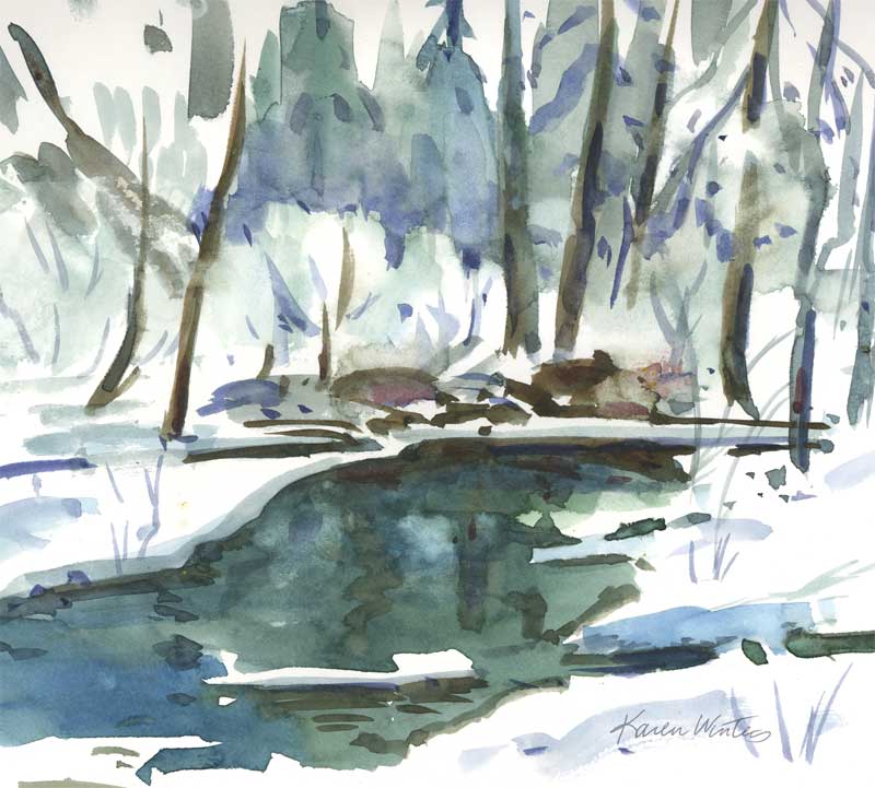
Pond in the Woods – 7.5 x 7 inches – watercolor
As I come to the conclusion of this winter series, I felt an urge to return to my roots in watercolor and to see how my experience of the medium has changed. As I have done in the past, I did no preliminary drawing of this rather abstract design. It was painted entirely with a No. 36 Goliath Round brush. It was my intention not to get too detailed here but to use negative painting to suggest some of the natural forms and to allow the viewer to have their own interpretation. I chose to use a limited palette to reflect the subtle colors of winter – the only spot of warm is in a pile of rocks in the middle ground.