Tumbling Down – Karen Winters daily painting

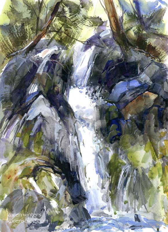
“Tumbling Down” – 10 x 14 – mixed media on watercolor paper (wc and acrylic)
Last night, after I decided to stop working on an oil painting (for the moment), I took out a watercolor pad and thought I’d experiment with some of what I heard Jerry Stitt talking about – painting what things are “doing” rather than literally what they look like. This was the result.
I started with big bold washes with a wide hake (goat hair?) brush, and then started layering with other watercolor washes. I dropped thick paint into wet areas and let it run. I used the edge of a flat brush to sculpt some of the rocks. Dry brush was added here and there for foliage. Most of the white of the waterfall was the reserved white of the paper.
After the watercolor was dry, I went back in with acrylic (both diluted and full strength) to add more crevices to the rocks and to add to the spray effect over dark rocks. Knowing that I was going to include acrylic, I didn’t use any masking.
I only vaguely used a reference photo as a starting point and to understand the flow of the cascade. Most of the rocks were made up as the paint did its own thing and I needed to respond to it. That’s something else that I found fascinating from Stitt’s demo – he did his paintings completely out of his head based on his response to a very quick gestural drawing and what the paint was doing on the paper. Stitt has been painting for so many years that his knowledge of land forms is vast, so in a sense he’s relying on an internal reference library and a near photographic memory. But what he says is true. At a certain point in a particular painting you need to make the painting work and forget trying to match a scene “out there” in reality. I observed the same ability with watercolorist Barbara Nechis who invented landscapes as she painted … again building upon years of experience as a painter and observer of nature. This is yet another reason to keep a sketchbook and draw nature wherever you go. By this simple act you are committing nature to memory.

sherry
January 22, 2008
There’s lots of energy here, nothing static or boring in any way, despite being a familiar subject. I’m very interested in combining the watercolor and acrylic. Sometimes achieving that sort of dark value in plain watercolor is difficult.
Lee Johnson
January 22, 2008
This is awesome
Karen
January 22, 2008
Thanks,
Sherry yes, getting a really opaque dark can be challenging – so it doesn’t look like mud. The opaque black acrylic did the trick
Genine
January 22, 2008
Wow Karen this is amazing. I can sit and “watch” your watefall. You can really feel the movement of the water.
Wonderful!!
Nancy
January 22, 2008
Just beautiful – so expressive, full of motion. And those rich dark colours — in short, wow!
shea
January 22, 2008
That is an awesome idea. I will try it out myself. Your results are inspiring.
Joanie
January 22, 2008
Hi again. This is truly brilliant. What a concept to work with, the ACTIVITY of a scene, rather than the LOOK of it. Marvelous. Could you email EDM with the links to the tutorials you mention? Blessings!
lindsay
January 22, 2008
Karen, this has a wonderful energy and expression. Very direct and I love the colors.
Katherine
January 22, 2008
This is absolutely terrific Karen – and your commentary is spot on.
And I can hear the water!!!
Karen
January 22, 2008
Thanks everyone. Joanie, I’m sorry there aren’t any links to tutorials. I saw those artists demonstrating live at workshops, so it’s all in my head – not in a book nor on the net. I do try to share what I’m learning here, so check back for more tidbits.
Detlef
January 22, 2008
Super work, Karen. A real sense of rushing water here.
Don
January 22, 2008
Karen this is a very nice piece. Up close it is abstract. step back and it melds into exactly what it is, a lively waterfall. That is what makes a piece interesting to me. It seems to be more of a challenge to create a piece that accomplishes that, especially in watercolor. Oils are more suited to it. Perhaps the combination of watercolor and acrylics is the answer for gaining the effect in watercolor? Sargent was a master at it. He used a bit of gouache here and there.
Great job!
Karen
January 22, 2008
Don, you are so right about Sargent – now that you mention it. Although I like the challenge of reserving the whites, there’s surely something to be said for using whatever works to create the right effect – including using opaque colors where necessary. It certainly does allow you to work with a piece and bring things forward and push things back.
mem
January 22, 2008
That is a very interesting post on photographic memory!
Jeff Kennedy
January 22, 2008
I reallly like this piece!Great technique. You can almost hear the water tumbling down the falls.
wendy
January 22, 2008
And the brush just took over and the lines took over and it turned out beautiful. Let the media do the talkin! And then be patient and add more paint after a bit of thought. Way to go.
w.
Bill
January 22, 2008
Karen, an exceptional work. You know, we paint and paint, and every once in a while we get not just a good painting but a gem. This is that. It sparkles with energy and spontaneity and vibrant harmony. Like an exceptional performance by a pianist; something happens and it goes better than right.
One of my teachers once told me that painting is like walking down a country road, moment by moment wondering what you’ll find next. Stephen Quiller calls it “listening to the painting.” Painting is much more than copying. And, yes, plein air is more than copying too. We’re out there to record internally what nature looks like, until nature is in our blood, so to speak, until our painting flows with the fluency of nature’s language. Nature is the real artist. Nevertheless, much as we admire her, nature is there for us, to nurture us, and in that sense serves us, just as we serve her.
Wendee
January 23, 2008
Oh wow, Karen! So alive and expressive and dynamic and bright! Stunning!
vivien
January 23, 2008
this is lovely with a freshness and great sense of movement :>)
I like working this way in the studio too, having worked plein air observing there is alot of information that sticks in the memoery and it’s distilled to the essentials. :>)
Rob Burkhard
January 23, 2008
Karen,
This is a very impressive painting. I enjoy the way you have simplified everything and really captured the motion of the water.
Ann
January 23, 2008
Awesome piece! Incredible sense of movement and energy.
Mariana
January 24, 2008
This is absolutely gorgeous, I love the movement and the colours that are all so alive. Wonderful!
Cathy Gatland
January 28, 2008
Wow – the effects of light and water belting down are realler than reality. Thanks for passing on the lesson too, to stop slavishly copying a scene and let the paints work, and the painting become its own entity. One to remember
Nicole
January 28, 2008
I’m not sure what I can say that hasn’t already been said above. What a wonderful peice.
carla
February 1, 2008
This is absolutely gorgeous! It captures the energy of nature… the colors, the movement, everything. Wow!