Santa Barbara Botanic Garden Cottage
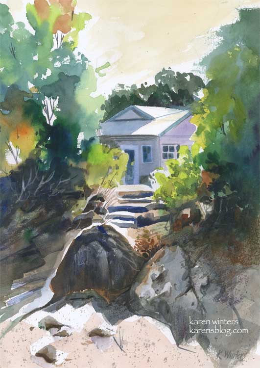
“Santa Barbara Botanic Garden Cottage” 11 x 15″ 140 lb. paper
These past few days have been very busy, and I have not been painting quite as many pieces as usual, but I did spend quite a bit of time with this one on Sunday, experimenting with a variety of techniques and concepts to come up with what I hope is a pleasing composition.
This painting was inspired by a scene I saw last summer when visiting the Santa Barbara Botanic Gardens. We walked down a path to a Japanese teahouse, and on the way back saw this view of a small cottage through the trees. I loved the contrast between the dazzling sun and the deep shade under the trees.
I’d like to highlight a few different things, for those readers who like to know details. I’m one of them, too. I like to get into the painter’s head when I can.
First off, I did a very light sketch on the paper with a 2H pencil. This was little more than the general shape of the trees, the roofline of the house, the shape of the steps area and the prominent foreground rocks.
I started painting in the upper left hand corner, painting the trees on dry paper with a juicy brush loaded with leaf green paint. Immediately, while the paint was still wet, I rinsed my brush and picked up some orange, and then some deeper green, letting them mix on the paper. I continued painting down the left side in this way, paying attention to variety of color and leaving some skyholes here and there.
Next, I put some initial light washes under the large foreground boulders, reserving a white edge for the sun highlight, then started at the top right and painted a solid medium green wash for the large mass of trees. Notice that I didn’t mirror the two tree shapes. The edge of the tree mass on the right is ragged, making use of the roughness of the paper with a drybrush technique.
When these layers were all dry, I went back in and glazed some other colors over them. Dark tones for the shadowed bushes on the left, and medium greens into the small bushes on the right. I started molding the shape of the rocks at this time, also, using a “palette” gray composed of the leftovers of other colors I’d been using. I put in the foreground color very loosely.
About this time I started laying in the first washes of the house, cool blues and lavenders to contrast with the warms of the foliage. I “saved” the whites of the roof and the tops of the steps to suggest the hot mid day sun.
When all of this was dry, I went back in to carve out detail in the shadows, model the different shapes of the rocks with a variety of neutral washes. I added some splatter to the foreground to suggest dry crumbling granite and sand.
Toward the end of the painting I added details of the windows and doors on the house, I “lifted out” the shapes of some bushes in the underbrush on the left, added deep crevices to the rocks and a few grasses and twigs here and there with a ‘rigger’ brush.
Finally I decided on a very light warm sky wash, instead of blue. I think that it adds to the feeling of sunny California warmth. Skies don’t have to be blue – they can be any color you like.
I used a number of different colors in this, including new gamboge, prussian blue, orange, mauve, ultramarine blue, burnt sienna, leaf green and raw sienna.
Did you find this interesting? Helpful?
Malibu morning
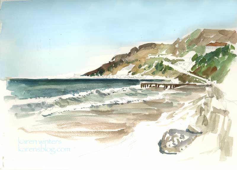
“Malibu Morning” 9 x 12 watercolor on paper
This morning I had a reason to be in Malibu while my husband was taking care of some business nearby. The sky was clear and a light breeze was blowing on a picture-perfect day. After taking a brisk walk up and down the shore a few times, I settled to paint this view in my Raffine sketchbook, en plein air. It might become the basis for a larger oil painting back in the studio. I used a large Niji waterbrush for everything but the sky, which was added with a wash brush when I got home. The slight discoloration in the sky is from the unevenness of my journal on the flatbed scanner. In fact it’s a nice even thalo blue all the way across.
The location of this watercolor is about a quarter mile north of Gladstone’s – along Pacific Coast Highway. The headlands in the distance is close to where Topanga Canyon comes out to the coast, I think.
Seed Fields

Seed Fields – sketchbook page – SOLD
There was no time to paint today, so before I head off to bed I did this quick watercolor sketch of one of the seed growers field that we pass by on our way up the coast to Santa Maria. The agricultural economy is changing and many of the growers now grow for seed (I think these are marigolds) instead of growing cut flowers.
This is another of those abstraction experiments, just playing around with color and shape – and pushing the intensity as far as I could. It’s in my Raffine sketchbook, but is not a full page. I managed to get in some time today for spring cleanup in our yard, so I’m really tuckered out – there was a lot of digging, clipping, ivy removal and weed pulling to do. I’m going to get some sunflower seeds strewn tomorrow so I’ll have material for cutting and painting later in the season.
Radiant Rose – Daily Painting

Radiant Rose – 9.5″ x 7.5″ watercolor.
Almost every day for the past five weeks or so, my dh and I have been taking walks of a half hour or an hour – within about 5-10 miles of our area. The benefits of this extra activity is many-fold. Not only do I feel healthier and more energetic (if that was possible – I was a pretty high-energy person as it was) but it takes us through different neighborhoods where we take time to smell the roses. No, I mean literally. If we see some really great roses in bloom we take a break from our walk to admire them. Because it’s impossible for me to go ANYwhere without a camera, I can often be seen with my new little digital hanging around my neck, and grabbing shots of things that I see when the light strikes them “just right.” I figure if it catches my eye, it might catch others’ too, when translated into watercolor. This is the result of one of those moments – caught about 10 am in some lucky gardener’s front yard in Glendale.
If you’re not a walker, I strongly recommend it. I used to walk a lot when I was in college – not only back and forth to class, but I’d take a 3 mile loop every day through the hills of Bel Air, just a few blocks off the Westwood campus. But I got out of the habit due to busyness and a few scary encounters while out walking alone. I’ve walked on and off through the years, but I realize now how much I’ve missed it. I envy those in walkable cities like New York and San Francisco. Here in LA we are so car-focused and things are so spread out that simply walking doesn’t occur to us.
If you’re in the Northern Hemisphere, spring has arrived and it’s a good time to get out and smell, shoot or draw the roses on your daily walk. You’ll return home both creatively and physically charged up.
This rose was painted with WN Bright Red, Holbein Opera and New Gamboge, with a few touches of cadmium orange and perm. alizarin crimson.
California Poppies
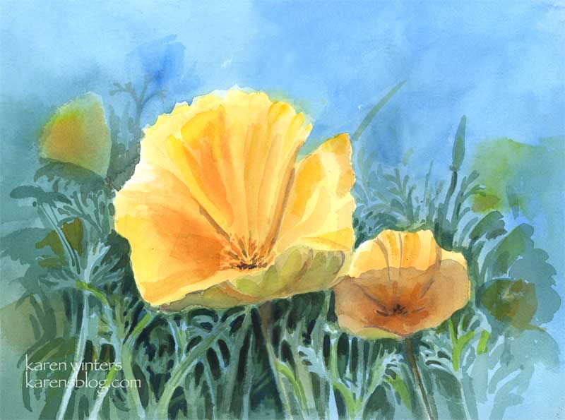
California poppies – 11 x 15 quarter sheet watercolor
SOLD
Come April, drifts of poppies, our state flower, burst into bloom in everyone’s yard. These cheerful blooms start to close around 4 pm, but in the middle of the day they are glorious.
Art thought of the day
Edgar Payne wrote: ” If the student will adopt the habit of putting much time on the preliminary compositional pencil sketches – the preparation for painting – he will have gained aid that will benefit him for as long as he paints. Additionally, the pleasure derived from doing pencil skteches is second only to that of painting.”
Amen to that!
Yellow Rose sketch

Sketchbook Rose – 7 x 10
While I work on some larger projects to prepare some paintings for shows, here’s a page from a Canson Montval sketchbook with a full blown Descanso rose. I didn’t spend a lot of time working on the subtle turn of each petal and leaf – I just wanted to get the colors of the late afternoon light falling on the blossom and leaves.
In retrospect, I see that I need to push back some of the petals so the bloom doesn’t look quite so separate from the background (even though it did look crisp with hard edges in real life.) I could use some complements to glaze over and do that, but I think I’d just risk overworking it too much. I’ve made a mental note of what I need to do, so this sketch has served its purpose. I used a lot of new gamboge, bright red, prussian blue and mauve for this one, and too many other colors to recall. Look for this in a larger version, coming soon.
Art thought of the day from Frank La Lumia, plein air painter, as interviewed by Molly Siple in American Artist:
The way you see things must be different from the way the average person sees the world. It’s important to be able to mentally break down nature into patters of color and value relationships. Until you can think abstractly, you will be at the mercy of leaves, branches and other details of nature.”
Yup, that’s the rub … where is the sweet spot that’s right for me between abstraction and realism? This is my koan of the moment. If you’re a painter, it yours, too?
Abstract sycamore
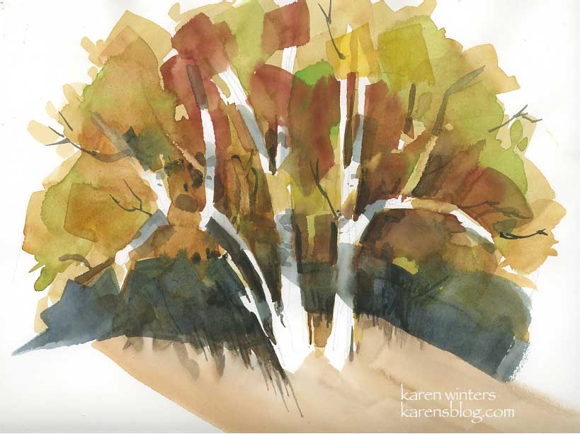
This was an exercise in abstracting natural forms in my watercolor class. Our teacher, who paints marvelously, is encouraging us to think more in terms of abstraction and symbol rather than literally painting what we see in front of us. I ‘get it’ and am doing the exercises and such, but there’s still a part of me that wants a tree to look like a tree with all the leafy bits (although not TOO fussy.) I’m guessing that my style will even out somewhere between the two, under the influence of my own predilections, likes and dislikes and gentle influence of other teachers yet to come. I love the California school painters with their abstraction and wild colors, but I also love Sargent and his beautiful loose renderings that simultaneously reveal and suggest. And I adore the crisp geometric patterns of Dong Kingman and the sweeping emotional scenes of Emil Kosa and the controlled wildness of Charles Reid. All of them – they all touch my heart, much as I like early music like that of Talis as well as jazz (but only if it swings.) Must we fit in only one mold?
Synchronistically, I opened a random art magazine to a random page and came up with an interview with Tony Pro an oil painter. Pro relates how he had the opportunity to meet Richard Schmid (author of Alla Prima and many other outstanding books.) Pro says that Schmid was kind but honest in reviewing his work, and advised him to be true to himself and not to copy others. Pro concluded with what what is today’s art advice: “Don’t paint like someone else to impress someone – work only to impress yourself.”
Geometric trees may be sophisticated, but for now they just don’t swing. Maybe they will some day – I’ll have to wait and see.
California Byway
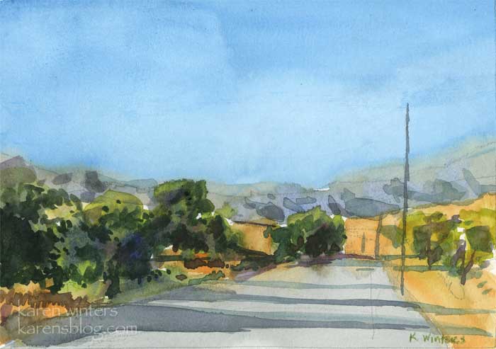
California Byway – 7″ x 5″ – watercolor
A peaceful country road in the Ojai area, a little northwest of Los Angeles.
There are still agrarian areas, even in Southern California, where the landscape still looks much as it did a hundred years ago (as long as you don’t notice the late model SUVs zipping by.)
When we take road trips we seek out these out of the way places off the beaten path where the late afternoon sun reminds us that it really is a golden state.
Art advice from watercolorist Rex Brandt:
“I advocate the study of other artists’ ways and indeed, I am suspicious of the student or teacher who professes neither knowledge nor concern about the ways of the masters of his field.”
High Desert Ravine
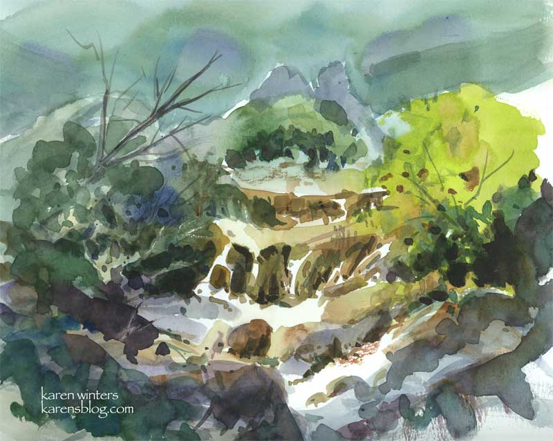
“High Desert Ravine” – watercolor – 8″ x 10″ – available
A roadside stop on the way to Idyllwild provided the inspiration for this watercolor sketch. Sagebrush, crumbing granite and the scruffy native bushes gave me an interesting variety of textures and colors to work with.
Good advice from David Millard on painting:
“Be a doer … don’t just talk about it. Talent is what your mother talks about. Work is what gets you around the bases and score!”
Two koi
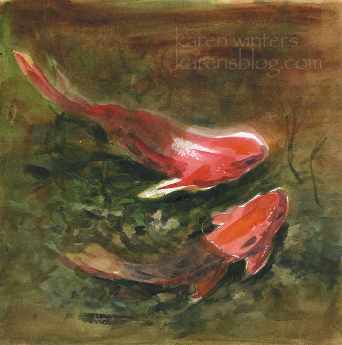
Two Koi – 8″ x 8″ watercolor on Stonehenge paper
Two little Descanso koi, looking for some fish chow. Look out for the racoons!
At Mulberry Pond at Descanso Gardens, they have created some ledges and shelves out of rock for the koi to hide under. I heard from one of the volunteers that the racoons will actually wade in the water to fish. But apparently they won’t swim into deep areas. Racoons, herons and egrets are a problem for pond owners who treasure their living jewels. To the predators it’s just an easy meal.