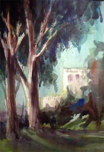
Huntington Gardens Jacaranda
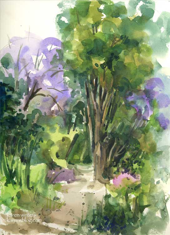
Huntington Jacarandas – 9 x 12 – Raffine sketchbook
The Best Laid Plans of Artists oft go awry (to paraphrase Bobby Burns.) Wendee and I arrived at the Huntington today and before leaving we both checked the website and discovered that the only way one is permitted to paint in the gardens is if you have previously registered with the Art Guild. So instead of doing a large size plein air painting as I had hoped, I used smaller brushes and painted this in my Raffine sketchbook in my lap. It’s still good 110 lb. paper but not quite the same feeling (to me) as a nice sheet of Arches. If you are in Southern California and are a Bank of America customer, many museums are open for free this month – you can get a complete list on their website. But there’s only a week left, so get busy!
This sketchbook painting represents a pathway near the Australian section of the gardens. The day was overcast and slightly cool so you’ll notice the lack of a brilliant blue sky. The periwinkle blue of the summer blooming jacarandas brightened an otherwise subdued green landscape. We have a jacaranda on our property as well but it hasn’t decided to bloom yet, but I’m looking forward to it.
Flintridge Eucs – Daily Painting
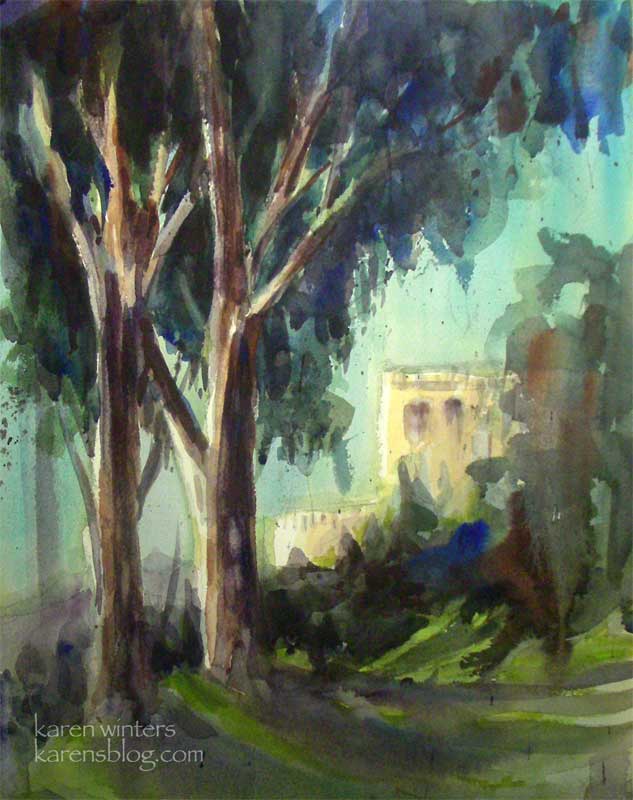
“Flintridge Eucalyptus” 11″ x 15″ watercolor on Arches paper
SOLD
This morning’s plein air outing took us to the beautiful home of one of the members of our group. There were literally so many views to paint that I had a hard time choosing one, but I finally settled on this perspective on their neighbor’s villa, with our friend’s stately eucalyptuses in the foreground. If you’ve been reading this blog for awhile, you know how I simply cannot resist these beauties.
I thought you might find it interesting to see how this painting began. If I had faced the subject straight on, the sun would have shined directly over my shoulder onto the paper, which would have made values extremely difficult to judge. I prefer to paint with shade on my paper, but when that’s not possible, I will move my easel so there is less sun falling on the paper, and I’ll tilt it vertically as well. This also makes it possible for my preliminary washes to run and blend.
At the end of the morning, the painting was almost finished (see below) but the villa in the background and some of the lawn still had white showing. Rather than making a permanent decision about these whites that I might regret, I took it home to think about it for awhile. Using a piece of acetate film, I tested a few different colors in overlay, then finally added warm tones to the whites as you see above in the final painting. Overall, I’m happy with how this turned out – I’m tempted to paint it in oils also.
The biggest temptation here was to RESIST painting every leaf, bush, twig and detail, especially in the background. The idea is to give an impression of the scene – to capture the feeling without explaining every part. Wise teachers like Edgar Whitney, Frank Webb and others say that by not putting in too much detail (just enough) it invites the viewer to participate in the painting. I agree!
Illo Friday – Citrus
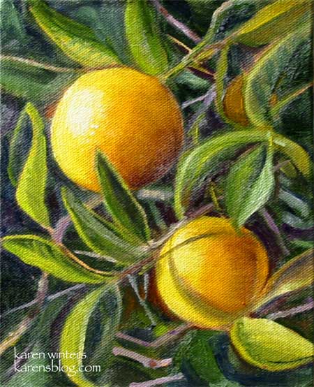
“Twin Oranges” – 6 x 8 – oil on canvas panel, mounted on hardboard – SOLD
These small oranges were spotted at the Old Mill in San Marino, home of the California Art Club.
I loved the way they were shining in the sun, so reminiscent, to me, of the California I remember from my childhood when the northern end of the San Fernando Valley was still filled with orange groves, not strip malls.
This is my entry for this week’s Illustration Friday theme – “Citrus”
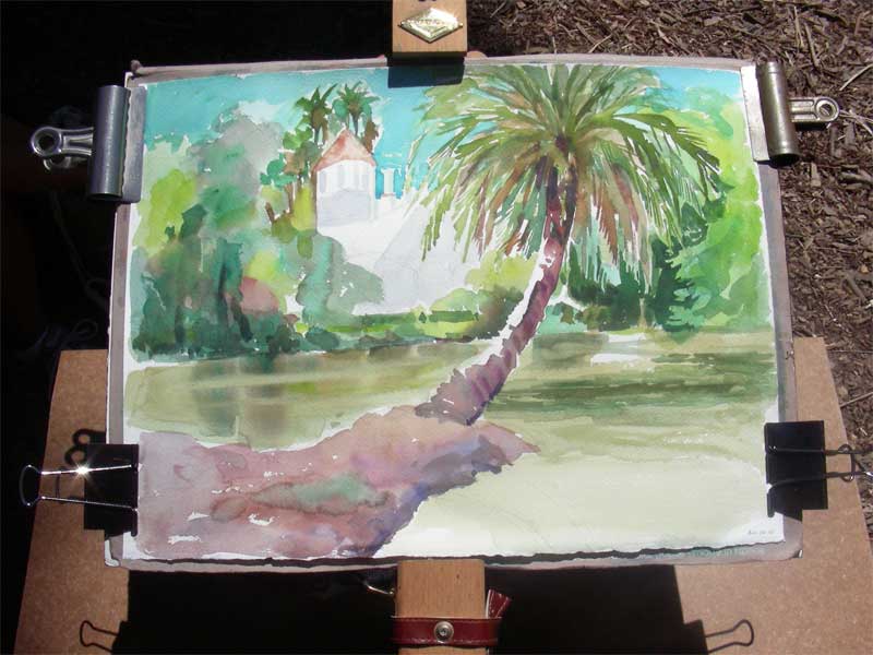
Arcadia – Fantasy Island House
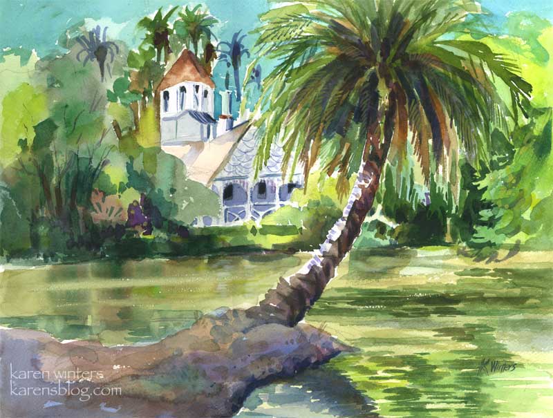
“Queen Anne Cottage” 15″ x 11″ (quarter sheet) – SOLD
Today my art pal Wendee and I went to the LA Arboretum in Arcadia for some plein air sketching and painting. We found a shady relatively cool spot in the tropical lagoon area, made famous by the 70s anthology series “Fantasy Island”
(Alright, let’s just say it and get it out of our systems, shall we? “Da Plane, Da Plane.”)
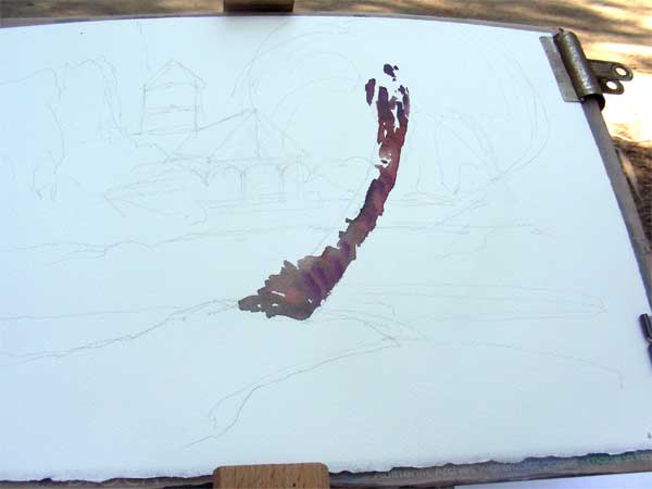
I took some digipix of the work in progress this time. After doing a quick value sketch, I drew some light outlines on the paper of where I wanted the main features to go. In this picture I’ve already started putting in the trunk of the palm, which I knew would be the featured item. I’m using burnt sienna and a mauve to get that warm/cool feeling where the trunk turns from light to shade.
Next , I’m moving around the page with a big round brush, putting in some of the background colors, and making up quite a few also. I’ve done a lot of work on the palm, not only because it was fun but because the light was changing and I wanted to get it to some degree of completion so I could evaluate the values of other things in the picture.
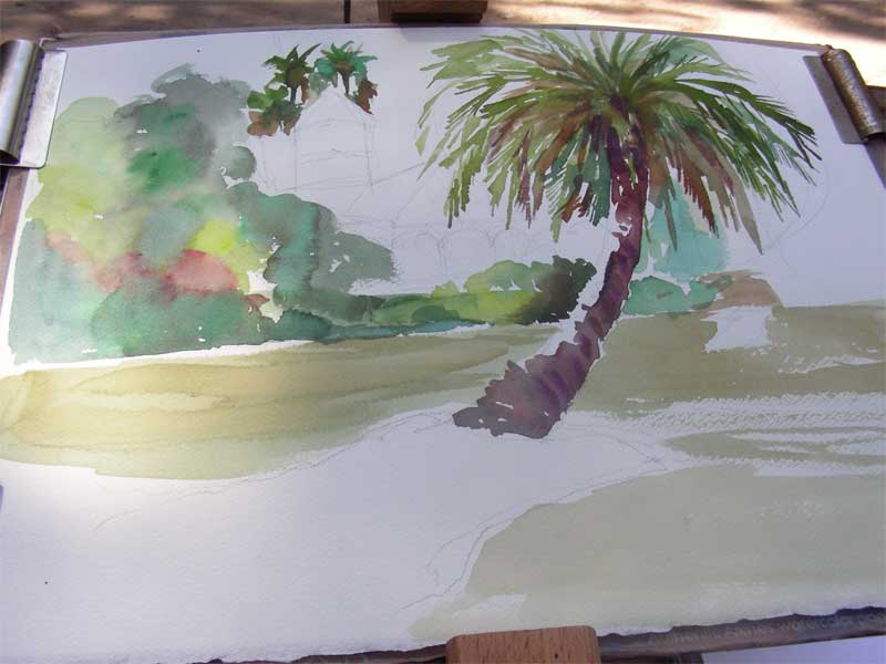
At this point it was probably an hour and a half after I began, give or take a bit, and the morning sun had become overhead noontime sun. It was time to call it a day on location. I took the painting home to check the photo I had taken at the beginning of the day, and to decide where the reflections would go. Most of the hard work is done at this point – what remains are putting in the darkest darks, details and calligraphic brushstrokes.
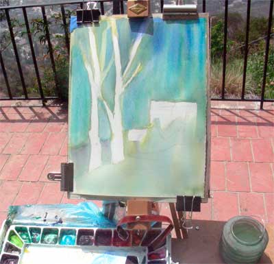
Santa Barbara Botanic Garden Cottage
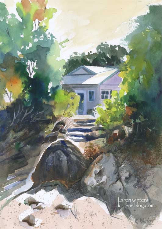
“Santa Barbara Botanic Garden Cottage” 11 x 15″ 140 lb. paper
These past few days have been very busy, and I have not been painting quite as many pieces as usual, but I did spend quite a bit of time with this one on Sunday, experimenting with a variety of techniques and concepts to come up with what I hope is a pleasing composition.
This painting was inspired by a scene I saw last summer when visiting the Santa Barbara Botanic Gardens. We walked down a path to a Japanese teahouse, and on the way back saw this view of a small cottage through the trees. I loved the contrast between the dazzling sun and the deep shade under the trees.
I’d like to highlight a few different things, for those readers who like to know details. I’m one of them, too. I like to get into the painter’s head when I can.
First off, I did a very light sketch on the paper with a 2H pencil. This was little more than the general shape of the trees, the roofline of the house, the shape of the steps area and the prominent foreground rocks.
I started painting in the upper left hand corner, painting the trees on dry paper with a juicy brush loaded with leaf green paint. Immediately, while the paint was still wet, I rinsed my brush and picked up some orange, and then some deeper green, letting them mix on the paper. I continued painting down the left side in this way, paying attention to variety of color and leaving some skyholes here and there.
Next, I put some initial light washes under the large foreground boulders, reserving a white edge for the sun highlight, then started at the top right and painted a solid medium green wash for the large mass of trees. Notice that I didn’t mirror the two tree shapes. The edge of the tree mass on the right is ragged, making use of the roughness of the paper with a drybrush technique.
When these layers were all dry, I went back in and glazed some other colors over them. Dark tones for the shadowed bushes on the left, and medium greens into the small bushes on the right. I started molding the shape of the rocks at this time, also, using a “palette” gray composed of the leftovers of other colors I’d been using. I put in the foreground color very loosely.
About this time I started laying in the first washes of the house, cool blues and lavenders to contrast with the warms of the foliage. I “saved” the whites of the roof and the tops of the steps to suggest the hot mid day sun.
When all of this was dry, I went back in to carve out detail in the shadows, model the different shapes of the rocks with a variety of neutral washes. I added some splatter to the foreground to suggest dry crumbling granite and sand.
Toward the end of the painting I added details of the windows and doors on the house, I “lifted out” the shapes of some bushes in the underbrush on the left, added deep crevices to the rocks and a few grasses and twigs here and there with a ‘rigger’ brush.
Finally I decided on a very light warm sky wash, instead of blue. I think that it adds to the feeling of sunny California warmth. Skies don’t have to be blue – they can be any color you like.
I used a number of different colors in this, including new gamboge, prussian blue, orange, mauve, ultramarine blue, burnt sienna, leaf green and raw sienna.
Did you find this interesting? Helpful?
Malibu morning
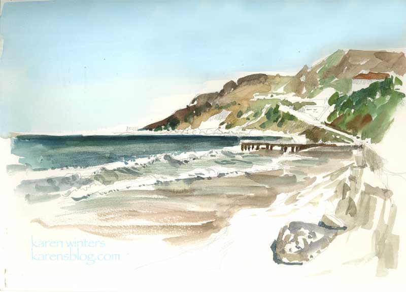
“Malibu Morning” 9 x 12 watercolor on paper
This morning I had a reason to be in Malibu while my husband was taking care of some business nearby. The sky was clear and a light breeze was blowing on a picture-perfect day. After taking a brisk walk up and down the shore a few times, I settled to paint this view in my Raffine sketchbook, en plein air. It might become the basis for a larger oil painting back in the studio. I used a large Niji waterbrush for everything but the sky, which was added with a wash brush when I got home. The slight discoloration in the sky is from the unevenness of my journal on the flatbed scanner. In fact it’s a nice even thalo blue all the way across.
The location of this watercolor is about a quarter mile north of Gladstone’s – along Pacific Coast Highway. The headlands in the distance is close to where Topanga Canyon comes out to the coast, I think.
Seed Fields

Seed Fields – sketchbook page – SOLD
There was no time to paint today, so before I head off to bed I did this quick watercolor sketch of one of the seed growers field that we pass by on our way up the coast to Santa Maria. The agricultural economy is changing and many of the growers now grow for seed (I think these are marigolds) instead of growing cut flowers.
This is another of those abstraction experiments, just playing around with color and shape – and pushing the intensity as far as I could. It’s in my Raffine sketchbook, but is not a full page. I managed to get in some time today for spring cleanup in our yard, so I’m really tuckered out – there was a lot of digging, clipping, ivy removal and weed pulling to do. I’m going to get some sunflower seeds strewn tomorrow so I’ll have material for cutting and painting later in the season.
Radiant Rose – Daily Painting

Radiant Rose – 9.5″ x 7.5″ watercolor.
Almost every day for the past five weeks or so, my dh and I have been taking walks of a half hour or an hour – within about 5-10 miles of our area. The benefits of this extra activity is many-fold. Not only do I feel healthier and more energetic (if that was possible – I was a pretty high-energy person as it was) but it takes us through different neighborhoods where we take time to smell the roses. No, I mean literally. If we see some really great roses in bloom we take a break from our walk to admire them. Because it’s impossible for me to go ANYwhere without a camera, I can often be seen with my new little digital hanging around my neck, and grabbing shots of things that I see when the light strikes them “just right.” I figure if it catches my eye, it might catch others’ too, when translated into watercolor. This is the result of one of those moments – caught about 10 am in some lucky gardener’s front yard in Glendale.
If you’re not a walker, I strongly recommend it. I used to walk a lot when I was in college – not only back and forth to class, but I’d take a 3 mile loop every day through the hills of Bel Air, just a few blocks off the Westwood campus. But I got out of the habit due to busyness and a few scary encounters while out walking alone. I’ve walked on and off through the years, but I realize now how much I’ve missed it. I envy those in walkable cities like New York and San Francisco. Here in LA we are so car-focused and things are so spread out that simply walking doesn’t occur to us.
If you’re in the Northern Hemisphere, spring has arrived and it’s a good time to get out and smell, shoot or draw the roses on your daily walk. You’ll return home both creatively and physically charged up.
This rose was painted with WN Bright Red, Holbein Opera and New Gamboge, with a few touches of cadmium orange and perm. alizarin crimson.
California Poppies
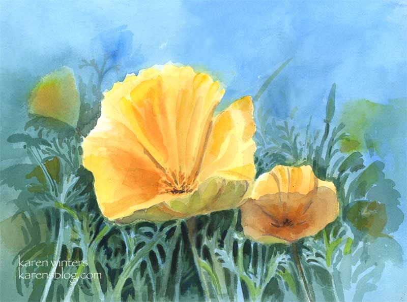
California poppies – 11 x 15 quarter sheet watercolor
SOLD
Come April, drifts of poppies, our state flower, burst into bloom in everyone’s yard. These cheerful blooms start to close around 4 pm, but in the middle of the day they are glorious.
Art thought of the day
Edgar Payne wrote: ” If the student will adopt the habit of putting much time on the preliminary compositional pencil sketches – the preparation for painting – he will have gained aid that will benefit him for as long as he paints. Additionally, the pleasure derived from doing pencil skteches is second only to that of painting.”
Amen to that!