Windswept – by Karen Winters

“Windswept” 18 x 24 oil on canvas
This new painting was finished just a few days ago, and will be in the show at Descanso Gardens, now just two days away. It’s my favorite painting, so far, for a few reasons. For one, it’s the largest oil painting I’ve attempted and probably represents the most dynamic design. The larger size meant using larger brushes and standing back farther. Although I did the block in part sitting down, all the finishing was done standing, which was a different experience for studio painting. I almost always stand when painting en plein air, but not in studio.
The best part was the inspiration for this piece. A month or so ago we visited our daughter in San Francisco where she was doing her summer internship between the two years of her MBA program. We went up to Mt. Tamalpais for the day and had great time wandering through a redwood grove. On the way back we got caught up in the traffic returning over the Golden Gate bridge, and our movement came to a standstill. When I’m a passenger in a car, I almost always have my camera at the ready, and this time, I happened to see a tree clinging to a cliffside we passed. The light was striking it in a particularly dramatic way and I was immediately started thinking of creative possibilities. (It was not a cloudy day – I made that part up.) So because we were frustrated and inconvenienced, this shot became a possibility. Speeding by at 60 mph, it wouldn’t have been.
This incident reminds me of the value of acceptance. Acceptance of things the way they are, rather than how we would like them to be. Possibilities are all around us if we are not fixated on achieving specific results.
For example, you run out of the color of paint you want as you are beginning a painting. Use a different color and see what happens. Water dribbles in the wrong place on your watercolor. Is it an error or a doorway to a new shape that you might not have tried? You leave your pencil sharpener at home and have to sharpen a tool with an exacto knife instead – creating a different sort of edge. I’ve heard stories of artists who suddenly develop an allergy to their medium of choice, and have to switch to another, leading to breakthroughs in their careers. These stories are abundant in art and other endeavors.
Have you had this happen to you? How did it change your art or, even more so, your life? How did acceptance of something unexpected or even unwelcome make a difference for you?
Eaton Canyon Trail – Pasadena
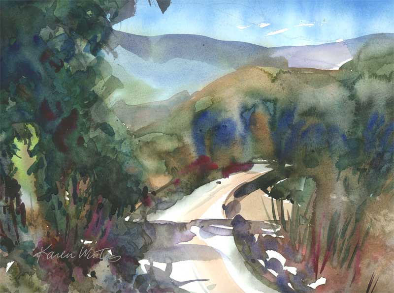
“Eaton Canyon Trail” 9 x 12 – watercolor on paper
The show prepping continues as I went to the frame store this morning and got some gorgeous plein air gilded frames. I put the paintings in them and loved the effect. Tomorrow is watercolor framing day and time to take a break with a visit to another art group in the region. I don’t know what the program’s going to be, but I’m sure it will be educational and entertaining. Today’s painting is in the same theme of looseness, wet into wet and negative painting. I’m having a very good time with it. Can you tell?
Coneflowers
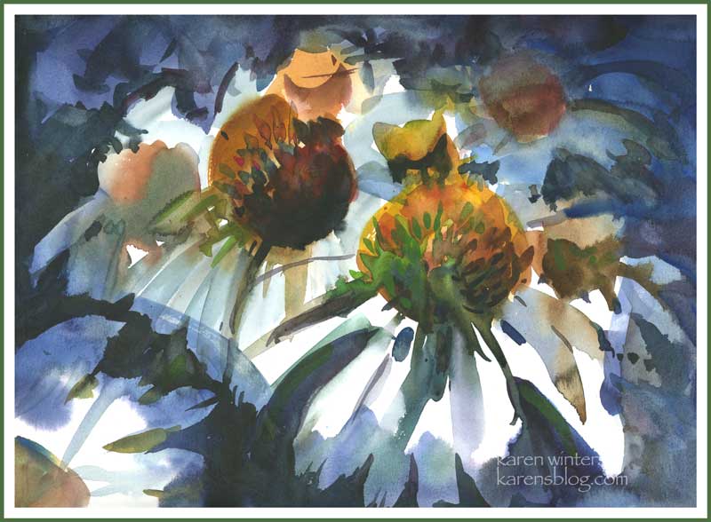
“Coneflowers” 9 x 12 watercolor on paper
Tonight was the meeting of our local art association, and we were privileged to see a demonstration by Fealing Lin, a remarkably gifted watercolorist who came to the US from Taipei as a dentist and reinvented herself as a fine artist. Her style is loose and free but it’s wonderful to see what she does with color. Unlike some watercolorists whose looseness seems mannered and almost formulaic, Fealing’s paintings are spontaneous and each presents a unique solution to a creative problem. She emphasized the importance of saving the lights and really pouring on the color, wet in wet.
I was so inspired by the demo she gave that I came home and painted this quick sketch of coneflowers, trying to get into that spirit of controlled spontaneity. Oh, yeah, and it was after dinner and a glass of cabernet. Hmmm. I think that helped.
If you’re in the Southern California area and would like a picture postcard invite to my show starting next week at Descanso, drop me a line at karen@karenwinters.com
Gloriosas in Excelsis
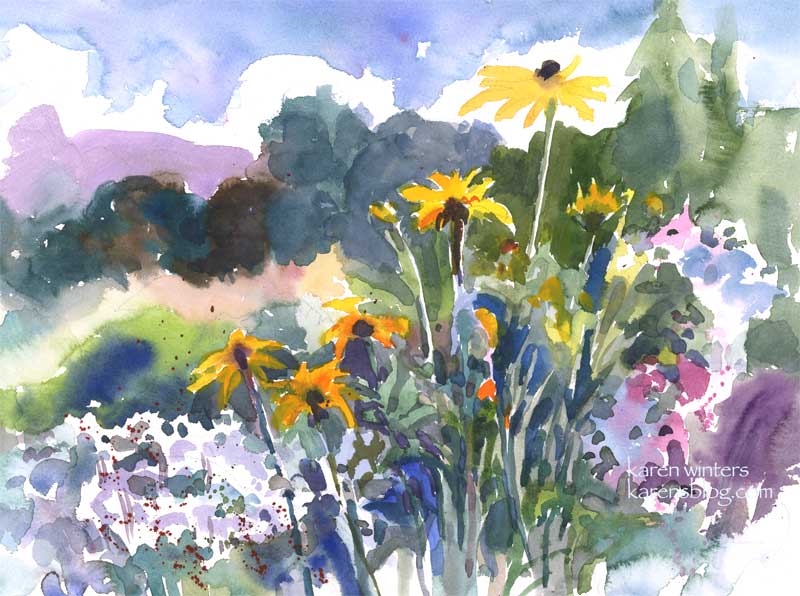
“Gloriosas in Excelsis” – 11 x 15 watercolor on paper
Not for sale. Prints available.
Gloriosa daisies (aka Rudbeckias) are among my favorite casual flowers. I love roses, of course, and alstroemerias, and lilacs, Shasta daisies, penstemons – ah, so many flowers so little time. But gloriosas are wonderful workhorses in a garden setting, as in this center planter at Descanso Gardens. They are long lasting either growing in the ground or cut, and if there isn’t too much cold weather they can even be cut back and coaxed to bloom a second year. Gloriosas are related to black eyed susans and coneflowers and they are outstanding in bouquets. I am still painting like crazy in advance of the show, even though I have more than enough paintings to choose from. But I know I won’t get a great deal of painting done during the month that I’m gallery-sitting, so I’m sort of putting a few in the bank ahead of time.
First Flush

“First Flush” 9 x 12 oil on canvas on board
SOLD
When spring comes to Descanso Gardens, the first flush of roses is a sight to behold. In fact, it’s pretty darn spectacular any time of year, even now when the hot summer colors radiate from every corner.
Yesterday I spent some time up at the gallery with fellow artists Belinda del Pesco, and Trish Kertes – two of the most gifted artists and nicest people you’d ever want to meet. They were so very helpful in teaching me the ropes of running the gallery when it’s our turn in a few weeks. Their expertise was so very welcome.
Prints coming soon
I’m making my master list of things to do to get ready, and among them is making prints available for sale as well as original works. So if you’ve been interested in getting prints of some of the things I’ve posted here, I will soon be offering those in a variety of sizes. More details on that as I get further along. At the moment I need to focus on the imminent deadline.
Castle Green – new show UPDATE

SOLD
Today I was delighted to get a notification that this will be one of 15 paintings accepted into the upcoming juried California Art Club group exhibition “California in Focus: Scenes of Pasadena and the San Gabriel Valley. Part 2”
The exhibition will be on view at Marston’s Restaurant in Pasadena … 151 E. Walnut Street … from November 27, 2007 – January 27, 2008. A reception will be held toward the end of the exhibition – the exact date and time to be determined. I’ll announce it on the blog as soon as I know.
Needless to say I am thrilled to be included in this beautiful CAC show, and to meeting my fellow exhibitors, but it just so happens that Marston’s is on the short list of our very favorite casual local restaurants. If you ever have a chance to dine there there you simply MUST try the Pasadena or Cordillera salad. Their cottage garden is a delight, too. I can’t tell you how many times I’ve photographed those blooms, and how it’s been an inspiration to my own cottage garden. I’m going to have to paint the Marston’s garden one of these days. If Descanso is my garden home, Marston’s is definitely my lunch home!
This was one of many painting projects that have been in the works these past weeks, and I am so very happy to be included.
Castle Green Balcony – Pasadena – by Karen Winters
“Castle Green Balcony” – 9 x 12 oil on board
SOLD
One of Pasadena’s most venerable landmarks is the Castle Green, which was built before the turn of the 20th century as an annex to the Hotel Green by Col George Green, who made his fortune in the patent medicine business. It has been home to the Tournament of Roses, and at its time was the center of fashionable society in Pasadena.
Although there are more imposing and “postcard” views of this building, my eye was caught by a simple balcony adorned with geraniums, and accented by a very old palm tree. The late afternoon light made the scene positively glow.
Now, back to the easel …
Saturday’s Show in La Canada
If you’re in LA, I’m going to be exhibiting these new paintings for the first time tomorrow afternoon at Flintridge’s Sacred Heart Academy. The show and benefit is in conjunction with the California Art Club.

SOLD


SOLD
Here’s the info from their press release:
The California Art Club is very excited to be participating in Faith & Hope: Beyond Prison Walls, a benefit art exhibition and sale at in support of Partnership for Re-Entry Program and Families of the Incarcerated, organized by the Office of Restorative Justice. The exhibition, held at the historic Flintridge Sacred Heart Academy, will feature work by the Incarcerated through the Arts and Corrections Program, Art Release, and by members of the California Art Club.Proceeds from sales will benefit the incarcerated and their families as they work to transition back into society and to make positive changes in their lives. To purchase tickets for the exhibition and sale, please call Viki Battaglia at the Office of Restorative Justice, 213/637-7428 (Adults $25, Students $10). Participating artists and one guest may attend free. All artwork will be available for purchase (cash and checks only).
The time of the event is 4 pm – 7 pm
Address: 440 St. Katherine Drive, La Canada, CA 91011
Painting like crazy
I’m painting and framing like crazy on deadline for three different shows; updates coming soon. In the meantime, so you don’t think I’m slacking, here’s one from the archives …

Santa Barbara Glow – 7 1/2 x 11″ – acrylic
The Way Back Home – Daily Painting
“The Way Back Home” (Central California Coast) – 9 x 12 oil on canvasboard
SOLD
When I saw this location last week it left me with a feeling of nostalgia and bittersweet longing, even though I have never lived in a rural setting. Perhaps there’s something about a lonely country road that evokes feelings of homesickness and curiosity – wondering what wonderful things await just around the bend.
Can you tell I am becoming seriously infatuated with vivid color?
Note: if you find that this image appears exceptionally dark (not just saturated color but DARK) on your monitor, please let me know. I’m trying to tweak my settings so that images scanned through a Mac appear reasonably correct on a PC.