California Poppies
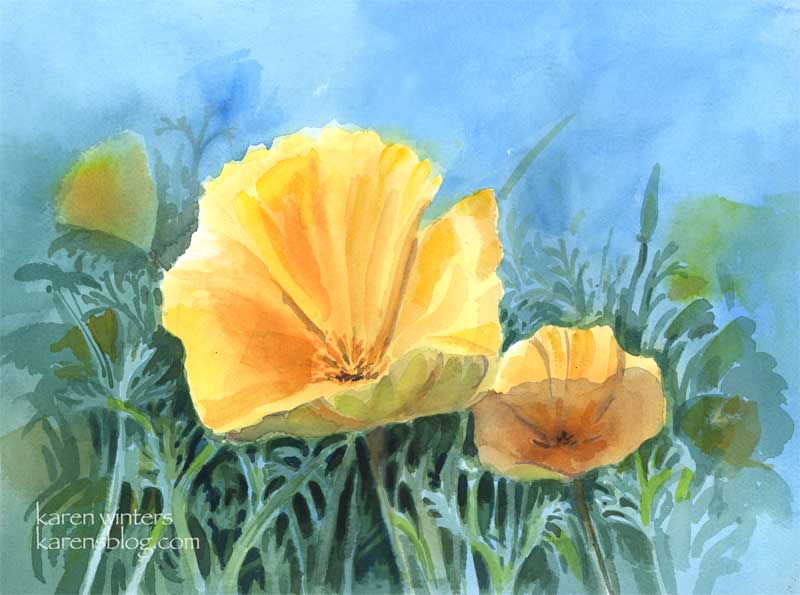
California poppies – 11 x 15 quarter sheet watercolor
SOLD
Come April, drifts of poppies, our state flower, burst into bloom in everyone’s yard. These cheerful blooms start to close around 4 pm, but in the middle of the day they are glorious.
Art thought of the day
Edgar Payne wrote: ” If the student will adopt the habit of putting much time on the preliminary compositional pencil sketches – the preparation for painting – he will have gained aid that will benefit him for as long as he paints. Additionally, the pleasure derived from doing pencil skteches is second only to that of painting.”
Amen to that!
Dawn Fishing
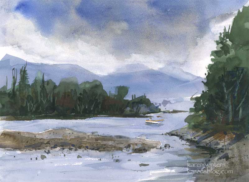
“Dawn Fishing” – 11 x 15 watercolor – SOLD
After a landscape or two that were quite giddy with fauve color, here’s one in a quieter more contemplative mood. Fishing friends through the years have told me that dawn and twilight are the best times for fishing. Except, of course if there’s a mid-day hatch of damselflies or something else, and then noon to afternoon is best. I think what they were saying is that any time of day is great if you’re in the mood, the conditions are right and the fish are hungry.
Kind of like painting, I think.
A watercolorist friend of mine says that early morning and early evening are the best times because the colors are most intense. The arc of the midday sun washes the colors out – and unless you want that brilliant bleached out look you’ll find better plein airing at “golden hour.”
Today’s art tip comes from an article by Brian Freeman in Artist Magazine: “Artist Dan Goozee’s advice was that you should stop working when you think you’re about 80 percent done. At that point, he said, you’re actually 90 percent done. Stop before you’re finished. Goozee’s words resonated with me. A big part of art is walking away – then coming back and looking at the work with a fresh eye.”
Or as my wc teacher says – every art kit should come with a guy with a hammer – to hit you on the head when you should stop.
Yellow Rose sketch

Sketchbook Rose – 7 x 10
While I work on some larger projects to prepare some paintings for shows, here’s a page from a Canson Montval sketchbook with a full blown Descanso rose. I didn’t spend a lot of time working on the subtle turn of each petal and leaf – I just wanted to get the colors of the late afternoon light falling on the blossom and leaves.
In retrospect, I see that I need to push back some of the petals so the bloom doesn’t look quite so separate from the background (even though it did look crisp with hard edges in real life.) I could use some complements to glaze over and do that, but I think I’d just risk overworking it too much. I’ve made a mental note of what I need to do, so this sketch has served its purpose. I used a lot of new gamboge, bright red, prussian blue and mauve for this one, and too many other colors to recall. Look for this in a larger version, coming soon.
Art thought of the day from Frank La Lumia, plein air painter, as interviewed by Molly Siple in American Artist:
The way you see things must be different from the way the average person sees the world. It’s important to be able to mentally break down nature into patters of color and value relationships. Until you can think abstractly, you will be at the mercy of leaves, branches and other details of nature.”
Yup, that’s the rub … where is the sweet spot that’s right for me between abstraction and realism? This is my koan of the moment. If you’re a painter, it yours, too?
Sycamore Creek
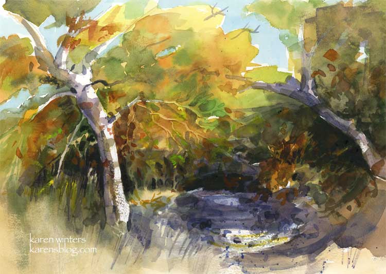
Sycamore Creek – 11 x 15 – watercolor on 140# paper
SOLD
Now this is a little more my speed. Some abstraction and impressionism, but some realism, too. I painted this picture twice today. The first one used more glazing, more overlapping patches of color in the main tree. I put that aside and tried another where the leaf patterns were painted more wet in wet. This seasonal creek is really at the Placerita Canyon Nature Center. The trees are beautifully green now, but I liked them better when they were decked out in reds and golds along with the green.
Thanks to everyone for all your thoughtful and insightful comments about the abstract exercise and the experience of coming under the influence of a teacher, or a artistic friend with a distinctive style.
A propos of that, today’s art advice is a quote from Frank LaLumia, plein air painter, as quoted in the January 2006 American Artist magazine.
“When you are responding to the subject rather than painting in a preconceived manner, you will find yourself doing things spontaneously, differently. In this way, every year your painting will look more like itelf and less like that o your teachers or other influences.”
High Desert Ravine
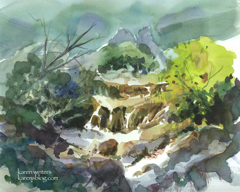
“High Desert Ravine” – watercolor – 8″ x 10″ – available
A roadside stop on the way to Idyllwild provided the inspiration for this watercolor sketch. Sagebrush, crumbing granite and the scruffy native bushes gave me an interesting variety of textures and colors to work with.
Good advice from David Millard on painting:
“Be a doer … don’t just talk about it. Talent is what your mother talks about. Work is what gets you around the bases and score!”
Back Country Creek
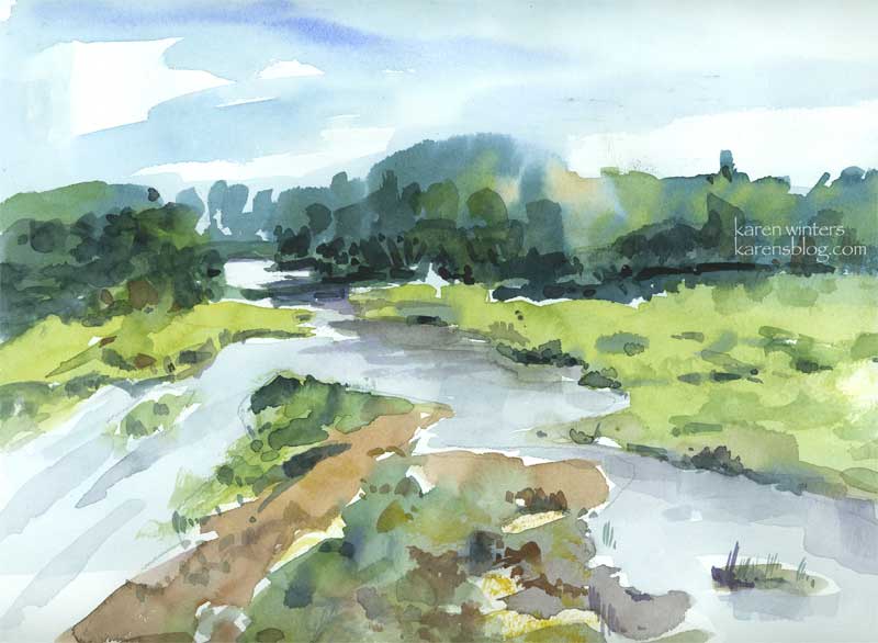
“Back Country Creek” – 9 x 12 watercolor on paper
A spring day in a subdued mood!
Wistaria branch
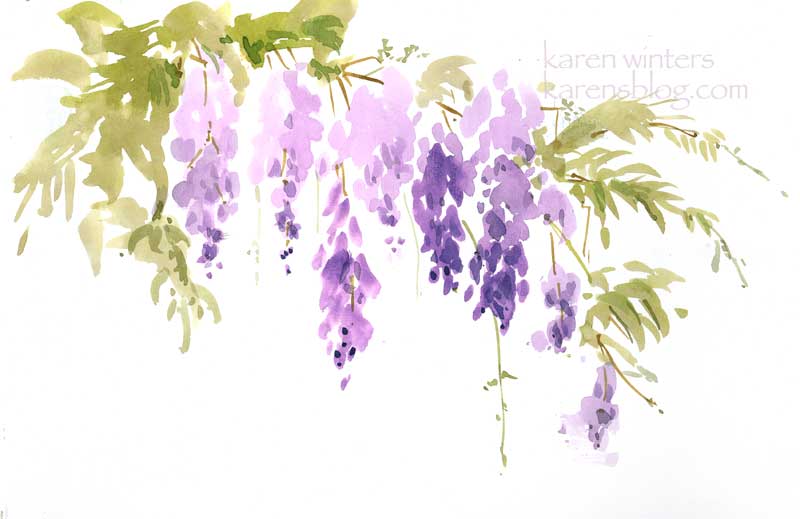
Wistaria Branch – 9 x 12″ on paper
Today’s paintout outing took us to a house in Sierra Madre where the world’s largest Chinese wistaria vine is growing. Sprawling, that is, over two homes. The perfume from the flowers was intoxicating as we painted the vine in all its springtime finery.
This was direct-painted primarily with a large, flat one-inch brush with no preliminary pencil drawing . The tiniest springs and trailing vines were added later with a very thin brush.
I think it has somewhat of an Asian feeling to it, appropriate to a plant that is native to China. What do you think?
Near Skye
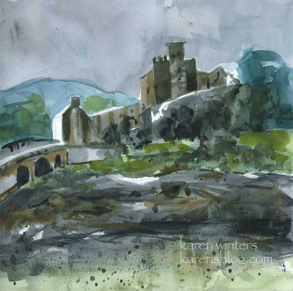
Scottish castle – watercolor on paper 8″ x 8″
Back in the 90s we went to England on business and had the opportunity to drive up to Skye, the home of my distant ancestors. This castle was nearby. I’m sure it would be prettier on a bright sunny day , but somehow mist and brooding moors seemed to fit perfectly.
Back on the home front, we spent this afternoon doing some gardening. After two years my right knee seems to finally have healed enough for me to work outside without concern for pain or undoing the slow process of recovery. So we vigorously trimmed shrubs, pruned the bougainvillea that survived the frost and tethered up a blue hibiscus that was being pushed aside by the bougainvillea. There’s so much work to be done in the yard but I’m looking forward to the exercise in the fine weather.
In the coming weeks, or weekends, mostly, I’ll put in our spring vegetable garden and transplant a few new plants I got at the Descanso Gardens spring plant sale – a fantastic twice a year event not to be missed.
Two koi
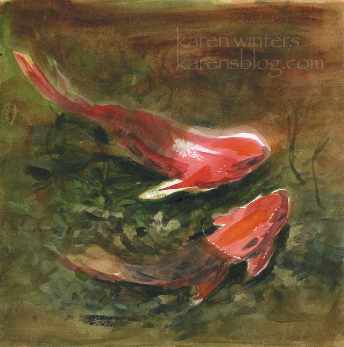
Two Koi – 8″ x 8″ watercolor on Stonehenge paper
Two little Descanso koi, looking for some fish chow. Look out for the racoons!
At Mulberry Pond at Descanso Gardens, they have created some ledges and shelves out of rock for the koi to hide under. I heard from one of the volunteers that the racoons will actually wade in the water to fish. But apparently they won’t swim into deep areas. Racoons, herons and egrets are a problem for pond owners who treasure their living jewels. To the predators it’s just an easy meal.
California Home 1 – Daily Painting
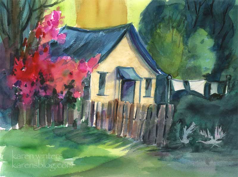
California Home 1 – 15″ x 11″ watercolor on paper
SOLD
Can you tell I’m in the middle of a very experimental try-anything phase? Well, I am. I absolutely love the California school paintings of the 30s through 50s, as I’ve mentioned here before, so today I thought I’d try something in that style.
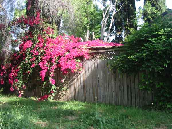
Last year, on a trip to Capistrano, I took this picture of a bougainvillea vine climbing over a wall onto what seemed to be a carport or something undefined. I liked the vine but I wanted it to be part of a larger scene – not just a big pink sprawling mass. I might still paint it again in oil or pastel, but that’s another story.
So, today, while letting the Alverno villa color study percolate in the back of my head, I took out my sketchbook and explored some other ways the vine could be part of an imaginary scene. I invented a cottage for the vine to crawl on, and made the fence lower so it could be seen.
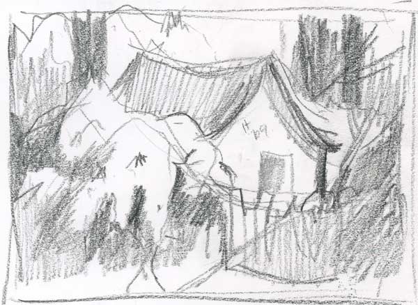
This was one of several value sketches I did, mapping out different shapes that I thought might work.
I scanned that drawing and brought it into Photoshop CS, where I experimented with different colors in different layers. To make the fuchsia-red flowers pop I looked for a complement for the cottage roof – a blue-green. I picked analogous colors for the other trees and shrubs in the scene.
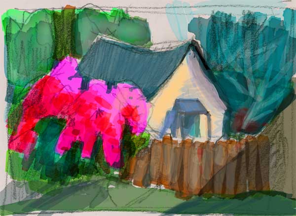
When I got it roughly sketched on the paper, I discovered that I had too much room to the right with nothing going on, so I drew in an old clothesline and tucked it behind a hedge because I didn’t want the fence to run full wide right off the page. And … I liked the allusion to an time before labor-saving devices, and the sun and breeze that it implies. I suspect that there are a couple of little kids playing with a floppy-eared dog in that back yard. Don’t you think? That shrubby background became a place to insert a couple of squabbling birds – geese or ducks, your guess.
So there’s the evolution of a California dream from a long-gone era and I hope you found the journey to its completion interesting. I’ll be putting this in my ebay store, tomorrow probably.