Casita Del Arroyo
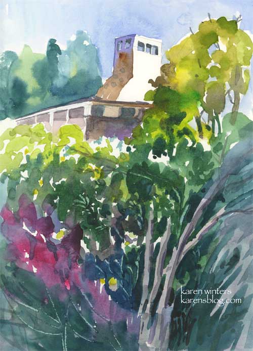
Casita Del Arroyo – 7.5 x 10 (cropped) in Raffine sketchbook
This weekend I’m working pretty intensely on a couple of paintings – still in the planning stages – so I’m posting this sketchbook page painted about ten days ago at the Casita Del Arroyo in Pasadena. You can just see the top of the chiminea behind the lush foliage – my point of view.
This is another page from my Raffine sketchbook, now down to its last pages. I’m going to have to make the decision whether to order another, bind my own or go with the Bateman smooth paper sketchbook which just doesn’t respond the way I like . It’s great for ink but too slick for the way I like to work. Falling back to the Superdeluxe Aquabee is another option, but not the best one. Maybe I’ll try making a hot press sketchbook as some of my other painting journaling friends Kate, Laura and Roz have done.
What I like in a watercolor sketchbook:
The ability to move paint around on the paper and get the reflected colors of ground, sky and such. This means the paper can’t be TOO absorbent or the paint just soaks right in from the first stroke. This Raffine allows some movement of paint, which is good – but it’s not as bright white as I like.
Maybe I’ll gesso some index stock and see what that looks like – after I get these paintings, done, that is. I am SO easily distracted when I have a deadline, y’know?
This morning we went out to our town’s annual Memorial Day French Toast Breakfast, which was delightful. We met some other people, enjoyed some chatting, and I drew people for about a half hour after that. (I might post the quick sketches if I get a chance.) Then we took a diversionary trip to a few garage sales where I found some lovely props for some still life paintings and we met more charming people.
If I get a break later tonight I’m going to do a little gardening – it feels like summer’s here already and I don’t have all my flowers planted yet.
Huntington Lilypond

Lily Pond Sketch – a small portion of a water lily pond at Huntington Gardens – painted on location last Tuesday in my Raffine Sketchbook.
Most of the lilies were white but there was one plant that sported a magenta/alizarin colored bloom. I saw this exercise as a way to just capture some loose colorful patterns – not to be too literal about veins and waterdroplets and such.
Cobb Estate – Hazy Morning
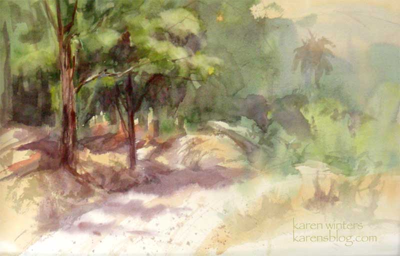
Cobb Estate – Hazy Morning 15″ x 22″ watercolor on Arches paper – half sheet
Today our paintout group returned to the Cobb Estate at the top of Lake Street in Pasadena where a light morning haze hung over the San Gabriels cast a veil of warm light over the scene.
My primary goal in this painting was to work on atmospheric perspective and to design the shapes and values of the painting, regardless of what the scene itself was showing me.
I heard a wonderful quote recently and I wish I had written down the author’s name immediately. When I come across it again, I’ll post it.
The gist of it was this: It’s the artist’s job not just to copy reality but to paint their emotional response to a scene.
I need to keep that in mind every time I feel the temptation to paint a rock or a branch just because it’s sitting there in front of me. The landscape is a source of inspiration but doesn’t need to be copied slavishy. Values can be changed, colors can be tweaked, things in the background can be faded back to suggest greater distances than actually exist. Drawing three dozen twigs on a tree may be accurate but it’s fussy and distracting – I remind myself to STOP before putting in a brushstroke, a symbol, another layer of glaze that’s not necessary.
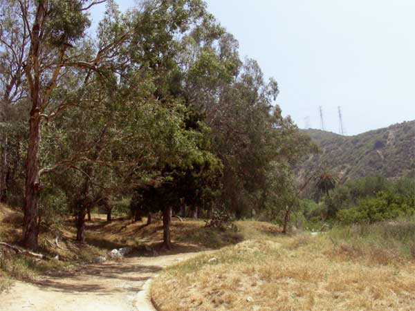
Here’s a photo of the reality of the scene to give you an idea of how much license I took with it
Huntington Gardens Jacaranda
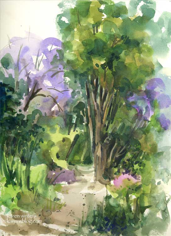
Huntington Jacarandas – 9 x 12 – Raffine sketchbook
The Best Laid Plans of Artists oft go awry (to paraphrase Bobby Burns.) Wendee and I arrived at the Huntington today and before leaving we both checked the website and discovered that the only way one is permitted to paint in the gardens is if you have previously registered with the Art Guild. So instead of doing a large size plein air painting as I had hoped, I used smaller brushes and painted this in my Raffine sketchbook in my lap. It’s still good 110 lb. paper but not quite the same feeling (to me) as a nice sheet of Arches. If you are in Southern California and are a Bank of America customer, many museums are open for free this month – you can get a complete list on their website. But there’s only a week left, so get busy!
This sketchbook painting represents a pathway near the Australian section of the gardens. The day was overcast and slightly cool so you’ll notice the lack of a brilliant blue sky. The periwinkle blue of the summer blooming jacarandas brightened an otherwise subdued green landscape. We have a jacaranda on our property as well but it hasn’t decided to bloom yet, but I’m looking forward to it.
Blue Cove
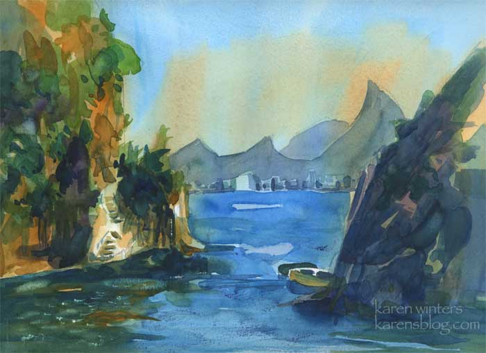
“Blue Cove” 9 x 12 watercolor
A few things I was experimenting with: lost and found edges, limited color scheme, interlocking edges, oblique forms, use of reflections, using suggestive brushwork rather than painting every little leaf and bush, using strong value patterns and so on.
This afternoon I’m looking forward to a paintout at a local botanical garden with artpal Wendee!
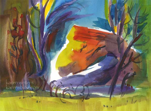
Flintridge Eucs – Daily Painting
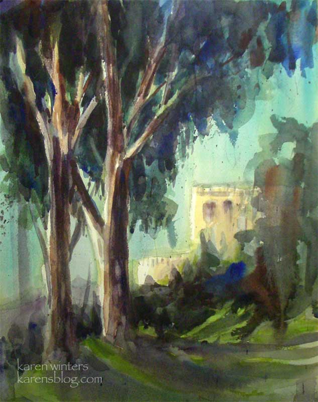
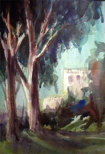
“Flintridge Eucalyptus” 11″ x 15″ watercolor on Arches paper
SOLD
This morning’s plein air outing took us to the beautiful home of one of the members of our group. There were literally so many views to paint that I had a hard time choosing one, but I finally settled on this perspective on their neighbor’s villa, with our friend’s stately eucalyptuses in the foreground. If you’ve been reading this blog for awhile, you know how I simply cannot resist these beauties.
I thought you might find it interesting to see how this painting began. If I had faced the subject straight on, the sun would have shined directly over my shoulder onto the paper, which would have made values extremely difficult to judge. I prefer to paint with shade on my paper, but when that’s not possible, I will move my easel so there is less sun falling on the paper, and I’ll tilt it vertically as well. This also makes it possible for my preliminary washes to run and blend.
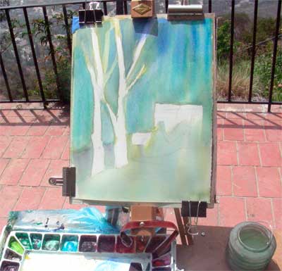
At the end of the morning, the painting was almost finished (see below) but the villa in the background and some of the lawn still had white showing. Rather than making a permanent decision about these whites that I might regret, I took it home to think about it for awhile. Using a piece of acetate film, I tested a few different colors in overlay, then finally added warm tones to the whites as you see above in the final painting. Overall, I’m happy with how this turned out – I’m tempted to paint it in oils also.
The biggest temptation here was to RESIST painting every leaf, bush, twig and detail, especially in the background. The idea is to give an impression of the scene – to capture the feeling without explaining every part. Wise teachers like Edgar Whitney, Frank Webb and others say that by not putting in too much detail (just enough) it invites the viewer to participate in the painting. I agree!
Illo Friday – Citrus
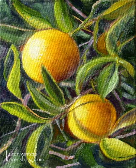
“Twin Oranges” – 6 x 8 – oil on canvas panel, mounted on hardboard – SOLD
These small oranges were spotted at the Old Mill in San Marino, home of the California Art Club.
I loved the way they were shining in the sun, so reminiscent, to me, of the California I remember from my childhood when the northern end of the San Fernando Valley was still filled with orange groves, not strip malls.
This is my entry for this week’s Illustration Friday theme – “Citrus”
Fulmer Lake in Idyllwild
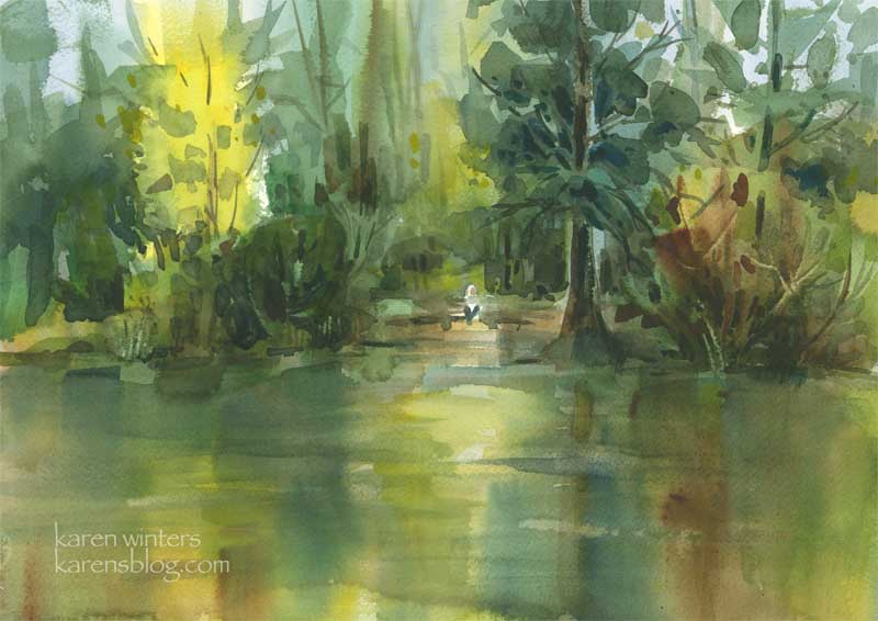
“Fulmer Lake” – 15″ x 11″ – watercolor on paper
I don’t have the opportunity to paint water too often, so this weekend was a special treat as we went, among other places, to Fulmer Lake in Idyllwild, California as some members of our watercolor class convened for a weekend plein air paintout.
It was a weekend of intense learning, practicing and friendship, and I loved every minute of it. This painting, which was done relatively quickly as the sun was setting behind the trees of Lake Fulmer, was both fun and challenging. Parts of it were painted wet into wet, while others were glazed wet over dry.
One of the biggest challenges was the constant breeze off the lake, which dried the paper very quickly. There was little time to dawdle or deliberate.
To answer a question that someone asked recently “calligraphic brushstrokes” are the final marks put on a paper that suggest branches, trees, weeds, iron railings, crevices in rocks, phone lines … just about anything that is a darker linear accent. They may be curving, staccato, dot-like, straight – any shape that serves the purpose. In this ainting, the branches in the yellow tree are calligraphic in nature.
The limited palette of warm and cool colors were chosen to convey calmness and serenity, with a late afternoon glow.
Arroyo Rose – Daily Painting
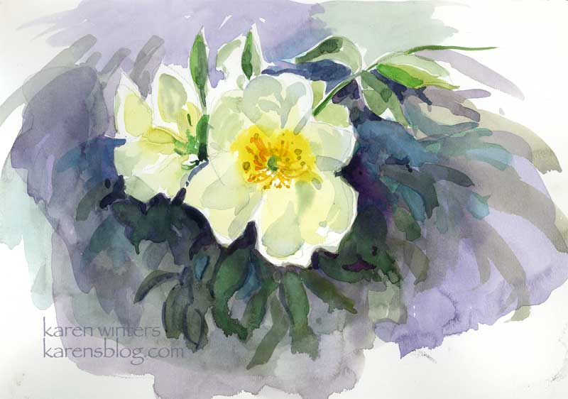
“Arroyo Rose” – 9 x 12 Raffine paper – plein aire
After I painted the Casita garden and the sun became too strong to continue … I moved to a shadier area and saw this rose coming over a wall. Some of the petals were backlit, which posed an interesting challenge. This practice watercolor sketch gave me some experience painting a flower while the light was changing quickly. New gamboge was my primary yellow .. with various greens, blues and mauve colors mingled in the background.