Casita Del Arroyo Garden Plein Air
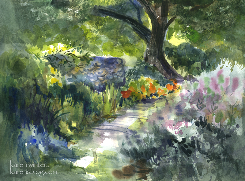
SOLD Casita Del Arroyo Garden – 15″ x 11″ quarter sheet 140# D’Arches coldpressed paper
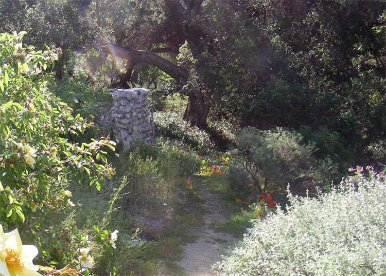
Today our Wednesday paintout group went to a charming location in the Pasadena Arroyo Seco area called Casita Del Arroyo. This little clubhouse was built in 1933 as a way to provide employment during the Depression. The stones came from the arroyo and the wood came from bicycle tracks used in the 1932 Olympic Games. The casita was made a cultural landmark in the 70s and a drought-tolerant garden was put in not too long ago.
This view is down a few steps from the driveway, looking toward a small path in the garden. The nasturtiums caught my eye in the morning sun, and I also liked the look of the cool stone retaining wall.
To say this was a challenge would be an understatement. Although the scene is shady, my viewpoint was out in the bright sun – which has been pretty hot lately in LA. In order to keep the sun off the paper, I needed to tip the paper to a near vertical position, which is a different way of working for me. (But that’s ok, I find that when nature throws me a curve it sometimes leads to new discoveries.)
The breeze and sun conspired to dry out my palette within minutes, so I found myself misting it with my spray bottle quite frequently. The puddles of paint would literally dry in the mixing area as I was watching!
This was painted between 9:20 and 11 in the morning, and the light was changing quite rapidly, meaning that shadows were moving and areas were coming into light that had previously been in shade. To accommodate that, I did several large background washes to block in areas of light and shade, and I painted the basic dark tree shape at the same time.
On the right is a honeysuckle vine and a clump of purple sage. Instead of getting caught up in a lot of small detail, I let gravity help me and I laid in several washes of soft mauves, blues and grays and let them run on the paper. I think this helped to suggest the softness of the large mass.
My painting friend Ginny said that that area looked like the light was coming through the paper, and when I stood back for a long look I think it does look quite bright in that region.
There’s a lot of negative painting in this one – on the tops of the honeysuckle bush, between the different kinds of foliage on the left.
If you look closely you’ll see evidence of:
wet into wet painting on the path
spatter – in the clump of foliage on the right
saving whites and other light areas – behind the tree and at the top of the wall where the rose is climbing
calligraphy – defining the stones of the wall and in the rose climbing over it and the slashed shadows of weeds across the path
scraping out – the textured highlights on the bark of the tree
the use of warm against cool, cool against warm
use of diagonals to add movement
Edited to add (in response to comments)
Where I usually begin is with a value sketch, if there’s time, but in this case, there wasn’t, so I needed to hold the image of the lights and darks in my head where I worked. In my faint underdrawing on the paper I placed the tree offset from the middle, on a line about 1/3 of the way from the right margin. I made the path to the tree diagonal because it’s more dynamic than straight ahead. With those two landmarks I drew in the wall but tilted it so that I could see more of it – I wanted it to be a place for roses to climb over. I made the nasturtiums much more prominent because that was what attracted me to the scene in the first place – the contrast of deep cools vs. hot bright colors where the sun came through.
I broke some rules here by having things in sharp focus all around the paper rather than confining them to one center of focus. If I had it to do over, I would correct that.
In case you are curious … this is what the scene actually looked like in real life. I didn’t paint from a photo, however …