Santa Barbara Botanic Garden Cottage
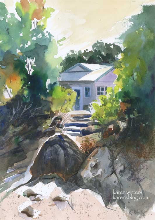
“Santa Barbara Botanic Garden Cottage” 11 x 15″ 140 lb. paper
These past few days have been very busy, and I have not been painting quite as many pieces as usual, but I did spend quite a bit of time with this one on Sunday, experimenting with a variety of techniques and concepts to come up with what I hope is a pleasing composition.
This painting was inspired by a scene I saw last summer when visiting the Santa Barbara Botanic Gardens. We walked down a path to a Japanese teahouse, and on the way back saw this view of a small cottage through the trees. I loved the contrast between the dazzling sun and the deep shade under the trees.
I’d like to highlight a few different things, for those readers who like to know details. I’m one of them, too. I like to get into the painter’s head when I can.
First off, I did a very light sketch on the paper with a 2H pencil. This was little more than the general shape of the trees, the roofline of the house, the shape of the steps area and the prominent foreground rocks.
I started painting in the upper left hand corner, painting the trees on dry paper with a juicy brush loaded with leaf green paint. Immediately, while the paint was still wet, I rinsed my brush and picked up some orange, and then some deeper green, letting them mix on the paper. I continued painting down the left side in this way, paying attention to variety of color and leaving some skyholes here and there.
Next, I put some initial light washes under the large foreground boulders, reserving a white edge for the sun highlight, then started at the top right and painted a solid medium green wash for the large mass of trees. Notice that I didn’t mirror the two tree shapes. The edge of the tree mass on the right is ragged, making use of the roughness of the paper with a drybrush technique.
When these layers were all dry, I went back in and glazed some other colors over them. Dark tones for the shadowed bushes on the left, and medium greens into the small bushes on the right. I started molding the shape of the rocks at this time, also, using a “palette” gray composed of the leftovers of other colors I’d been using. I put in the foreground color very loosely.
About this time I started laying in the first washes of the house, cool blues and lavenders to contrast with the warms of the foliage. I “saved” the whites of the roof and the tops of the steps to suggest the hot mid day sun.
When all of this was dry, I went back in to carve out detail in the shadows, model the different shapes of the rocks with a variety of neutral washes. I added some splatter to the foreground to suggest dry crumbling granite and sand.
Toward the end of the painting I added details of the windows and doors on the house, I “lifted out” the shapes of some bushes in the underbrush on the left, added deep crevices to the rocks and a few grasses and twigs here and there with a ‘rigger’ brush.
Finally I decided on a very light warm sky wash, instead of blue. I think that it adds to the feeling of sunny California warmth. Skies don’t have to be blue – they can be any color you like.
I used a number of different colors in this, including new gamboge, prussian blue, orange, mauve, ultramarine blue, burnt sienna, leaf green and raw sienna.
Did you find this interesting? Helpful?