Mango and Mates – Daily Painting

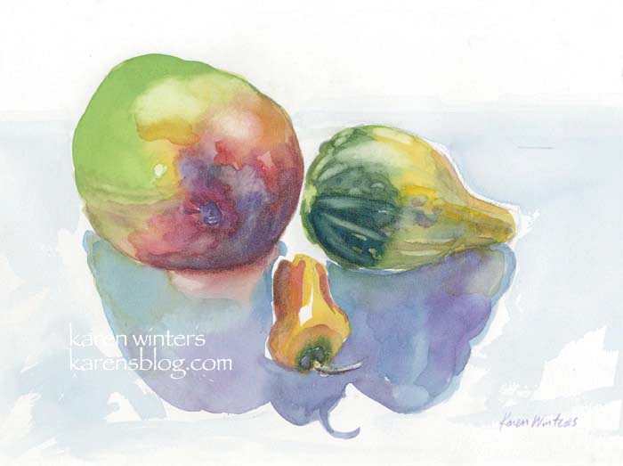
Watercolor on paper 10″ x 7.5″. Available
What I learned on my weekend vacation that I decided to apply today …
Colorful shadows with reflected light. Playing around with complementary schemes.
Being bold with wet in wet painting.
Getting more daring with saturated color.
Painting watercolor standing up (even when not plein air) to give more arm/shoulder range.
Mixing colors from a limited palette.
Oh, and this is not the same mango that my husband was pining for before. That one went into the margaritas.

wagonized
October 30, 2006
Powerful and vibrant colors, Karen! And thank you for taking us “backstage” by showing us a picture of them being painted.
Tami
October 31, 2006
The colors are definately bolder than I usually see you use, looks great!! So now he has a new mango to pine over??? the margaritas sound delish!
Nancy Coler
October 31, 2006
Wonderful shadows Karen! I think I know what inspired you………. Well done, and you wasted no time!
Wendee
October 31, 2006
Oh, this looks and sounds like so much fun! Keep ’em coming!
andrea
October 31, 2006
This is lovely. I especially like the mango – the colours are wonderful.
shavenwarthog
October 31, 2006
yay! Warty fruit make wonderful watercolors, and charcoals too for that matter. And the mango margaritas…
Jana Bouc
November 1, 2006
Brilliant work! Did you use a limited palette as you mentioned for this one? I was trying to guess which colors you used but it just doesn’t look at all limited…you’ve gotten such a wide range of bright colors.
Karen
November 1, 2006
Jana, yes it was very limited. New Gamboge, Opera, Prussian blue and a “convenience” yellow-green because the NG wasn’t quite lemony yellow enough to make the shade I wanted. But that’s it … just those three plus yellow-green.
Anastasia
November 1, 2006
beautiful shades! that mango sure looks good!
Jana Bouc
November 1, 2006
Thanks Karen,
That’s so interesting. I’d never thought of using opera as a regular color–I thought of it as a spice rather than a main course. I think I’ll try that combo–I really like working with a limited palette and this painting really makes it work beautifully.
Jana
Cin
November 1, 2006
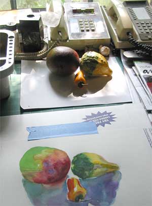
I really like seeing the photo and final art together, you’ve done such a beautiful job, the colors are wonderful.