Blue Hat

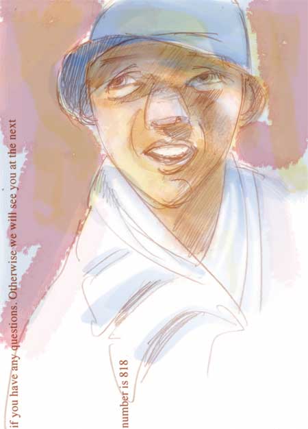
I’ve been reading a book this week called Mastering Glazing Techniques in Watercolor (Rankin) which has been affecting my thinking about other kinds of painting. Perhaps you’ve seen a watercolor painting in which the colors seemed to glow from within, or one that had an ethereal feeling to it. How do they do that? The author says that effect can be achieved by using thin layers of transparent color over white paper and using glazes in the right order and of the right value. The author is particularly fond of glazing with Winsor Blue, Winsor red and aureolin yellow (or new gamboge.) Although watercolor painting and digital painting use completely different processes to achieve different hues (one subtractive, with pigment and one additive, with light) I thought it would be interesting to try ‘glazing’ in Photoshop by building up the color on multiple layers. This was just a quick experimental sketch on a piece of scrap paper, scanned and then painted, to see how it would work.

Kate
November 28, 2005
Mmmm…it DOES have a lovely glow…
buzz
November 29, 2005
It’s a great effect. This looks like watercolor.
Nita
November 29, 2005
There’s an energy, a feeling of the artist in process (washing on color), that the glazing creates. Works!
janey
November 30, 2005
Well I think it worked very well. I really like the soft colors.
coffee
December 4, 2005
It looks alright with me. Keep up the work though!