White Poppy
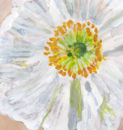
Someone please tell me what possessed me to try to paint white poppies on a Moleskine page previously toned with darker paint? As a first attempt with a difficult flower it would have made a lot more sense to use watercolor paper and reserve the whites. But no … I had to do it the bass ackward way. The background is all acrylic – a mixture of red, blue, yellow and white. Most of the white of the poppies is acrylic, the better to cover the mottled background. Then there’s some gouache in there for shadows, and more dilute acrylic on top.
These are Iceland poppies from (where else?) Descanso Gardens. I have some matilija poppies in a pot, and when they bloom I’ll give it another try.
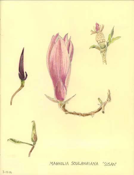
Another opening, another show
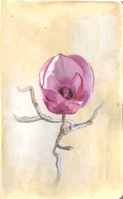
A different view of an opening magnolia blossom from Descanso.
As part of an ongoing experiment with some art friends, I painted the background with Van Dyke brown watercolor, then scumbled some white gouache over top. When that was dry I drew the flower and stems and painted it with watercolor and gouache, and touched it up with a little colored pencil at the end.
I might go back and add the genus and species later, but maybe not. This was done mostly for practice.
I wish these magnolias bloomed all year. I just love, love, love them.
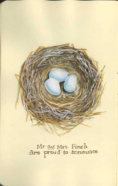
A nest in the west – Illo Friday Spring
For more current spring paintings from my journals … click here .
Last springtime, a finch family came looking for nesting quarters and decided that the eaves were not nearly as hospitable as one of my hanging Boston ferns. I saw the frantic search for twigs and grasses, the constant flying to and fro of the parents and before long I had a good idea that there were little ones on the way. One day when both parents were out looking for food I hurriedly took the basket down for a look (camera at the ready.) I took a picture that was the inspiration for this painting and quickly put the hanging nursery back where I found it. (There would be no drawing or painting from life for this one.) Eventually two sisters and a brother hatched, fledged, and grew to lead successful independent lives of their own. When I see finches returning in the spring I always wonder if they’re members of the same family.
Arty bits: Painted in gouache in a Moleskine sketchbook
Magnolia blossom 1
The magnolia shrubs are in full bloom at Descanso, and I had the opportunity to paint some of them in my botanicals sketchbook a week or so ago. I will probably do another page with the blossom fully open, but at the time I loved their sculptural look in well-formed bud. It’s no wonder that these are often nicknamed “tulip trees.” I would like to have one of these in my yard, and perhaps I’ll plant one some time. We lost a very large magnolia tree to oak root fungus many years ago, so I’ve been hesitant to plant anything in the magnolia family since then.
Two guys out for a walk

Seen at a farmer’s market … a man and his lizard. I liked the look of the these two buds, hanging out together, getting some fresh air and a snack. Some days it actually is easy being green.
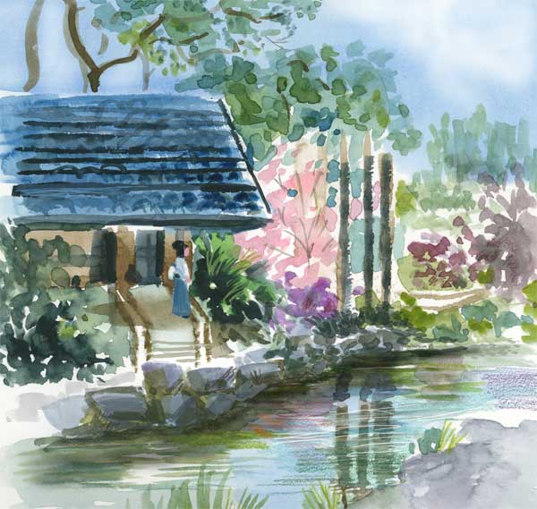
Return to the teahouse

I am visiting Descanso Gardens several times a week now, weather permitting, just to capture the changing beauty of the season. Day by day the garden seems to change. The rain that nourishes some buds to open washes away others in full flower. It reminds me that beauty is very fleeting and that the time to appreciate it is NOW, not someday. A trip to the garden in May will let me paint sunflowers but not cherry blossoms.
This garden area incorporates the Japanese landscaping principle of “hide and reveal.” You enter the garden through several gates, and as you follow several meandering paths, new vistas appear before you. If you stroll by the garden from the outside, you may glimpse a different view through the camellia shrub hedge, such as this one.
If you were to move yourself 90 degrees to the left, you would see this view – that flowering tree is the same. (Oh, and Go Bruins … onward to the Final Four!)
Spring lilacs – challenge 59
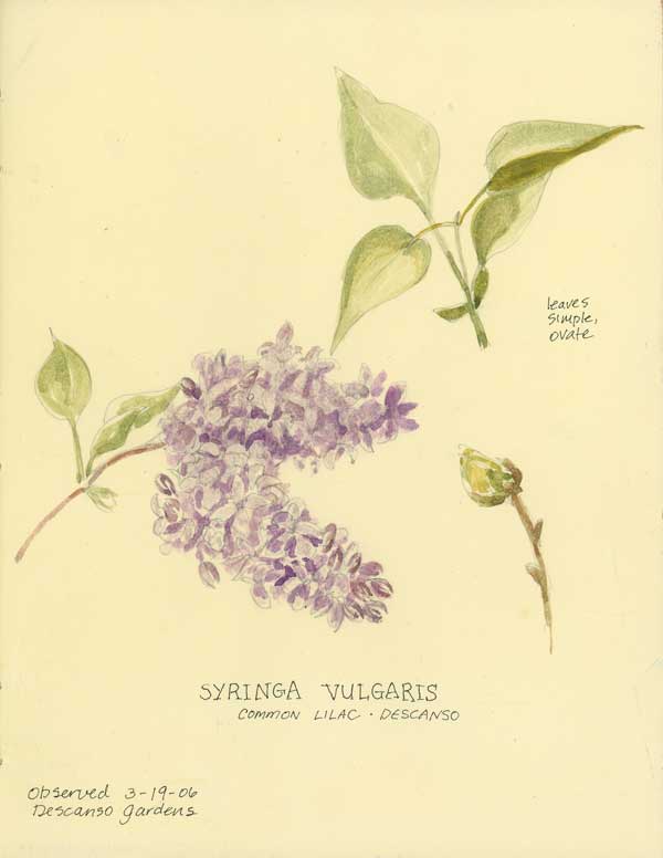
It was cool and partly cloudy, but spring was in the air today at Descanso Gardens, where the lilacs are beginning to bloom. I painted this botanical study in my paperblanks journal which I am using for that purpose, exclusively (see callistemon, earlier this month.)
I used a combination of tube watercolor paints and caran d’ache watersoluble crayons for this one – with just the barest pencil drawing underneath. A Niji waterbrush provided the water. It was a special treat to have several conversations with other garden visitors who like plants and art.
Now, this is in complete contrast to “Union Station Sketchcrawl” (March 12) in which I changed almost every aspect of the courtyard to suit my composition. Here, I tried to faithfully represent the subject as best I could. I think that both are good styles for drawing, you just need to be clear about your objective before beginning.
Hat trick
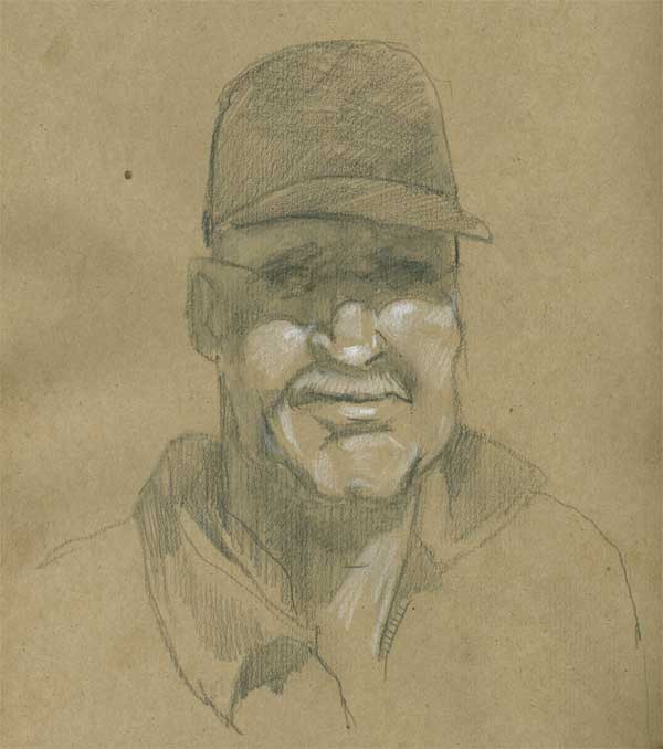
I’ve been talking to some of my art friends about going to a life drawing session and they made some very good recommendations about using materials I’m familiar with. Usually I draw with either ink or watercolor, unless I’m doing something digital. But neither of those seems well suited to a life drawing class. I think that graphite or charcoal would be best, until I can get around to using paint, but that may take some practice. So I’m going to do some exploring with different media before I attend that first session. I rather like the look and feel of toned paper – it seems a bit easier to create dimension than building it all up with the graphite. I’d really love to do drawings with brush pen, and I guess there’s no reason I couldn’t bring a few different things to try.
Earlier today I saw a neat pencil drawing on toned paper, and I had some “bogus rough sketch” paper on hand to experiment with. I drew this using a 4B water soluble Derwent pencil (then I added some water to slosh it around a bit) and finished up with Prismacolor white pencil and some 4B Derwent graphite pencil. I think I’ll try some figures, too, just to see how it goes. I recall seeing some fantastic figure drawing on toned paper in Drawing magazine … around here somewhere … hmmm …
Oh and UCLA beat Alabama, onward to the Sweet Sixteen. Go Bruins.
Mike’s Photos from NCAA!!
UCLA has eliminated its first opponent in the NCAA Basketball Tournament, and our son, Michael (a UCLA junior and Daily Bruin senior staff photographer) was courtside catching all the action. Click the image to see more of his dramatic photos … Tomorrow, round two. Go Bruins! And go, Mike — you got some great shots!

MIKE WINTERS/Daily Bruin Senior Staff
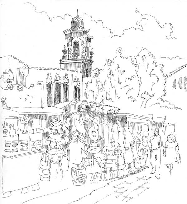
Sketchcrawl Downtown #3 – Olvera Street
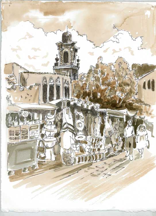
Click picture to enlarge
Here’s the third and last of my drawings I did last week on the sketchcrawl in downtown LA, and another response to the “draw a local landmark” challenge. With limited time for drawing I opted to spend the time drawing rather than doing washes or painting on location. Today I took some time to figure out how I wanted to handle those washes. As an experiment, I printed out the line drawing on watercolor paper rather than use the flimsier paper in my sketchbook. That also gave me a backup in case my ideas didn’t work – I could just toss the printed version out and print another one. In fact, I might paint one using bright colors instead of this monochrome/sepia scheme which is primarily based on tonal values.
Unlike the Union Station fountain painting, in this experiment I decided I would draw it as it actually was, because I liked the angle and the bustling activity following the morning’s rain. Also, unlike the courtyard painting, I opted for Rapidoliner and wash because I wanted to draw the small details of the shops instead of suggesting dabs of color with the brush. I did take a picture before I left, so I might still try an impressionistic watercolor sketch for comparison. Below is the drawing before painting, if you’re curious. Click to enlarge.