Fall in Winter – in La Canada
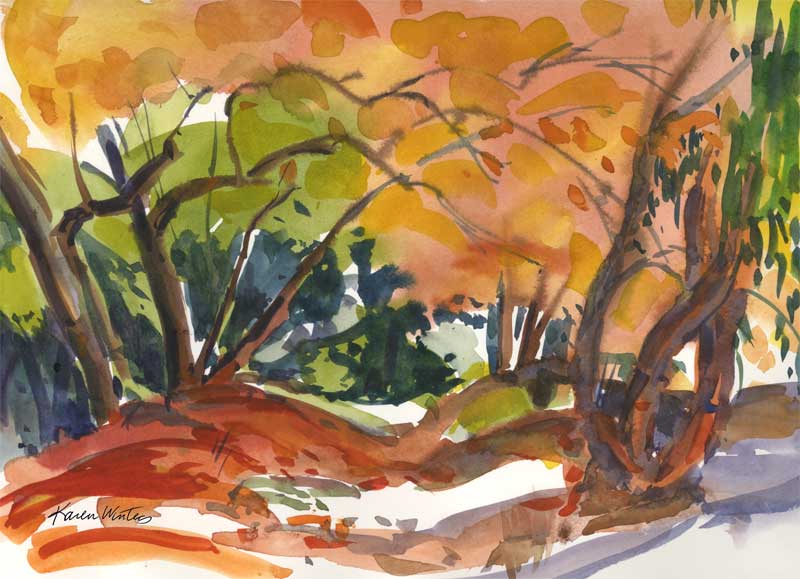
Fall in Winter – 9 x 12 watercolor
SOLD
Today is the winter solstice and here in La Canada, California, the sycamores finally decided to show some fall color. All I can say is “it’s about time!” This is an impressionistic painting of Flint Canyon – an equestrian trail that borders a small creek here in our town. Due to the recent rains the water was plentiful, reflecting a brilliant blue sky (not shown — you’ll just have to imagine it). One of these days I’m going to go back to Hall Canyon and see how the sycamores are doing up there – and hope that there won’t be any mountain lions about.
This was painted with a very large round brush, quickly, and with a lot of thick, rich paint. The time of day depicted is about 11 am – and look how low the light is … you can tell by the light-struck sides of trees. If it were later in the year everything would be in deep shade with no sideways light.
A few things about leaves. Experienced teachers have always cautioned (whether painting in oil or watercolor) not to paint every leaf on a tree because it looks too fussy. Rather, paint the mass of leaves and then put a few distinct leaf shapes in to suggest the rest. Viewers are pretty clever, and we don’t have to put in minute details get the idea across. I think it’s rather like telling a good joke. If you have to explain it, it didn’t work.
Pond in the Woods
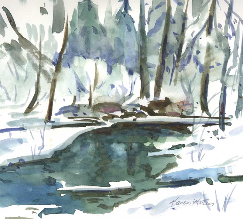
Pond in the Woods – 7.5 x 7 inches – watercolor
As I come to the conclusion of this winter series, I felt an urge to return to my roots in watercolor and to see how my experience of the medium has changed. As I have done in the past, I did no preliminary drawing of this rather abstract design. It was painted entirely with a No. 36 Goliath Round brush. It was my intention not to get too detailed here but to use negative painting to suggest some of the natural forms and to allow the viewer to have their own interpretation. I chose to use a limited palette to reflect the subtle colors of winter – the only spot of warm is in a pile of rocks in the middle ground.
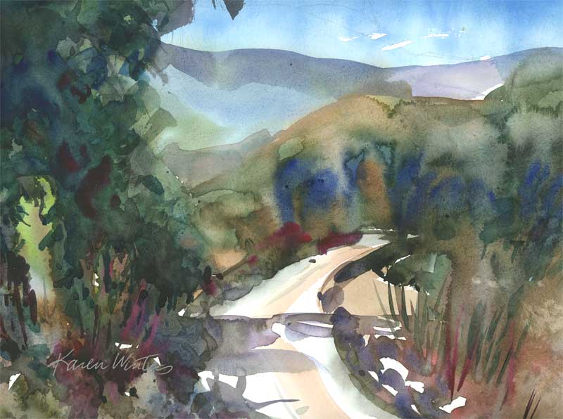
California Country Road – Karen Winters
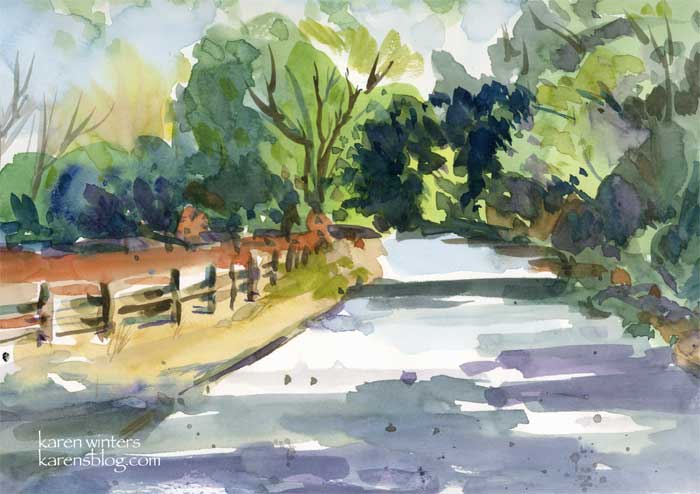
California Country Road 9.5″ x 7.5″ watercolor on paper
A spontaneous sketch of an out of the way byway in California’s beautiful hills. Around the bend may be a tired old barn or a vineyard. You just never know what to expect when you go for a drive.
University of Redlands Clocktower – Daily Painting
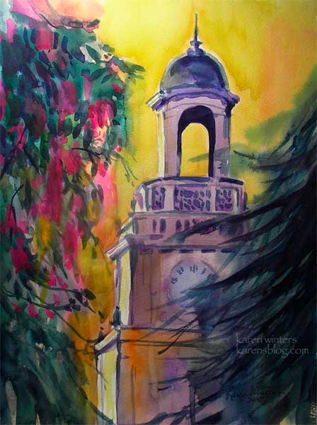
“Clocktower at Sunset -(University of Redlands)” – 11 x 15 watercolor
Here’s another of my University of Redlands series – the chapel clocktower at sunset, framed by a Chinese silk tree (I think) and a deodar fir tree. In the late afternoon the light made the facade of the tower just glow. I pushed the colors, of course, but that’s the fun of painting.
My Chinatown – in 39th annual Watercolor West
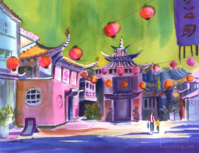
“Chinatown, My Chinatown” – 16″ x 12.5″ (before framing) – watercolor on paper
I came home from Descanso Gardens yesterday to a very special surprise. My painting “Chinatown, my Chinatown,” has been selected for the 39th annual Watercolor West show which will open December 6 at the Riverside Art Museum.
Watercolor West is a national transparent watercolor society, which means that the painting must be done with pure transparent watercolor – no opaque white paint, gouache, acrylic, collage, ink or other materials can be used. In past years there have been about 1000 entries, from which 100 paintings are chosen. I don’t know the facts for this year, yet, but that’s been the trend. With the acceptance of this painting into the show, I will become a Juried member of the society.
I painted this a few months ago using reference photos that I took in LA’s Chinatown. I used exaggerated color for the purpose of increasing the mood of fun and excitement. Complementary colors (red against green, orange next to blue) create energetic contrasts.
The sky was the first thing painted, with the painting upside down so the paint wouldn’t run into the building area. After that, the various elements of the buildings were “carved” out, reserving the whites.
The banner in the upper right hand corner was invented to confine that corner to keep the eye from going off the paper. The hanging streamers direct the eye back into the composition. Strong diagonals, as created by the lanterns and tops of building add to the feeling of energy.
The center of interest, of course, is the two small figures of mother and child walking through the scene. These figures were invented to link the foreground, middleground and background. Notice how the mother’s head intersects the background building and how her cast shadow touches the major shadow cast across the foreground. In fact, just about everything in the picture is linked through the overall value pattern
Rhythmic elements include the repetition of the lanterns from foreground to background, as well as the striping on the underside of the eaves and suggestion of rooftiles. It’s easy to get carried away with decorative elements, which usually come in the final stages of painting. The tassels on the banner in the upper right echo the windows in different parts of the picture.
I think that it’s worth mentioning that even though I rarely do architectural subjects, I intentionally avoided using any straightedges or other aids in painting this so as not to get caught up into a stiff, controlled feeling. In my opinion, the unevenness of the buildings suggests their age and adds to the liveliness of the subject.
I have mentioned frequently on this blog how fond I am of California scene painting of the 1930s through 1950s. This painting is my homage to the great painters of that era, to whom we are most indebted.
September Clouds

“September Clouds” – 11 x 15 watercolor on paper – plein air
I couldn’t imagine a more picture perfect day than the one I had today. Although there was the suggestion of a weather front on the way, the cumulus clouds merely circled our little valley, putting on one of the grandest display of cloudage that I’d ever seen. So I set up my easel outside of our gallery and devoted the day to cloud studies. The colors and patterns changed literally by the moment and sometimes I’d start painting one cloud and finish with details from another. Overall, it was an excellent opportunity to explore the many shapes and hues that clouds provide in a landscape. Creating soft edges and hard edges, painting wet in wet, charging pigment into semi-wet paint, doing dry brush, utilizing oozles and glazing, lifting pigment and creating texture with sponges, clouds give you the opportunity to try it all. These clouds were painted around noontime.
Also, one of the real joys of being at the Descanso Gallery is meeting all of the nice people who come by to chat about art and the gardens. I can’t think of anything I’d rather do on a crisp pre-fall day.
Red Tulip – Daily Painting – Karen Winters
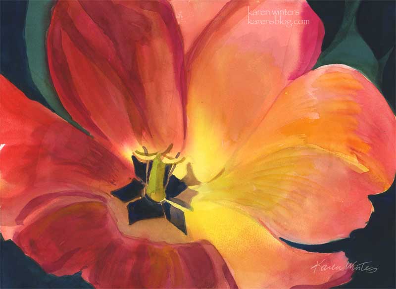
Red Tulip 11 x 15 watercolor on paper (quarter sheet)
Here’s another new one for the show – a red and golden striped tulip from Descanso Gardens, catching the last rays of the day. And speaking of rays, I’m happy to report that our heat wave has broken. We had dinner on the patio last night and it was 68 degrees at 7:oo or so – what a change from just a week ago when it was close to 100 at that time. Very weird.
I spent today organizing my files to make prints and I was astounded to discover that I have more than 162 pieces in my catalog – and that’s just the ones that I have a positive feeling about. There must easily be three or four times that many. Today was the process-athon. Tomorrow begins the making print and framathon. Eventually comes the sleepathon.
At least (I think) I can take some comfort in the fact that I will never have this kind of intense startup again. There will be more paintings to paint and frame, but the learning the ropes part, the knowing where to go to get this or that supply – that should hopefully be a bit more predictable and relaxed.
Eaton Canyon Trail – Pasadena
“Eaton Canyon Trail” 9 x 12 – watercolor on paper
The show prepping continues as I went to the frame store this morning and got some gorgeous plein air gilded frames. I put the paintings in them and loved the effect. Tomorrow is watercolor framing day and time to take a break with a visit to another art group in the region. I don’t know what the program’s going to be, but I’m sure it will be educational and entertaining. Today’s painting is in the same theme of looseness, wet into wet and negative painting. I’m having a very good time with it. Can you tell?
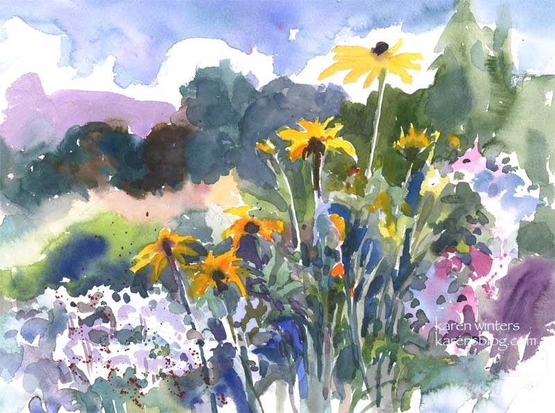
Coneflowers
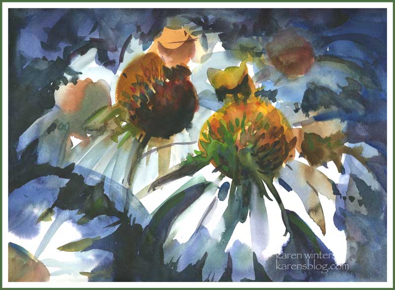
“Coneflowers” 9 x 12 watercolor on paper
Tonight was the meeting of our local art association, and we were privileged to see a demonstration by Fealing Lin, a remarkably gifted watercolorist who came to the US from Taipei as a dentist and reinvented herself as a fine artist. Her style is loose and free but it’s wonderful to see what she does with color. Unlike some watercolorists whose looseness seems mannered and almost formulaic, Fealing’s paintings are spontaneous and each presents a unique solution to a creative problem. She emphasized the importance of saving the lights and really pouring on the color, wet in wet.
I was so inspired by the demo she gave that I came home and painted this quick sketch of coneflowers, trying to get into that spirit of controlled spontaneity. Oh, yeah, and it was after dinner and a glass of cabernet. Hmmm. I think that helped.
If you’re in the Southern California area and would like a picture postcard invite to my show starting next week at Descanso, drop me a line at karen@karenwinters.com
Gloriosas in Excelsis
“Gloriosas in Excelsis” – 11 x 15 watercolor on paper
Not for sale. Prints available.
Gloriosa daisies (aka Rudbeckias) are among my favorite casual flowers. I love roses, of course, and alstroemerias, and lilacs, Shasta daisies, penstemons – ah, so many flowers so little time. But gloriosas are wonderful workhorses in a garden setting, as in this center planter at Descanso Gardens. They are long lasting either growing in the ground or cut, and if there isn’t too much cold weather they can even be cut back and coaxed to bloom a second year. Gloriosas are related to black eyed susans and coneflowers and they are outstanding in bouquets. I am still painting like crazy in advance of the show, even though I have more than enough paintings to choose from. But I know I won’t get a great deal of painting done during the month that I’m gallery-sitting, so I’m sort of putting a few in the bank ahead of time.