My artworkbooks
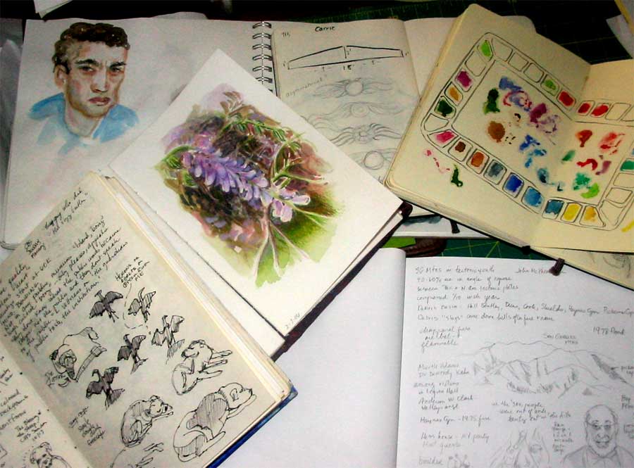
As you can see, I use my journals for a lot of different purposes, not only for sketching pleasure. As I’ve committed myself to doing more painting this year, I find that I’m reaching for it more and more as a practical workbook, not a chronological diary of my days. In fact, I have numerous workbooks with different paper in different sizes. I keep notes of ideas for paintings, I try out color mixtures. I paste in swatches of different kinds of paper and practice different drawing techniques. I work out designs for soft block carving. I carry it with me to museums and make notes about the artists. I even print out and paste in my sketches and paintings done in Photoshop or Painter.
This is my portable personal encyclopedia free of rules and concern about outcomes. The disastrous pages are as valuable as the “good” ones but none of them gets torn out and thrown away. It’s not an artists book destined to look pretty on its own. It’s a workbook – raw, spontaneous and full of scribbles and wrong turns. It’s where I map my “Creative Journey.”
Do you keep an art workbook for experiments and testing paint and such? Write and tell me about it.
karen@karenwinters.com
Gung Hay Fat Choy
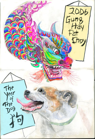
Ripley wishes you a Happy (Chinese lunar) New Year, it’s the year of the dog.
Which is pretty much every year, around here.
My friend Armand Frasco asked me if I might be doing a drawing in my Moleskine for the annual event and I told him that I most likely would. So if you haven’t been over to Moleskinerie today, you should take a look at his China links.
Drawing details:
This was drawn and painted in my Cahier-sized Moleskine, which I mentioned a few days ago. So this drawing is actually 15″ x 10″. I used watercolor Tombow markers for the details on the dragon to save the time of using a small brush. Ripley was painted using my regular tube paints, plus some colored pencils. I added the banners after the dragons using my brush pen, but then looked at it and realized that white banners looked rather bland. At that point there was no choice but to add the color in Photoshop after scanning, or I would have smeared the ink.
Ripley in my new cahier Moleskine
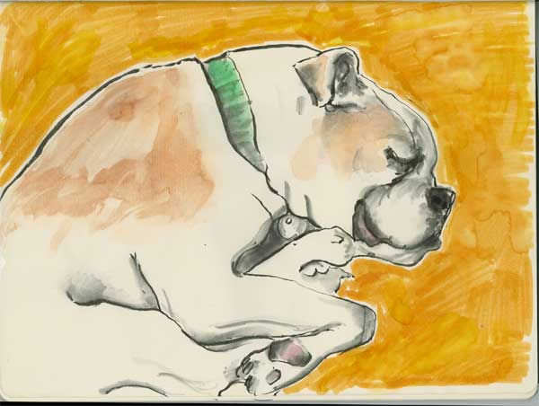
This afternoon Ripley was sleeping so soundly on the floor of my office that I thought I could probably get a quick drawing of her done before she stirred. She did move her paws around but thankfully kept her head steady most of the time.
This was drawn with the water soluble Kuretake brush pen, which is a most unforgiving and hair-pulling instrument. Still, I like the way I can go from a thick to a thin line without changing pens and breaking the mood.
This was drawn in my new Cahier model Moleskine, which my husband gave me for Christmas. The paper is thin like the basic Moleskine journal, but it is much larger, which allows freer expression. I was hesitant to use juicy watercolor on the paper so I added the background with some Tombow pens, and swished a little water over the top. There’s something about a cream colored dog on a cream colored background that just looks a little vanilla, you know? If I had been thinking I could have painted the background with an acrylic, which would have been less splotchy. Ah well.
The shadows are created by gently softening the black ink line with a Niji waterbrush filled with clear water.
Dogginess
I know, I said I was going to do something botanical. And then I went and painted something dogical.
Just don’t tell Ripley that I drew someone else. She will be so jealous.
If I go to a friend’s house and play with their dog she is ALL OVER me with questions when I come home.
Who were you with? What did he look like (yes, dogs know if it was a he or a she)
Did you give him a treat? Did you bring one for me?
Tech stuff:
Watercolor and colored pencil (both watersoluble kind and waxy kind) on Stonehenge paper. The underlying watercolor was painted with a squirrel mop. Some Photoshopping to clean up ragged edges and correct color and values.
I guess I better not leave that squirrel mop within reach of you-know-who or I’ll have to go looking for it in the doghouse.
Botanical Guild Meeting
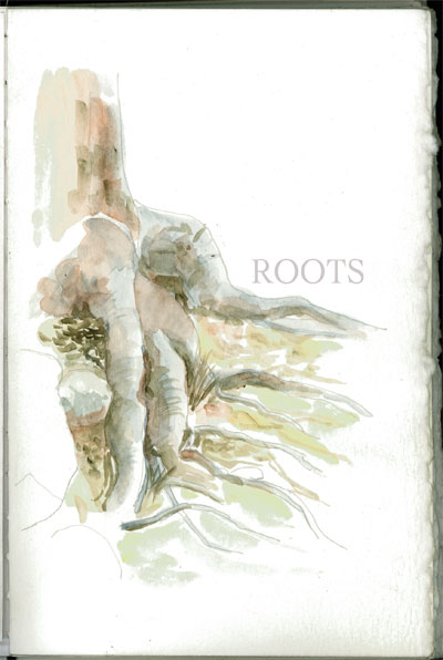
I just got back from a meeting of the So. Calif. Guild of Botanical Artists, which is held every three months in and around the southland area. What an incredibly nice (and talented) group of people! I am still evaluating whether or not I have room in my life for another membership or commitment, but if I do this would be high on my list. During this period of exploring and experimenting as I return to art after my long hiatus, I am looking at many different forms and expressions. Botanical illustration is among the most rigorous as every detail must be technically accurate as well as beautiful. Some artists draw their subjects many times, defining and refining it on tracing paper until they get the details perfect. At that point, they will transfer it to paper (watercolor paper or bristol board or another type, depending upon the medium used.) Then begins the detailed application of paint or pencil. I’m not sure that I will have the patience for that kind of exacting work, but as some of the members mentioned, some people do accurate paintings in a much looser style. On the other hand, I love flowers and gardening so much … AND … I love watercolor and other media so it makes a lot of sense that I’d be attracted to botanicals – it would unite two of my passions. So, we shall see. I don’t have any tightly rendered botanicals to share today, although I think I may try to render something small in the next few days, just to see what it “feels” like. In the meantime, here’s a field study of some tree roots, painted last year in the Angeles Forest.
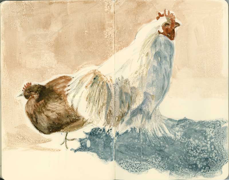
Who’s Your Daddy? – Moleskine
First you saw her, earlier this week, drawn with the Derwent drawing pencils …. (scroll down)
Then you saw him, painted on watercolor paper ….
Now we’ve got them, in my Moleskine, using a more subdued palette of watercolors and a different, looser approach to the brushwork, given the slick nature of the Moleskine sketchbook paper. Are these details boring? I don’t know. I’ll mention it anyway because it’s part of what I’m discovering …
I started this sketch by squinting my eyes and looking for the darkest darks, which I indicated in the rough pencil drawing underneath. I painted the darkest areas first so that I could judge the other values accordingly. Usually I paint from light to dark, so this was a difference for me. Only after the hen and rooster were both finished did I decide about the color of the background (top) and the shadow below. I kept reminding myself to “think shapes” rather than to literally try to make it look like a shadow. I can honestly say that this is the first time that the “beading up” nature of the Moleskine paper worked to my advantage in creating that pebbly ground texture in the shade. Gotta remember that.
From this angle you can see his feathery legs, completely obscuring his feet. He’s not a Leghorn, what is he? It also occurs to me that I didn’t see anyone trying to pick up or pet the hens in the petting zoo. I’ll bet he would have pecked them if anyone had tried. The guy’s just doing his job.
The spread is 10″ x 8″ and so far I am keeping my resolution to paint every day.
Little Kids
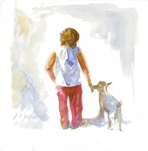
Another watercolor exploration painted from two different source pictures, which I shot. Although the little girl was very lively, she was quite careful with the small animals. The scene reminded me of the gentleness we are all born with, and which always lies within us, no matter how old we may be.
The actual size of this is 8″ x 8″
Guarding His Girls
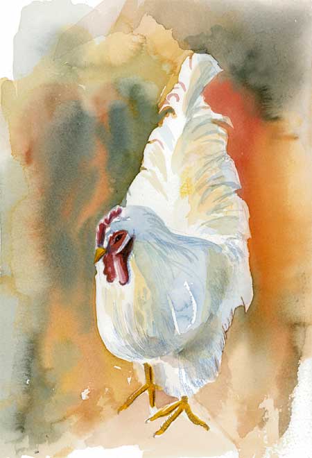
The rooster at the petting zoo was extremely protective of his two hens. He looked pretty good in his crisp white suit. And he knew it.
Art Thought of the Day from Patricia Harrington, in the October 2004 issue of Artist’s Sketchbook:
“A beginning painter can learn about tools and techniques from books and workshops, but if she would just start painting she’d eventually stumble over, back into or just learn most of what she needs to know.”
Me: I’m sure hoping that will start to stumble over what I need to know this year. I read everything I can get my hands on, but at some point you just have to sit down and give it a go. That’s my resolution for the year, so I might as well get started.
Things I’d do differently and things I learned:
More lost and found edges. He looks like a cutout
Think about creating a cast shadow to ground him
Paint on a tilted surface for better control of the wet in wet washes.
Three “fold” Path
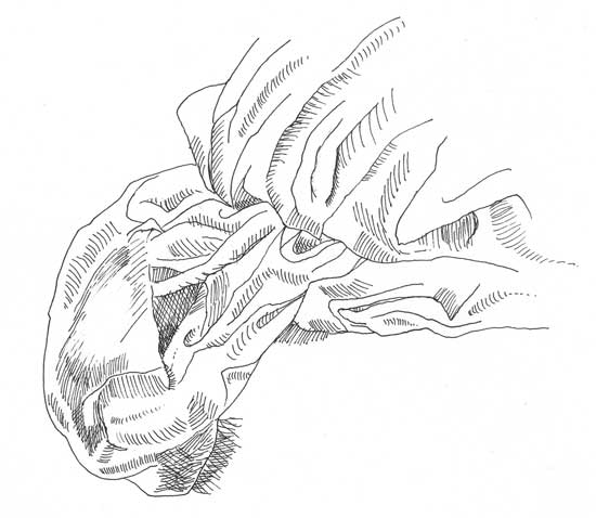
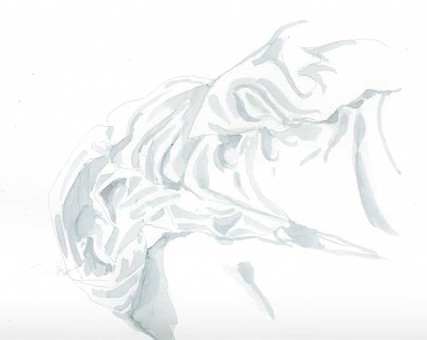
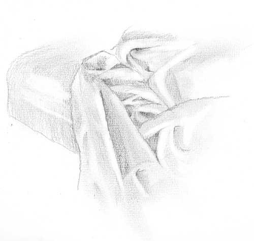
This week’s challenge for the EDM group was to draw something with folds. I selected the challenge based upon my experience the weekend before – attempting to draw a crumpled comforter in a hotel room. I didn’t get very far with that live drawing as I vastly underestimated the complexity of it and we needed to leave to be somewhere. So I took some reference photos to work on later.
Drawing folds has proven, for me, to be one of the most difficult projects so far. Here are some of the reasons why:
The folded fabric doesn’t look like anything. It’s an abstract design which is mostly about light, shadow, mass, tone, value. Drawing a fold forces you to throw away the crutch of “symbol” drawing and really look at the subject. If I draw a landscape I can draw a the line of distant mountains to ‘suggest’ mountains without having to draw them slowly and carefully as they really are. I can’t do that with folds.
You can get lost in folds. It happened to me over and over. In the time that it took me to look at the subject and look down at the paper, I’d lose my place as though I was walking in a maze. When you draw a face you have landmarks that keep you oriented. The nose goes here. The eyebrows go here. Look out, there’s the ear. These familiar objects let you know where you are as you look-draw-look draw. When you do folds it’s like getting lost in an Escher drawing; up is down and in is out. You think you’re on a hill and find you’re really in a valley. Disorienting.
-Folds are unforgiving. There’s no way for me to just splash some watercolor around and say, hey, there’s a peach. If a fold works, it does. And when it doesn’t, there’s no place to hide.
For all the crabby reasons above, this has actually been one of my favorite challenges. It has forced me to slow waaaay down, to see in finer and finer increments and to think more about where my pen/pencil/brush is going.
I also realize that, in typical Karen fashion, I jumped right into the deep end rather than hanging one simple little dishtowel on a hook and getting the feel of doing some simple “pipe” folds. That’s another thing I learned from this experience – to go back to square one and see if I can draw one fold well before attempting anything so complex.
All that aside, here are three explorations of the comforter, in the order in which I did them: 1) Rapidoliner, 2) #8 round watercolor brush, and 3) pencil (2B and 3B). They were all done on the same type of paper. The top two were of one view, the bottom one was of another.
Road Trip. Stop #1
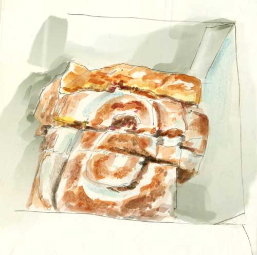
Friday morning we headed out of town to drive up the coast to do some interviews for a show we’re working on. We got about a half a mile from our front door before we stopped for coffee and a cinnamon bun to share. “Road food.” Breakfast of champions. Or at least, Breakfast of road warriors. I need to get out of the car every hour or so and stretch my bad knee so it doesn’t stiffen up on me. 20 ounces of coffee is a pretty safe way to guarantee periodic stops. Well-caffeinated and sugarfied, we hit the road in earnest. I’d tell you the name of the coffee and bun place but they’re not kicking in for product placement. I’ll just call it Ishmael’s.
Friday’s weather was spectacular – in the low 70s F, with blue sky and occasionally puffy clouds. Trees were turning color all the way up the coast, but of course we had an appointment time and couldn’t stop for drawing. Taking pictures and picking up leaves was the best I could do. I think the leaves will hold their color for a day or two longer …