Three “fold” Path

This week’s challenge for the EDM group was to draw something with folds. I selected the challenge based upon my experience the weekend before – attempting to draw a crumpled comforter in a hotel room. I didn’t get very far with that live drawing as I vastly underestimated the complexity of it and we needed to leave to be somewhere. So I took some reference photos to work on later.
Drawing folds has proven, for me, to be one of the most difficult projects so far. Here are some of the reasons why:
The folded fabric doesn’t look like anything. It’s an abstract design which is mostly about light, shadow, mass, tone, value. Drawing a fold forces you to throw away the crutch of “symbol” drawing and really look at the subject. If I draw a landscape I can draw a the line of distant mountains to ‘suggest’ mountains without having to draw them slowly and carefully as they really are. I can’t do that with folds.
You can get lost in folds. It happened to me over and over. In the time that it took me to look at the subject and look down at the paper, I’d lose my place as though I was walking in a maze. When you draw a face you have landmarks that keep you oriented. The nose goes here. The eyebrows go here. Look out, there’s the ear. These familiar objects let you know where you are as you look-draw-look draw. When you do folds it’s like getting lost in an Escher drawing; up is down and in is out. You think you’re on a hill and find you’re really in a valley. Disorienting.
-Folds are unforgiving. There’s no way for me to just splash some watercolor around and say, hey, there’s a peach. If a fold works, it does. And when it doesn’t, there’s no place to hide.
For all the crabby reasons above, this has actually been one of my favorite challenges. It has forced me to slow waaaay down, to see in finer and finer increments and to think more about where my pen/pencil/brush is going.
I also realize that, in typical Karen fashion, I jumped right into the deep end rather than hanging one simple little dishtowel on a hook and getting the feel of doing some simple “pipe” folds. That’s another thing I learned from this experience – to go back to square one and see if I can draw one fold well before attempting anything so complex.
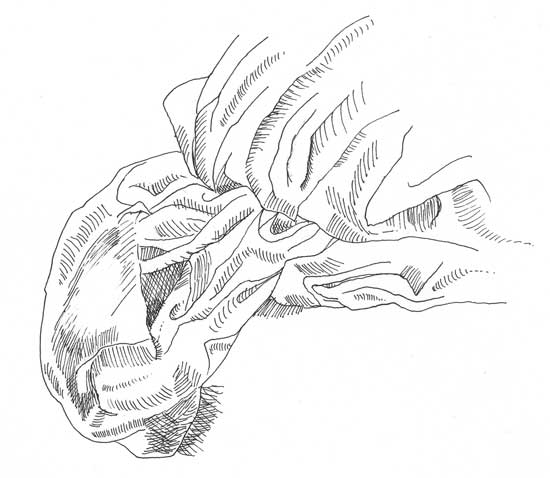
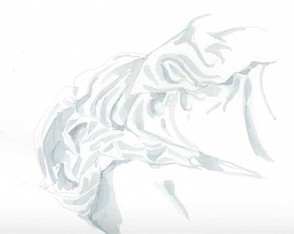
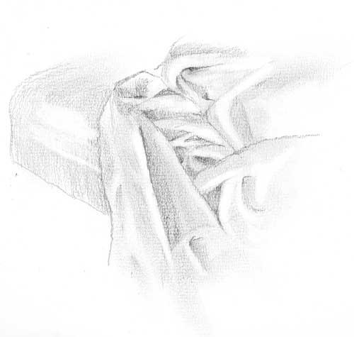
All that aside, here are three explorations of the comforter, in the order in which I did them: 1) Rapidoliner, 2) #8 round watercolor brush, and 3) pencil (2B and 3B). They were all done on the same type of paper. The top two were of one view, the bottom one was of another.

Linda
November 13, 2005
I love all three, although the watercolor one is my favorite. You’re right — this was one of my favorite challenges, too.
Belinda Del Pesco
November 13, 2005
Karen, I think each of them are great. And I think the variations in medium & approach add to that. They’re wonderful. I couldn’t agree with you more on your thoughts about getting *lost* in folds. There is no map to follow, and patterned fabric makes it even harder. Slowing down helps, but to get it right, SLOW means slower than either of us is accustomed to. But that’s exactly why it’s all good.
Cher
November 13, 2005
I like the water color best also. YOu’re right, lack of form and addition of patterns has made this a very tough challenge for myself as well. I posted two simple ksketches but they were not waht I’d like to do. I’m still working on a good one to post, but it’s going to have to wait till tomorrow for more work. Nice job!
Jurgen
November 14, 2005
Like all three of them, but my fave would have to be the rapidoliner one. I’m a sucker for good crosshatching.
lindsay
November 14, 2005
as usual,Karen, you feed me well. I love seeing all three drawings. Its amazing what different feelings you can get with media! I think i like the top one the best.
Thanks for a great challange. Now that that the chicago crawl is over, i want to do this one!
hfm
November 14, 2005
folds are always difficult but you have done a very good job.
joyce
November 14, 2005
So nice! My fave is the watercolor one–looks like a good soft, cozy place. I know what you mean about getting lost in the folds. I usually find my self
inventing stuff because it’s hard to concentrate on such a subject. Of course my drawing suffers when that happens.
Joyce
http://drawdaily.blogspot.com/
zee
November 14, 2005
I love the ‘feel’ of the watercolor, but my fave is the first one. I don’t think I could ever make anything look so good with ink. *sigh*
Evy
November 14, 2005
It’s great to be able to see all three different techniques together!
Nita
November 15, 2005
Random thought: the ink one looks like cotton with a lot of sizing, the w/c looks like silk, and the pencil looks like terry cloth. Nice job on all of them!
Karen
November 15, 2005
Interesting observation, Nita! Yes, it’s funny how the choice of medium/technique has such an effect on the way it renders out. And they were all done on exactly the same paper. But the grain only shows with pencil, ergo the soft and fuzzy look.