Communicating Pairs – Illustration Friday

“Communicating Pairs” 9″ x 7 3/4″
Watercolor and mixed media on board
$150 + shipping …
Purchase from the artist
For Illustration Friday on the theme of “Communication.”
Loose Flowers – Daily Painting
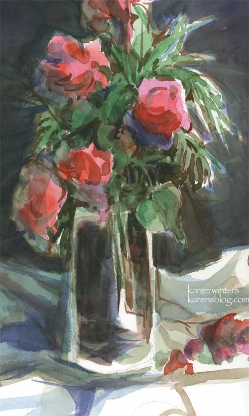
“Loose flowers – watercolor on paper – approx 7″ x 11”
This was yesterday’s study in our watercolor class. The objective was to paint the still life arrangement using a split complement color scheme. I did … using a red violet, a red orange and green. But the only mixable background color ended up being brown … Not exactly what I had in mind, so when I got it home I glazed it with blue. Next time, I’ll pick other colors to experiment with and maybe save the green red split complement for a landscape where brown would be a welcome consequence.
Now, I have to confess the flowers were some wispy looking orange bougainvilleas, but we were encouraged to paint shapes, not the individual blossoms, so mine ended up looking more like roses. And … there wasn’t another fallen blossom at the base of the glass vase. I threw that in because I thought it needed something for balance. And when I got it home, I cropped it (in the computer) and like it better than seeing the whole thing. I like the suggestion that there is more than just what we see.
Inspiring Quote of the Day:
” The struggle is not to be a great artist. It is to be a great student.” – Robert Henri
I read someone’s email recently in which the person sounded a little apologetic for being a beginner. How I wish I could change that person’s mind about that belief. Being a beginner is a wonderful thing because it means we’re still open to change, learning, growth and new discoveries. There’s no shame in being a beginner, and we are all beginners at something. My teacher is a master watercolorist but a real beginner at computers. Our veterinarian is an incredibly skilled doctor but a beginner at welding. My father was a master welder but a beginner at metal sculpting. I know superb sculptors who are beginners at oil painting. And outstanding oil painters who are beginners at watercolor. How sad it is to apologize for being a beginner at anything. It’s a good place to be – and may we all continue to be beginners at something as long as we live.
Pine Hillside – Daily Painting

“Pine Hillside” 7″ x 10.5″ – Watercolor on paper – A scene from the Angeles Crest Forest, about an hour from our house, up in the mountains.
Time for an update. The past few days have been more than a little hectic. My aunt went back to the emergency room again on Wednesday, but this time did not have to stay overnight. So we’re hoping that a solution will be identified soon. I have my hunches, we’ll see what it leads to.
I’ve been reading an older book by Edgar Whitney that I’ve had on my shelf for a very long time. It’s out of print now but it still has some of the best advice on watercolor I’ve seen. Whitney’s approach was based strongly on designing good pictures and not simply painting what one sees, a topic that comes up a lot in various discussion boards I participate in.
The Design Principles he discusses are Unity, Conflict, Dominance Repetition Alternation Gradation Balance
Each of these principles can be broken down into design components such as dominance of a particular color, value, shape, line, color, size and so forth. This is basic stuff, certainly, but it’s so well explained and demonstrated that I could probably read it every day and still find more to learn. And the concepts, of course, apply to any painting, not just watercolor.
So much to learn, so little time. Sigh.
Jug and Candle – Daily Painting
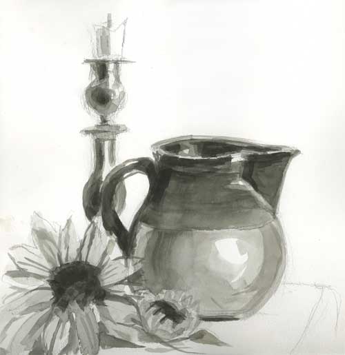
Jug and Candle – watercolor on paper
What a week – busy on all fronts, from doing an illustration project for a client (oil painting to be posted soon) to a sudden out of town business trip. The night before my Saturday watercolor class I had barely enough time to set up a quick still life to paint from. I am so used to painting in color that I am definitely out of my comfort zone working in black and white. No matter, I’m happy to do it. Next week some of us who are a bit more experienced are assigned to do another one of these studies and bring it in matted, along with several practice landscapes.
On the Breakwater – Daily Painting

Breakwater – Approx 10.5″ x 5.5″ – Watercolor on paper
Sometimes, instead of drawing something from life or a photo, I just like to start painting and see what emerges. This little sketch began with some large juicy strokes of dark colors, applied with a large flat brush. I leaned back and it looked like rocks to me, and some manipulation with a credit card revealed sharp breaks and flat edges. To that I added some water and a sky to make an imaginary scene along a breakwater. This little exercise was a lot of fun to do – no need for underdrawing or attention to specific details – just paint!
Camellia Study
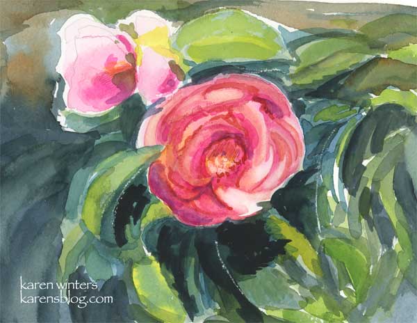
Camellia Study – 7.5″ x 6″ – watercolor on paper
It’s camellia season at Descanso Gardens again. Here’s a quick study I did of one of the countless blooms in the massive camellia forest.
Yesterday we went to the Irvine Museum to see the last day of the exhibit “Majestic California.” The museum will now be closed for a week while they hang their new show of paintings representing spring in California. All this nature viewing has me inspired to paint, paint, paint.
The colors used here were mostly thalo blue, new gamboge, opera, payne’s gray, and a few small touches of colored pencil in the stamen area.
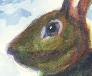
A Young Hare – Daily Painting
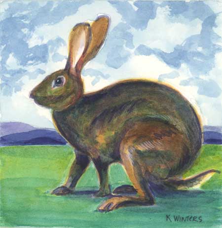
Young Hare – 4″ x 4″ watercolor on Arches paper
Click to bid
I had a lot of fun with this one – painting layer upon layer of very transparent glazes to build up the suggestion of fur.
Many years ago, my husband and I read Watership Down at the same time, passing the book back and forth as we’d read chapters in our spare time. I can imagine that this might be Fiver or one of the other watchful young rabbits.
Here’s a closeup of the head:
Coat of Many Colors – Daily Painting
“Coat of Many Colors” – 7.5″ x 11″ watercolor on paper – Available
Out in the meadow that borders the northern part of the arroyo, there stood a willowy creature, pondering what she would wear. Shall it be the gold today? The yellow? The pale chartreuse? I’m done with the dark green … it’s SO last week. Perhaps the rust?
As storm winds rose, her garment slowly came undone, and I knew before long all her glory would lay at her feet.
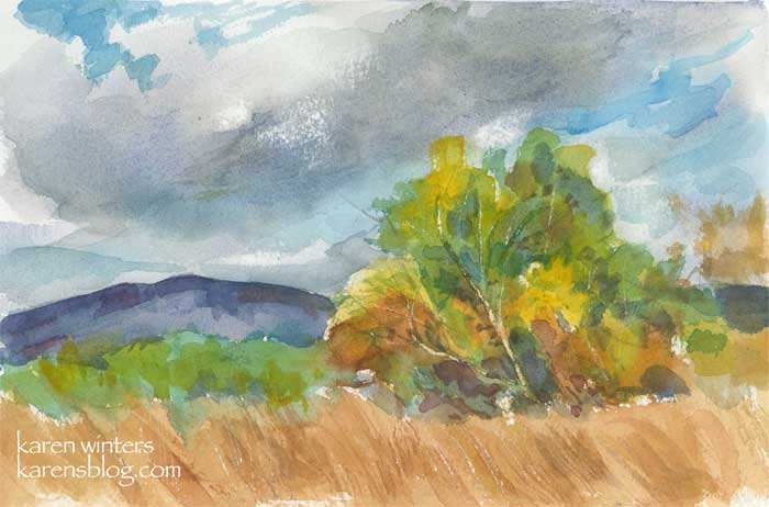
Citrus Valley – Daily Painting
“Citrus Valley” – 9 x 12 sketchbook study
Between holidays and business, this week’s paintings may consist of quickie sketches in my sketchbooks. This study, painted in my Raffine book, represents a part of the landscape we visited last Sunday during some high windstorms. The area is near Ojai – inland from Ventura and west of the Interstate 5. Most of the area is agricultural with rolling hills covered with avocado and citrus groves, and many eucalptus windbreaks.
Small watercolor sketches like these (9 x 12) give me some ideas of what I might want to do (or not do) when I translate it into an oil painting.
Shell game – Daily Painting

“Shell Game” – Approx 8.5 in. x 6 in. – Watercolor on 140 lb. paper
OK, I lied. I said yesterday that I was mainly working on loosening up with a big brush and soft flowing edges. So what’s the next thing I paint? This.
Actually this is a community project for those of us who are daily painters, suggested by the very talented Laura Wambsgans. I’d love to try one in oils but I stayed in my comfort zone, watercolor. I was planning to break an egg and paint the contents of the shell in a small pyrex cup, but I had no sooner cracked it and set the shell halves down on our quarter-sawn oak dining room table in a shaft of afternoon sunlight that I saw what I wanted to work with.
I found this setup very challenging, but very instructive as well. The dark background is composed of at least a dozen layers of glazes, but no black. I wanted to keep the edges of the shell crisp but I didn’t trust masking so all of those areas were painted around with a very small brush tip. After all the layers were finished I went in with a fine pointed brush to add the “tiger” stripes in the wood which is so characteristic of golden oak. This is one that I wish I had been scanning in stages, but I was trying to push to get it done on time!