Abstract Cliffs

Cliffside 7.25 x 3.25 – watercolor on paper
This small watercolor was an experiment in abstracting a scene – an exercise that I found very liberating and refreshing. When I look at the work of the California regional painters of the 30s and 40s, I see how often they broke away from realism to paint simplified forms and improvised color schemes. You can see the evidence of this movement in the highly designed travel posters of the era.
Quote of the day from Robert Henri:
“The object isn’t to make art, it’s to be in that wonderful state which makes art inevitable.”
May you all be in that state all this week!
Asparagus – Watercolor painting
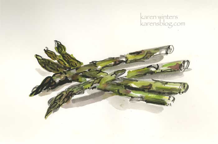
Asparagus 9 x 12 – 100 lb. paper
From my sketchbook …. When asparagus shows up in stores it’s a sure sign of spring, even if it comes from Chile or who knows where. My dear husband knows how much I love the vegetable and when it appears for a good price at Trader Joe’s or one of our other local markets, he brings it home when he’s out doing errands. I like it simply prepared, like most of the fresh vegetables we enjoy around here. Steamed or microwaved briefly, with a little butter and salt.
This was painted directly with ink and brush and watercolor. Simple and quick, just like asparagus should be prepared.
Mums on the Table
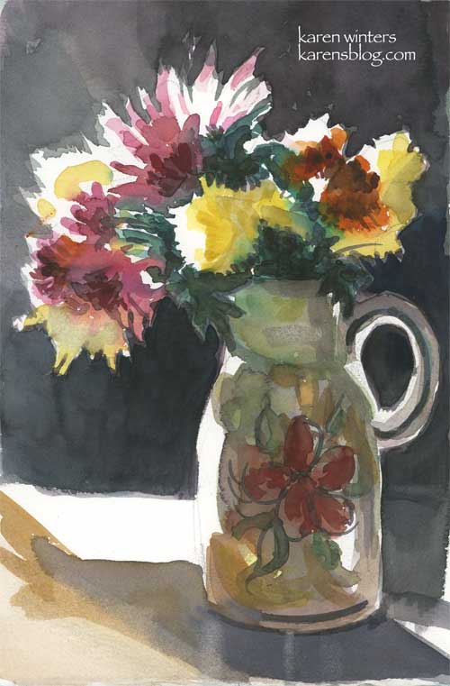
“Mums on the Table – 6.5″ x 10” (approx.) – watercolor
Purchase from the artist
Being in Southern California, even with occasional cold days, my chrysanthemums don’t know when to stop blooming. They start around late October but there are always some stragglers that manage to put out a few more blooms unless I cut them back – hard – in December.
Our oak dining room table is becoming one of my favorite places for a still life setup. You’ve seen it in the eggshells and in the black and white study of the pear/grape and bottle … and now the dining room window provides the rimlight for these blooms, casually tossed in a glazed ceramic vase we picked up a few years ago at a garage sale.
Loose Flowers – Daily Painting
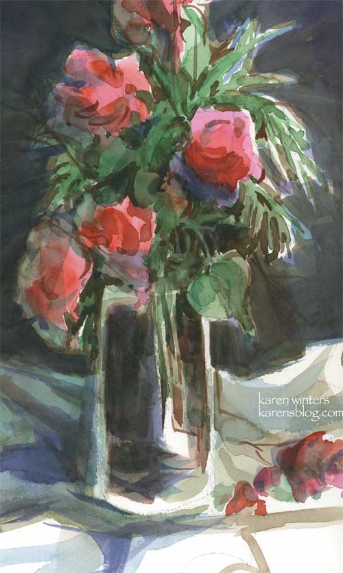
“Loose flowers – watercolor on paper – approx 7″ x 11”
This was yesterday’s study in our watercolor class. The objective was to paint the still life arrangement using a split complement color scheme. I did … using a red violet, a red orange and green. But the only mixable background color ended up being brown … Not exactly what I had in mind, so when I got it home I glazed it with blue. Next time, I’ll pick other colors to experiment with and maybe save the green red split complement for a landscape where brown would be a welcome consequence.
Now, I have to confess the flowers were some wispy looking orange bougainvilleas, but we were encouraged to paint shapes, not the individual blossoms, so mine ended up looking more like roses. And … there wasn’t another fallen blossom at the base of the glass vase. I threw that in because I thought it needed something for balance. And when I got it home, I cropped it (in the computer) and like it better than seeing the whole thing. I like the suggestion that there is more than just what we see.
Inspiring Quote of the Day:
” The struggle is not to be a great artist. It is to be a great student.” – Robert Henri
I read someone’s email recently in which the person sounded a little apologetic for being a beginner. How I wish I could change that person’s mind about that belief. Being a beginner is a wonderful thing because it means we’re still open to change, learning, growth and new discoveries. There’s no shame in being a beginner, and we are all beginners at something. My teacher is a master watercolorist but a real beginner at computers. Our veterinarian is an incredibly skilled doctor but a beginner at welding. My father was a master welder but a beginner at metal sculpting. I know superb sculptors who are beginners at oil painting. And outstanding oil painters who are beginners at watercolor. How sad it is to apologize for being a beginner at anything. It’s a good place to be – and may we all continue to be beginners at something as long as we live.
Valentine Tulips
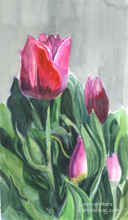
Spring Tulips – 5.5″ x 9.25″ – NFS – prints available
My dear husband surprised me with a beautiful pot of tulips for Valentine’s Day. Now that he is participating so much with me in my art activities, he has developed an quite an eye for things I would like to paint. I have always loved tulips, and carried them in my wedding bouquet, but being able to paint them just doubles the enjoyment.
OK, a few art notes about this. After I painted it I realized that it is really a painting made up of just one color and its complement – magenta and yellow green. The gray for the background is something I’ve heard described as “palette gray” – you mix together the various bits of red, maroon, dark green and yellow green and it produces a soft neutral that works well with the bright colors.
On another note … I’ve gotten quite a few emails that people are unable to leave comments when they try – and last night I was getting database error messages from my host when I tried to publish. Please drop me a line and let me know if you’ve run into the same problem, and what system, browser you’re using. Something is afoot but I’m not quite sure what it is. Thanks!
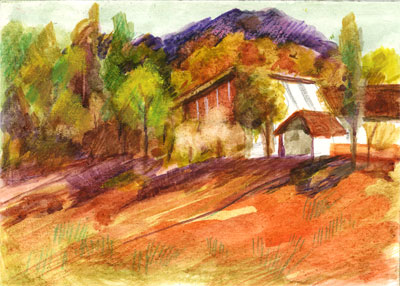
Pine Hillside – Daily Painting

“Pine Hillside” 7″ x 10.5″ – Watercolor on paper – A scene from the Angeles Crest Forest, about an hour from our house, up in the mountains.
Time for an update. The past few days have been more than a little hectic. My aunt went back to the emergency room again on Wednesday, but this time did not have to stay overnight. So we’re hoping that a solution will be identified soon. I have my hunches, we’ll see what it leads to.
I’ve been reading an older book by Edgar Whitney that I’ve had on my shelf for a very long time. It’s out of print now but it still has some of the best advice on watercolor I’ve seen. Whitney’s approach was based strongly on designing good pictures and not simply painting what one sees, a topic that comes up a lot in various discussion boards I participate in.
The Design Principles he discusses are Unity, Conflict, Dominance Repetition Alternation Gradation Balance
Each of these principles can be broken down into design components such as dominance of a particular color, value, shape, line, color, size and so forth. This is basic stuff, certainly, but it’s so well explained and demonstrated that I could probably read it every day and still find more to learn. And the concepts, of course, apply to any painting, not just watercolor.
So much to learn, so little time. Sigh.
Jug and Candle – Daily Painting
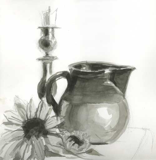
Jug and Candle – watercolor on paper
What a week – busy on all fronts, from doing an illustration project for a client (oil painting to be posted soon) to a sudden out of town business trip. The night before my Saturday watercolor class I had barely enough time to set up a quick still life to paint from. I am so used to painting in color that I am definitely out of my comfort zone working in black and white. No matter, I’m happy to do it. Next week some of us who are a bit more experienced are assigned to do another one of these studies and bring it in matted, along with several practice landscapes.
On the Breakwater – Daily Painting

Breakwater – Approx 10.5″ x 5.5″ – Watercolor on paper
Sometimes, instead of drawing something from life or a photo, I just like to start painting and see what emerges. This little sketch began with some large juicy strokes of dark colors, applied with a large flat brush. I leaned back and it looked like rocks to me, and some manipulation with a credit card revealed sharp breaks and flat edges. To that I added some water and a sky to make an imaginary scene along a breakwater. This little exercise was a lot of fun to do – no need for underdrawing or attention to specific details – just paint!
Hilltop Haven – Daily Painting
Hilltop Haven – 2.5″ x 3.5″ watercolor on illustration board with watercolor pencil accents
I like painting these miniature scenes of rural peace. The small size forces me to simplify the message.
I spent the remainder of my painting time yesterday working on a bigger oil painting 11 x 14, which I hope will be finished tomorrow.
Camellia Study
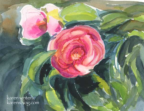
Camellia Study – 7.5″ x 6″ – watercolor on paper
It’s camellia season at Descanso Gardens again. Here’s a quick study I did of one of the countless blooms in the massive camellia forest.
Yesterday we went to the Irvine Museum to see the last day of the exhibit “Majestic California.” The museum will now be closed for a week while they hang their new show of paintings representing spring in California. All this nature viewing has me inspired to paint, paint, paint.
The colors used here were mostly thalo blue, new gamboge, opera, payne’s gray, and a few small touches of colored pencil in the stamen area.