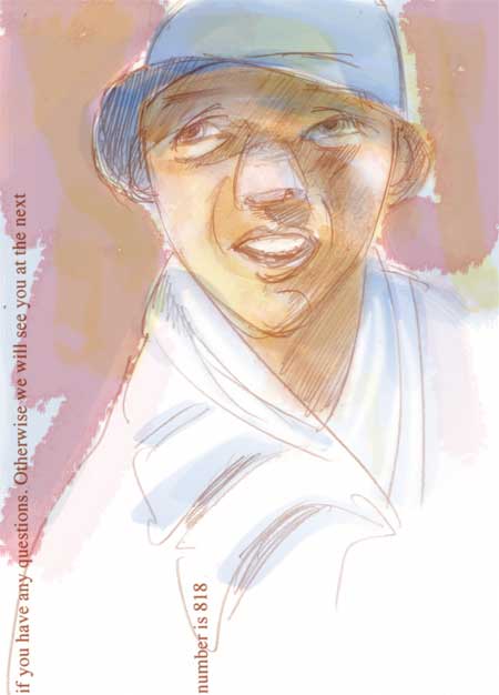
Cuecard man

Last week we made some cue cards for on-camera talent and brought them back with us when the project was over. I was about to throw them out when I realized that the back side could still be used for drawing practice. So I did.
Those blue specks showing through aren’t the paper texture … they’re the bleed-thru of the Sharpie on the other side.
I kind of like the effect, actually.
Blue Hat
I’ve been reading a book this week called Mastering Glazing Techniques in Watercolor (Rankin) which has been affecting my thinking about other kinds of painting. Perhaps you’ve seen a watercolor painting in which the colors seemed to glow from within, or one that had an ethereal feeling to it. How do they do that? The author says that effect can be achieved by using thin layers of transparent color over white paper and using glazes in the right order and of the right value. The author is particularly fond of glazing with Winsor Blue, Winsor red and aureolin yellow (or new gamboge.) Although watercolor painting and digital painting use completely different processes to achieve different hues (one subtractive, with pigment and one additive, with light) I thought it would be interesting to try ‘glazing’ in Photoshop by building up the color on multiple layers. This was just a quick experimental sketch on a piece of scrap paper, scanned and then painted, to see how it would work.
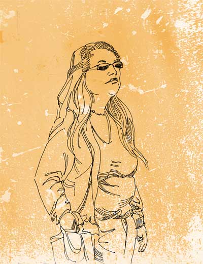
Long Hair

I had wanted to get to the Doodah parade this weekend, but work called so we had to pass. So, to make up for the people drawing opportunity I drew this person instead from a photo reference. She’s not the doodah type – a bit reserved and contemplative for that, but had an interesting face all the same.
This was drawn with a dip pen and brush with a water soluble ink which bled a bit when I ran clean water over it. The head was sort of hanging there in the white of the page so I scanned it with a frame around so it wouldn’t look so … disembodied.
More folding
I’ve been continuing with the folds challenge. The more I look around my daily environment, the more I am aware that folds are everywhere. Fabric is only a fraction of the picture. On my desktop I see a folded plastic bag, Kleenex coming out of a box, several pieces of crumpled paper. Out the window leaves are bent and folded. Even mountain ranges are folded. People are practically seas of folds, from their garments to their flesh to the things they carry. So here’s another one …
Three “fold” Path
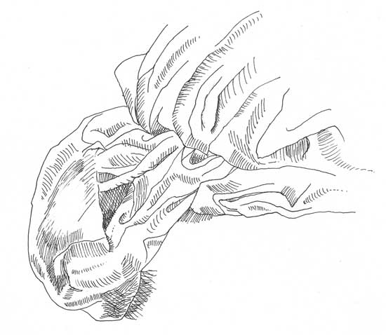
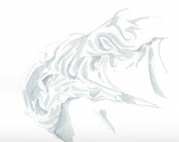
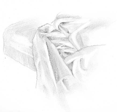
This week’s challenge for the EDM group was to draw something with folds. I selected the challenge based upon my experience the weekend before – attempting to draw a crumpled comforter in a hotel room. I didn’t get very far with that live drawing as I vastly underestimated the complexity of it and we needed to leave to be somewhere. So I took some reference photos to work on later.
Drawing folds has proven, for me, to be one of the most difficult projects so far. Here are some of the reasons why:
The folded fabric doesn’t look like anything. It’s an abstract design which is mostly about light, shadow, mass, tone, value. Drawing a fold forces you to throw away the crutch of “symbol” drawing and really look at the subject. If I draw a landscape I can draw a the line of distant mountains to ‘suggest’ mountains without having to draw them slowly and carefully as they really are. I can’t do that with folds.
You can get lost in folds. It happened to me over and over. In the time that it took me to look at the subject and look down at the paper, I’d lose my place as though I was walking in a maze. When you draw a face you have landmarks that keep you oriented. The nose goes here. The eyebrows go here. Look out, there’s the ear. These familiar objects let you know where you are as you look-draw-look draw. When you do folds it’s like getting lost in an Escher drawing; up is down and in is out. You think you’re on a hill and find you’re really in a valley. Disorienting.
-Folds are unforgiving. There’s no way for me to just splash some watercolor around and say, hey, there’s a peach. If a fold works, it does. And when it doesn’t, there’s no place to hide.
For all the crabby reasons above, this has actually been one of my favorite challenges. It has forced me to slow waaaay down, to see in finer and finer increments and to think more about where my pen/pencil/brush is going.
I also realize that, in typical Karen fashion, I jumped right into the deep end rather than hanging one simple little dishtowel on a hook and getting the feel of doing some simple “pipe” folds. That’s another thing I learned from this experience – to go back to square one and see if I can draw one fold well before attempting anything so complex.
All that aside, here are three explorations of the comforter, in the order in which I did them: 1) Rapidoliner, 2) #8 round watercolor brush, and 3) pencil (2B and 3B). They were all done on the same type of paper. The top two were of one view, the bottom one was of another.
Road Trip. Stop #1
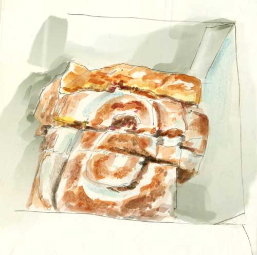
Friday morning we headed out of town to drive up the coast to do some interviews for a show we’re working on. We got about a half a mile from our front door before we stopped for coffee and a cinnamon bun to share. “Road food.” Breakfast of champions. Or at least, Breakfast of road warriors. I need to get out of the car every hour or so and stretch my bad knee so it doesn’t stiffen up on me. 20 ounces of coffee is a pretty safe way to guarantee periodic stops. Well-caffeinated and sugarfied, we hit the road in earnest. I’d tell you the name of the coffee and bun place but they’re not kicking in for product placement. I’ll just call it Ishmael’s.
Friday’s weather was spectacular – in the low 70s F, with blue sky and occasionally puffy clouds. Trees were turning color all the way up the coast, but of course we had an appointment time and couldn’t stop for drawing. Taking pictures and picking up leaves was the best I could do. I think the leaves will hold their color for a day or two longer …

Encountering the Inner Aphrodite
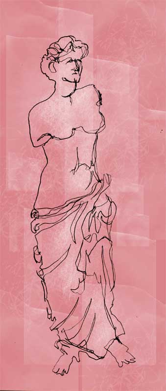
After posting my contour drawing of Perseus a few days ago, an art buddy wrote me a very nice note and suggested that maybe sometime in the future I could draw something a little less scary, like Aphrodite, for example. So here it is, based on the statue of Venus de Milo. Again, this was about a 3 minute drawing while keeping the penpoint on the paper. It wasn’t blind. I did look at the paper frequently.
If we take a trip back to junior high history and English, we’ll remember that Aphrodite was the goddess of love and beauty and one of the many Olympian deities who took pleasure in meddling in the affairs of humans. In spite of her captivating appearance and charms she was not particularly a nice goddess, unless you were a devoted follower. Aphrodite, after all, was responsible for starting the Trojan War when she promised Paris the hand of Helen (a married woman) in exchange for Aphrodite being chosen the most beautiful goddess of all. Paris fell for this bribe, stole Helen’s heart, enraged Helen’s husband and the rest is history, not to mention more than a few bad movies.
The very embodiment of passion, Aphrodite is generous to her followers. But to those who deny her and her cause (love), she can be wrathful and punishing. She caused prideful women to grow cow’s horns on their heads, and made Poseidon’s sons to go mad. All sweetness and light? Not by a long shot.
So what can we learn from her, creatively? Aphrodite reminds us to be passionate about our lives and to embrace each day as a lover. A promiscuous creature, the goddess encourages dalliances and amorous liaisons. So if you always draw with a pen – have a fling with a pencil. Above all, let art become more than an idle flirtation. It’s time to turn up the heat.
More drawings from the Simpsons Scoring Session
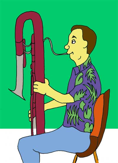
The contrabassoon player. I really liked your Hawaiian shirt. I’m not sure that it had palm fronds and hibiscus but I think most of them do, so I hope you won’t mind that I took liberties with your attire.

A trumpet player, sitting fairly far from me. I’m sorry it doesn’t look like you. About all I could see was that you had a beard. Your horn sounded very good, however.
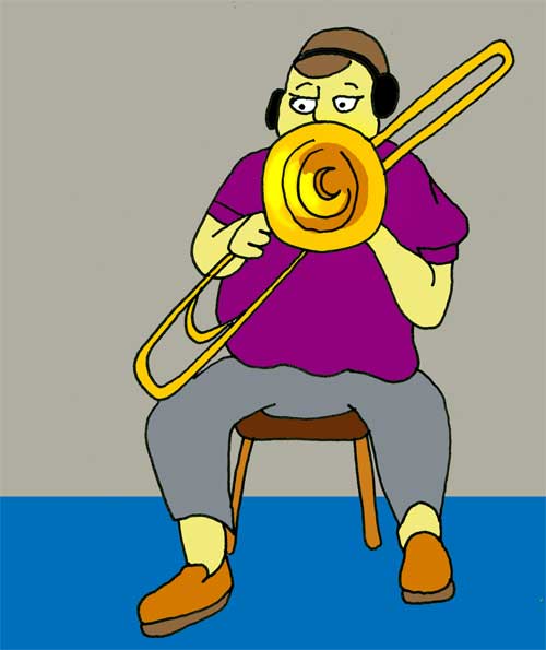
Trombone artist. Same apologies. The bell of the bone was covering your face a lot of the time.
More inking, scanning and coloring of Moleskine drawings from the Simpsons’ Treehouse of Horror music recording session.
I know they don’t look like Moleskines now, but that’s where they started.
If you didn’t see the previous drawings, scroll down to October 10 …
LOST – Illo Friday
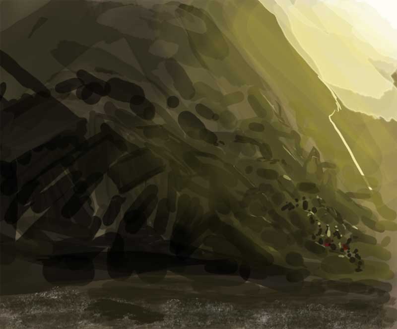
I had been thinking about the quake in Pakistan and made an attempt to suggest the size and scale of the recovery process with this experimental imaginary sketch painted in Photoshop. So I just finished posting it here and turned my thoughts to Illustration Friday. I was wondering what to do on the theme of “Lost.”
Then it hit me.
I am always amazed at how my unconscious mind is sometimes a step or two ahead of my dopey conscious mind.