Lemons and Silver – California still life oil painting
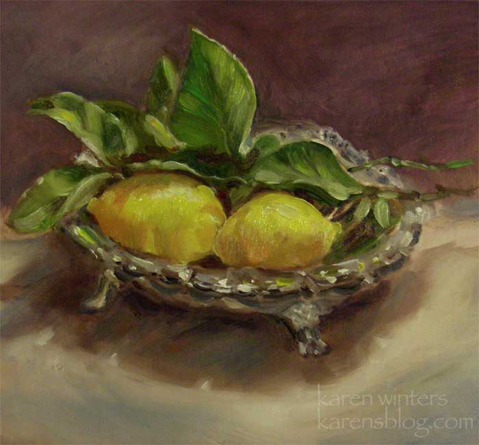
“Lemons and Silver” – 8 7/8″ x 7 7/8″ – oil on masonite –
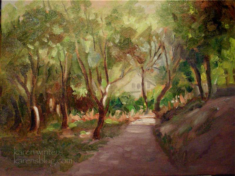
Arroyo Shelter – Daily Painting
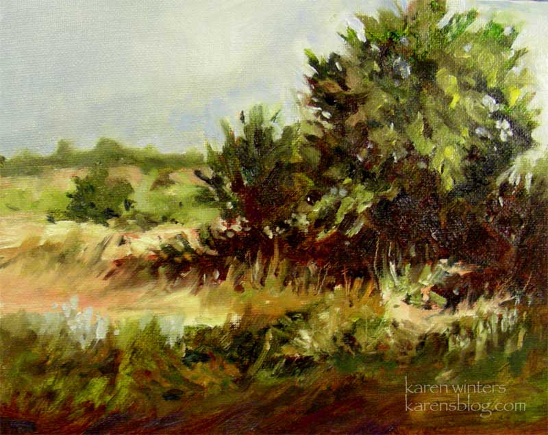
Arroyo Shelter” – 8 x 10 – oil on canvasboard
When I take a walk through the Hahamongna wetlands area in the nearby arroyo, I love to look at the various forms of short shrubbery and small trees that are home to so many kinds of wildlife. Late in the day, rabbits emerge from the brush and red-winged blackbirds roost in the many small willow trees that fill the area.
I’m not sure of the name of these small trees – next time I’ll have to take a field guide along and see if I can identify them.
This week I’ve been taking a break from watercolor to work in oil and to put into practice some of what I’ve been learning. This week I was fortunate to come into contact with a woman who was giving up oils for acrylic painting and selling her supplies. So my paint box is restocked (for the moment) and I have a few new colors to experiment with, too.
Mulholland Twilight – Nibblefest
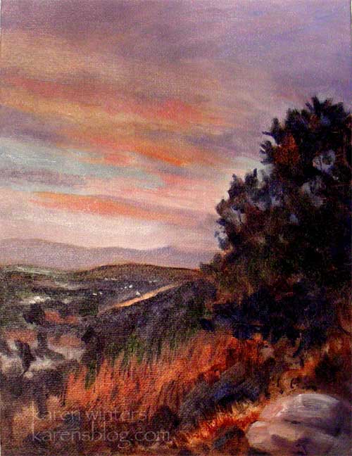
“Mulholland Twilight” 8 x 10 – oil on canvasboard
SOLD
The purpose of Ebay’s monthly Nibblefest is to generate interest and publicity for our works and the person with the most unique bids from different bidders is the winner. For this reason, it’s good to keep the price in a low range as long as possible because it encourages more nibbles. Of course, I’d love to see it sell for a good price at the close of auction, but in the beginning, small bids from a lot of different people is ideal. In fact, I’d love to see 15 + people bid on it in 50 cent increments.
I only take part in this activity once a month, so if you’ve been interested in owning one of my paintings, this is a great time to do it.
This painting – a view of the San Fernando Valley from Mulholland Drive – is even more vibrant in person. The sky is a blend of ultramarine blue and alizarin crimson, with accents of cerulean blue and cadmium red. It’s the sort of sunset that is all too rare because of our lack of clouds. But when they happen it can be magical. In the distance the lights were just beginning to come on, creating the kind of wild/urban scene that can only happen in LA.
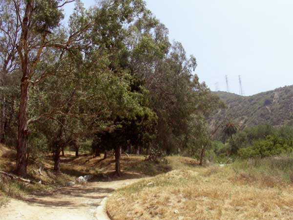
Flint Canyon Trail – Daily Painting
“Flint Canyon Trail” – 9 x 12 oil on canvasboard
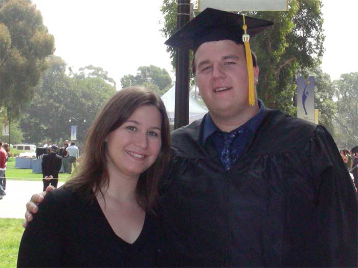
Graduations and reunions are completed (joyfully) and we are catching up after all the partying and celebrating. Here are our son and daughter, who will be having her own MBA graduation next year.
So, it was time for me to get back to painting, and new watercolors, oils and pastels will follow soon. This painting represents a portion of the Flint Canyon Trail which is part of a large loop of trails that goes through La Canada, Flintridge, where we live. The trail is most beautiful in early morning and late afternoon light (this was about 6 pm.) The canvas was toned with burnt sienna underneath which adds an overall glow as bits of it peek through here and there.
Descanso Camellia
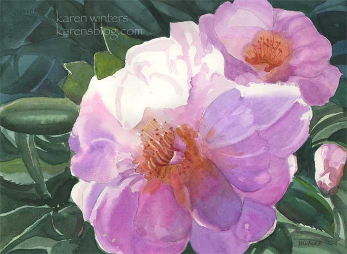
“Descanso Camellia” – Approx 15 x 11″ – watercolor on paper
SOLD
This is probably the largest floral piece I’ve done so far – and I enjoyed the process very much. Essentially it’s no different from working small except I have to stand back more frequently and use larger brushes to avoid getting too many picky details.
Busy, busy. I don’t have time to write much right now – I’m up to my ears in framing and gathering materials for a new class I’ll be attending tomorrow. Plus, our son is graduating from UCLA on Saturday and we’re co-hosting a grad party for him and some of his roommates.
OK, back to work for me …
Gloriosas and Delphiniums
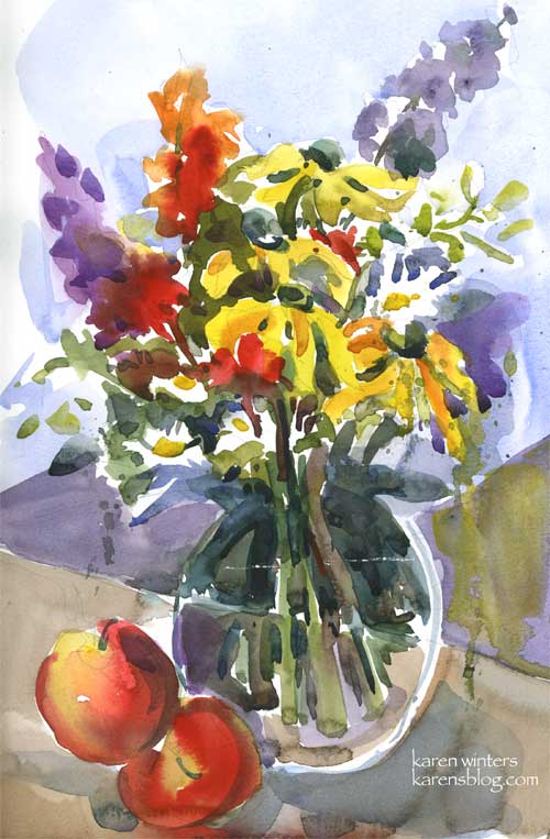
9 x 12 – watercolor on Canson cold pressed paper – Gloriosas and delphiniums
Well, here it is 1:50 am again. I was drifting off to sleep when Ripley (who sleeps at the foot of our bed) suddenly barked once and woke me up. If I am awakened as I am making that first descent into sleep, it seems to take the edge off my sleepiness and I might as well get up and do something. Which I did (exhibit A, above.) I think these yellow gloriosa daisies are called “Irish Eyes” because the centers are as green as the emerald isle.
I got a pretty cool new brush the other day and I was eager to try it out. So I clipped a piece of paper to my easel, vertically, did a quick sketch and painted this as only a half-awake, half-asleep person can do. This Davinci Cosmotop is just dreamy – it holds a lot of paint and releases it smoothly.
Now that this is done I feel a little sleepier – I hope.
Newport Vignette
This is just a quick and loose sketch based upon scenes from our Newport paintout day. I don’t know why, sometimes I like the fast and loose ones better than the ones I toil over for hours. But I just can’t bring myself to ‘dash off’ something I intend for a show. Which is the kiss of death, of course, and invites overworking , overthinking, just over-overing. Sigh.
There’s an Irish proverb, attributed to various people, that says
“Work like you don’t need money,
Love like you’ve never been hurt,
And dance like no one’s watching.”
And to that I might add … “Paint like it doesn’t matter.”
Now I’ve got to finish framing up a few things to take to a friend’s open studio tomorrow, for a group exhibition on Sunday.
And gather some things together for another library show on Saturday. Then back to the painting board!
California Farmhouse
California Farmhouse – Aprox 9″ x 12″ – watercolor
While I continue to work on my big painting (yes, I finally put brush to paper yesterday on that snowy white sheet) here is a painting I did a few weeks ago as a practice using warm and cool colors alternatively. The actual scene was rather lackluster with uninteresting lighting so I decided to spice it up a bit using a range of colors typical of the California scene painters of the 30s and 40s.
I might paint this one larger, too, some day.
OK, back to work for me …
Procrastination vs. Incubation
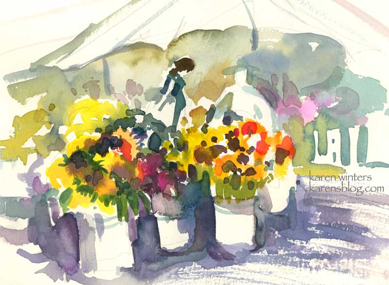
“Market Flowers” – watercolor on paper – About 8″ x 6″ – Fabriano Artistico 140# cold press
I’m working on a big painting project right now – a full sheet watercolor that incorporates most of the different techniques I regularly know and use and a few new ones. It’s an ambitious project and I’m dedicated to seeing it through, even if I have to paint it multiple times. Right now, I’ve done the design and color studies, I’ve tested the colors I’m going to use on a separate sheet of paper and labeled them all to know what’s mixing with what. I’ve even abandoned one paper surface in favor of another. Ordinarily I would call this hesitation to jump right in “procrastination” – but the more I wait the more I’m working out other design issues, coming up with new solutions and so on. I think it is more like a period of gestation as the ideas take shape. All the while I read voraciously; I review my notes from class and from demonstrations I’ve seen. I test different ways of moving paint; I practice watching the sheen leave the paper for the exact right time to scrape away a highlight or to drop in a dollop of thick pigment. . I am like an actor rehearsing my timing, watchful that I don’t make awkward entrance too soon or an exit too late. Or like a juggler trying to keep all the plates spinning. My brush is a tentative dancer, exercising at the barre, trying to develop muscle memory so the moves become both spontaneous and automatic. I wait. I think. I test.
So while my project is percolating in the back of my mind, I did this brief and loose wc sketch of a flower vendor’s booth at Sunday’s farmer’s market. As you can tell, I’m thoroughly enjoying painting negative shapes (such as around the buckets and umbrella ) … and alternating warm and cool colors in one continuous passage – and even throwing in a few calligraphic brushstrokes for umbrella poles and bucket details. Any minute now I’m going to return to that big piece of 22 x 30″ paper – perhaps charged with a few new ideas about lights and darks and linking of shapes and colors.
Cobb Estate – Hazy Morning
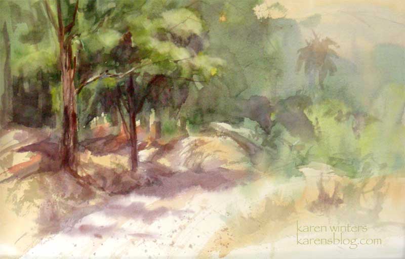
Cobb Estate – Hazy Morning 15″ x 22″ watercolor on Arches paper – half sheet
Today our paintout group returned to the Cobb Estate at the top of Lake Street in Pasadena where a light morning haze hung over the San Gabriels cast a veil of warm light over the scene.
My primary goal in this painting was to work on atmospheric perspective and to design the shapes and values of the painting, regardless of what the scene itself was showing me.
I heard a wonderful quote recently and I wish I had written down the author’s name immediately. When I come across it again, I’ll post it.
The gist of it was this: It’s the artist’s job not just to copy reality but to paint their emotional response to a scene.
I need to keep that in mind every time I feel the temptation to paint a rock or a branch just because it’s sitting there in front of me. The landscape is a source of inspiration but doesn’t need to be copied slavishy. Values can be changed, colors can be tweaked, things in the background can be faded back to suggest greater distances than actually exist. Drawing three dozen twigs on a tree may be accurate but it’s fussy and distracting – I remind myself to STOP before putting in a brushstroke, a symbol, another layer of glaze that’s not necessary.
Here’s a photo of the reality of the scene to give you an idea of how much license I took with it