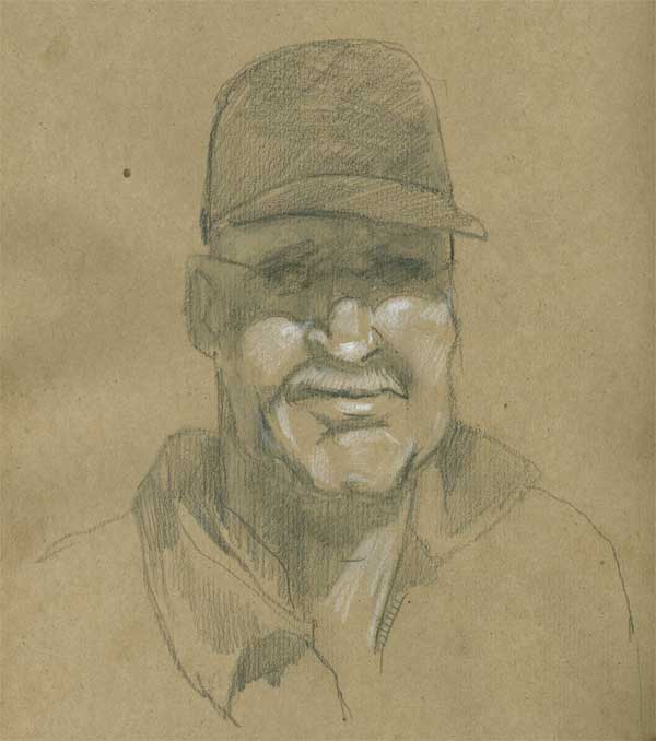
Hat trick
I’ve been talking to some of my art friends about going to a life drawing session and they made some very good recommendations about using materials I’m familiar with. Usually I draw with either ink or watercolor, unless I’m doing something digital. But neither of those seems well suited to a life drawing class. I think that graphite or charcoal would be best, until I can get around to using paint, but that may take some practice. So I’m going to do some exploring with different media before I attend that first session. I rather like the look and feel of toned paper – it seems a bit easier to create dimension than building it all up with the graphite. I’d really love to do drawings with brush pen, and I guess there’s no reason I couldn’t bring a few different things to try.
Earlier today I saw a neat pencil drawing on toned paper, and I had some “bogus rough sketch” paper on hand to experiment with. I drew this using a 4B water soluble Derwent pencil (then I added some water to slosh it around a bit) and finished up with Prismacolor white pencil and some 4B Derwent graphite pencil. I think I’ll try some figures, too, just to see how it goes. I recall seeing some fantastic figure drawing on toned paper in Drawing magazine … around here somewhere … hmmm …
Oh and UCLA beat Alabama, onward to the Sweet Sixteen. Go Bruins.
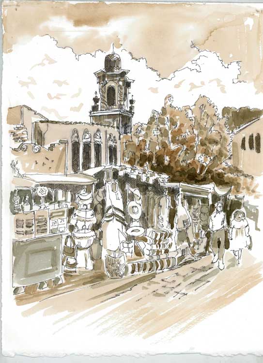
Sketchcrawl Downtown #3 – Olvera Street
Click picture to enlarge
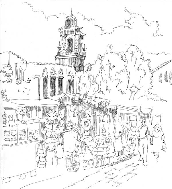
Here’s the third and last of my drawings I did last week on the sketchcrawl in downtown LA, and another response to the “draw a local landmark” challenge. With limited time for drawing I opted to spend the time drawing rather than doing washes or painting on location. Today I took some time to figure out how I wanted to handle those washes. As an experiment, I printed out the line drawing on watercolor paper rather than use the flimsier paper in my sketchbook. That also gave me a backup in case my ideas didn’t work – I could just toss the printed version out and print another one. In fact, I might paint one using bright colors instead of this monochrome/sepia scheme which is primarily based on tonal values.
Unlike the Union Station fountain painting, in this experiment I decided I would draw it as it actually was, because I liked the angle and the bustling activity following the morning’s rain. Also, unlike the courtyard painting, I opted for Rapidoliner and wash because I wanted to draw the small details of the shops instead of suggesting dabs of color with the brush. I did take a picture before I left, so I might still try an impressionistic watercolor sketch for comparison. Below is the drawing before painting, if you’re curious. Click to enlarge.
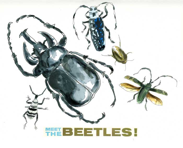
Meet the Beetles – Illo Friday
These beetles are all from the Milwaukee Public Museum collection, which I had the pleasure of seeing last year. I like all kinds of nature topics, even somewhat creepy ones. The designs of nature have inspired artists from the beginning of man’s history; no wonder they still continue to fascinate. Can’t you just see a tapestry fashioned after the back of that blue beetle, or a gossamer gown mimicing those transparent amber wings? I’m not so sure about the horizontal stripes on that little one down in the corner. Vertical would have been much more slenderizing.
And now the burning question … who really is the “fifth” beetle?
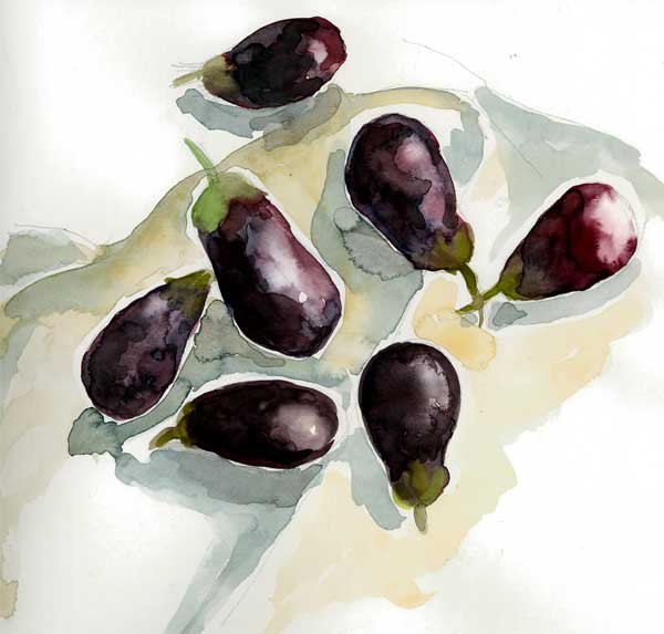
More vegetables – tiny eggplants
Another one for the “Draw a Vegetable” Challenge!
I had a terrific dish at a recent potluck and meeting of the Botanical Artists Guild of So. California. The hostess gave out the recipe to everyone present and I filed it away as something I wanted to try. Today, I saw these baby eggplants at the market and decided that I would give it a try. It includes small tender eggplants, italian parsley, diced tomatoes, calamata olives, garlic and some spices – all mixed with the hands and baked in a shallow pan. But like a raccoon who must wash everything before eating it, I often feel compelled to draw or paint it.
This was sketched in my Superdeluxe Aquabee workbook, 9 x 9, 90# weight. I learned some things from it that I’ll take into consideration in doing a real painting. The best thing I learned was which colors to use to get that eggplant color, and I figured out some ways to get the colors to mingle on the wet paper.
Teahouse of the February Morning – TEA for Illo Friday
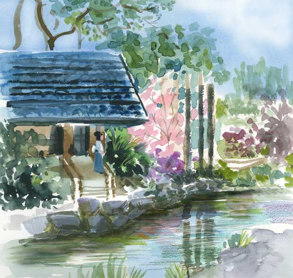
A watercolor sketch of the teahouse at Descanso Gardens. Kind of. Sort of. I took a lot of liberties with it, as I understand a painter has a right, maybe even an obligation to do.
I might make a painting of this someday. For now, it’s just a study for practice. Did you know that a pivotal scene from Memoirs of a Geisha was filmed here? I didn’t – until a few days ago. Can you spot the koi in the water?
I am also going to call this my first “local landmark” for the Everyday Matters “draw a local landmark” challenge. I have a few others I think I will do also.
Arty notes: 9 x 9 Super Deluxe Aquabee sketchbook, watercolor and some colored pencil for enhancement.
portrait for practice
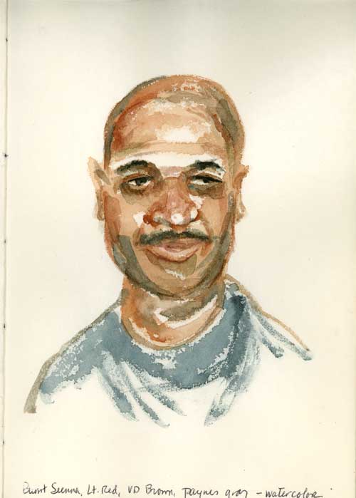
A quickie watercolor sketch portrait in the old “blue coptic” journal , done from photo ref, which I made a few years ago. The paper is awful – coarse, too absorbent, and you can’t push paint around when you apply it; it sinks in immediately. But I’m too stubborn to just put it away with a dozen or so pages left unused. So I’m going to use it up in the next few days so I can be DONE with it, already. The one “good” thing about this paper, if you can call it that, is that it forces you to be as deliberate with your brushstrokes as drawing with a pen. There’s no “lifting” the watercolor – it’s as merciless as indelible ink.
Why the bad paper? Because I had it on hand – some old drawing paper torn out from a tablet – and I didn’t expect the book to turn out well and didn’t want to waste “the good stuff.” And then I was stuck with it. Oh, and it kind of beads up, too, before it sinks in.
Hmmm … what about acrylic gesso on the page first … I’m going to experiment.
Now, Kate is much more optimistic and practical than I – she used good paper for her first journal, which she posted today on her blog. You should see it, it’s really nice.
Another sketchcrawl page
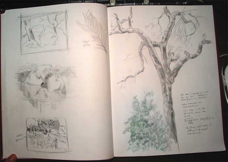
My workbook is evolving, and so am I. Sometimes the mood strikes me to do compositional and value sketches; other times I might be captivated by the texture of a rock, carefully observing the nature of reflections. On Saturday, while hiding out from the sprinkling of rain under the teahouse roof, I settled in to do a long, slow drawing of a California Live Oak. The biggest challenge was trying to describe the volume of the limbs when the light kept changing (like the camellia painting I posted two days ago.) Still, it was a satisfying sketching session and I felt like I got to know this tree a little better.
Too big to fit under my scanner, this 9 x 12 Watson Guptill sketchbook is a good size for trees and big objects.
Camellias Sketchcrawl style
Saturday, four hardy artists braved the cold temperatures and sallied forth to Descanso Gardens for a sketchcrawl. Because it was sprinkling, our first stop was the Japanese teahouse with its sheltering roof, which protected us from the morning drizzle. We sketched there for an hour or more and then, seeing that the sun was peeking occasionally through the clouds, we ventured out into another part of the garden.
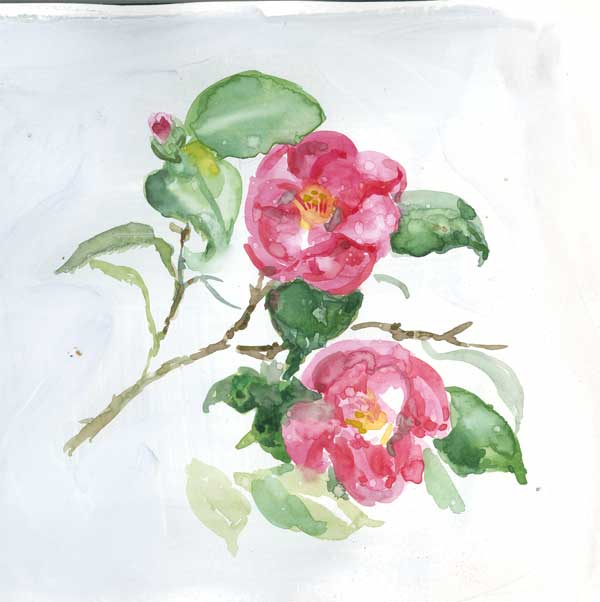
I stopped at a camellia bush where I painted this cluster for a little while. I used a page in my Canson watercolor journal that I had previously started at the Chinatown parade, then rapidly gave up on. (Digression warning) The only scribble on said page was a stiltwalker in drag wearing a slinky Chinese dress. Think “Al” from ToolTime (the flannel-shirted, bearded one) wearing a dress from The World of Suzie Wong, only imagine him 10 feet tall. Got the picture? There simply wasn’t time to capture him/her in all his/her glory, so I gave up somewhere between the mandarin collar and the flash of beefy thigh. However, being of a frugal nature, I painted over the page with a few coats of Liquitex acryllic gesso (white) figuring I’d do something else in that space.
The else moment arrived on Saturday. I painted these using my portable w/c palette (which I have since misplaced, unfortunately.) The first challenge was trying to figure out the values of the colors when the light conditions went from full sun to dark stormy clouds, minute by minute. The next challenge was painting directly without doing any drawing or sketching underneath. Usually shadows provide positive and negative spaces to get ones bearings with. But everytime the sun went away the image “flattened out” and the shadows disappeared.
The final challenge involved the medium itself. The watercolor flowed smoothly over the gessoed surface and was surprisingly malleable until it dried. I’m guessing that the gesso prevented it from sinking into the paper, so the pigment was simply a dry layer on the surface. When raindrops started falling, it created dissolved water drop marks. Before I panicked, I realized that it looked somewhat like raindrops clinging to the petals. Hmmm. An accident becomes a technique. “Why yes, um, er, I did plan it exactly that way, timing my painting so the waterdrops would fall just so at the appropriate moment.” Sorry, Karen, not very convincing. At any rate, I stopped painting before the droplets turned the whole thing into a runny splotchy mess.
I had a nice moment when some camellia watchers came by and asked if they could see what I was doing, which I happily shared with them.
So that’s my sketchcrawl story. I am now in pursuit of the missing palette which I surmise may be proof positive of poltergeist activity in my house. When I find it, I suspect a lost shaker of salt will be nearby. Wasted away again in Watercolorville.
Sketches are made by fools like me
It’s startling to me at times how I can get so caught up in what I’m doing and ignore the obvious.
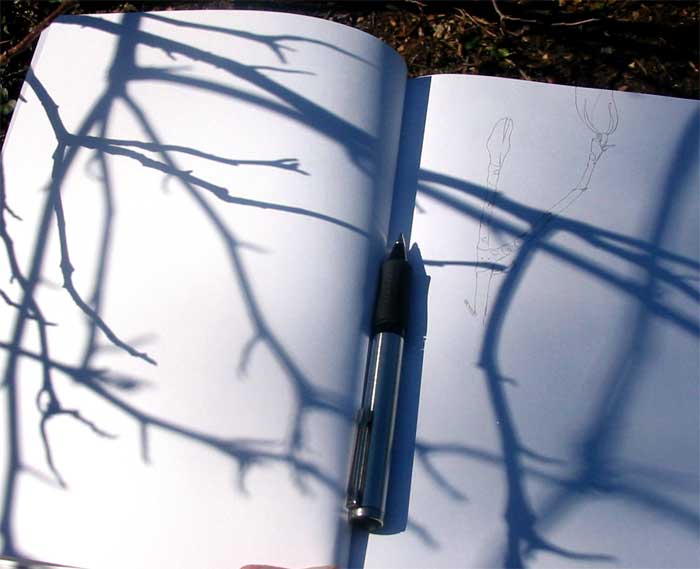
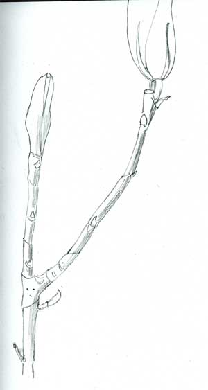
Today I spent some time at Descanso Gardens with my husband, enjoying the beauty of a spring (Valentine’s) day, and I took my time doing a very detailed line drawing of a magnolia twig. As I peered at it intently, something “clicked” and I realized one of the purposes of botanical drawing. When you observe something very closely – and I mean down to the 1/16 of an inch closely, you start to understand what the plant does. You begin to sense which way the twig will bend even before it does. You know where the leaf will come out of an axil, and what side it will be on. You begin to think, perhaps a little bit, like a plant. OK, that’s too new age, scratch that. You know what I mean. You begin to understand the plant intimately, becoming lost in its anatomy, its function and its beauty.
So, as I was fixated on this small twig, working slowly and methodically, I lost sight of the larger plant patterns that shared the same white space: the bare winter bones of the magnolia overhead, the tumescent buds, the rhythm of line and shape, the lost and found edges, the positive and negative spaces. While I was trying to capture nature with my pencil, Nature was impishy doing her own dance with effortless grace, as though to taunt me. But perhaps to lead me on, to keep practicing and to keep looking. I bow to you, Madame Magnolia. You win. Sketches are made by fools like me, but only God can use light to paint a tree.
My artworkbooks
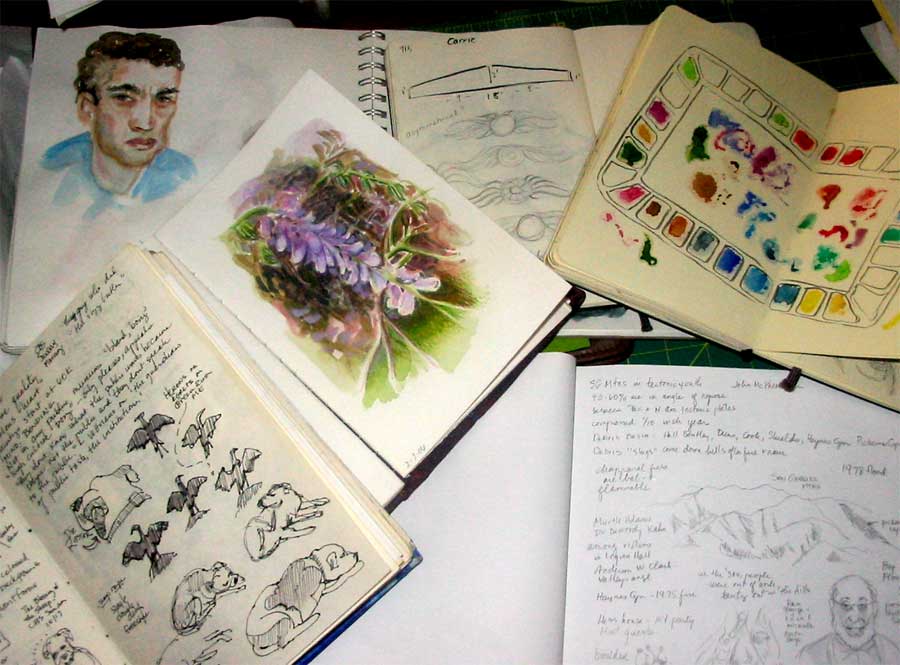
As you can see, I use my journals for a lot of different purposes, not only for sketching pleasure. As I’ve committed myself to doing more painting this year, I find that I’m reaching for it more and more as a practical workbook, not a chronological diary of my days. In fact, I have numerous workbooks with different paper in different sizes. I keep notes of ideas for paintings, I try out color mixtures. I paste in swatches of different kinds of paper and practice different drawing techniques. I work out designs for soft block carving. I carry it with me to museums and make notes about the artists. I even print out and paste in my sketches and paintings done in Photoshop or Painter.
This is my portable personal encyclopedia free of rules and concern about outcomes. The disastrous pages are as valuable as the “good” ones but none of them gets torn out and thrown away. It’s not an artists book destined to look pretty on its own. It’s a workbook – raw, spontaneous and full of scribbles and wrong turns. It’s where I map my “Creative Journey.”
Do you keep an art workbook for experiments and testing paint and such? Write and tell me about it.
karen@karenwinters.com
