Incoming Tide – Dana Point – Karen Winters Daily Painting

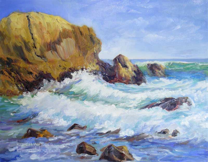
Incoming Tide (at Dana Point) 16 x 20 – oil on canvas
SOLD
OK, I’ll say it. This is probably one of my favorite paintings so far, for several reasons. I like the color, the composition, but mostly I like the energy and action of it and how it reminds me of being there. It’s good sized (for me) and was not painted on location but in the studio after a day of studying the waves on location. My reference photo was tempered with my very vivid memory of what the rock looked like, how the waves moved, the feeling of the day, the spray of the surf. And I can hardly wait to get back to the ocean to study some more.
This brings me back to the Jerry Stitt watercolor demo I went to a few months ago. He said instead of painting things, paint what the things are doing. In this painting the rocks are thrusting up, the waves are curling with energy as they rush forward, the water is pulling under the wave, swirling. The spray is flying, whipped by the wind. The distant horizon water is lying flat (at least at this distance.) The clouds have motion in the sky, but not so much that they are competing with the waves for attention. The brushstrokes all seek to express this movement. I hope that the viewer can feel my act of painting this, and in so doing participate in my experience of being there when I observed the scene.

Cathy (Kate) Johnson
March 28, 2008
Your ocean pictures make me SO want to be there again! They’re so fresh and immediate, I can smell the salt and iodine tang…
PamYla
March 28, 2008
Beautiful! I love your work Karen, I also love works from your sold collection
Karen
March 28, 2008
Well, Kate, come on out here right now! LOL
Cathy (Kate) Johnson
March 28, 2008
I wish, girl!
DebMc
March 28, 2008
Lovely painting and great thoughts. ‘Paint what the things are doing…’ Excellent advice no matter what the artistic medium. Thanks for sharing.
shelly mcc
March 28, 2008
Gorgeous painting!
wendy
March 28, 2008
Wild and scary and certainly has movement. It’s just that some of our coastline here is dangerous and people get swept off the rocks when they don’t know the area and can’t even swim to safety.
w.
Karen
March 28, 2008
Wendy, this rock is in the middle of the sea. People would have to swim out to it to get up on it in order to get swept off. It was very dramatic looking being there, too.
Tracy
March 29, 2008
karen… your paintings are amazing… you can definatly feel the movement of the waves and the spray of the ocean. keep it going!
Tami
March 29, 2008
This IS full of energy! You captured the subtle colors in the waves so well! I love that clear teal just at the peak of the waves, find myself at the sea, watching for it…
Lydia
March 29, 2008
yes, I can feel the energy
iT’S beautiful!
shea
March 29, 2008
I love the colors.
Bill
March 29, 2008
I admire YOUR energy, Karen. You just keep going.
I agree with your choice of this one as a favorite, a cherry, sunlit scene, with rich color in the waves and rocks. A nice feel to this one. Gentle, with the contained power of the waves. But movement, yes.
To me, and probably you too, it all comes down to color. Once you get the design right, either rationally or intuitively or both, then its down to the pigments, which you choose and how you use them.
Good work.
You do take breaks, right?
Pat
March 29, 2008
Don’t know if you will get the email I send, but had to tell how much I really liked this painting. When it was opening on my email, I thought this is good and when it finished I thought, this is really good. I agree with your thoughts on the subject and admire your writing skills as well. Your ability to express your thoughts and feelings in two mediums is really a gift. I am so glad that your are sharing it.
Nancy
March 29, 2008
Even before I read your text, I felt that the waves were very dynamic — often in paintings they are not, they look frozen. It must be very difficult to achieve. I liked what you said about painting what things do — it’s a very good insight (if one can actually practice it). Absolutely lovely colors, too. It’s a beautiful painting.
Sue A
March 29, 2008
Great painting. I especially like the colors you used in the water. Beautifully done.
Susan
March 31, 2008
The colours! Warm against cool.. calming despite the energy.
Jana Bouc
April 3, 2008
I agree! Everything about it is just perfect. I love the colors and the movement and the feeling of the warm sunning shining throughout. There’s a wonderful little passage in the “sweet spot” where the wave is breaking on the top right rock and it’s all transparent and glowing from the light blue at the bottom of the wave to the green at the top that is my favorite part of the painting. Congratulations on Karen. This is a real success!
Jana Bouc
April 3, 2008
P.S. When I said I agree, I meant with you and it being a favorite. Also, I love the colors and brush strokes on the big rock. After I sent the first message I clicked to see the enlarged view and really fell in love with the big rock. Inspiring!
Jenae Tucker
May 26, 2008
Hi Karen! This is Jenae from Apple Valley. My daughter is graduating from high school and we were wondering what your new mailing address is. We are hoping this is Karen March. Please write back I would love to hear from you and give you a call!
P.S. Beautiful paintings as usual!!!