Daily Painting – Asheville River

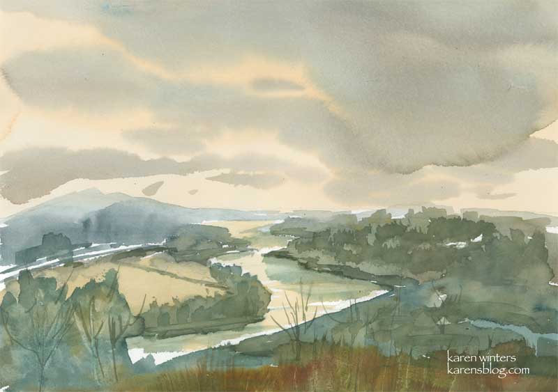
French Broad River – 14.1 inches by 9.5 inches
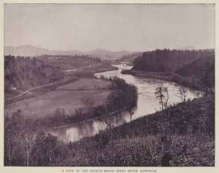
This painting represents a bit of a turning point for me, and one that I hope takes me into new and interesting directions. The painting is of the French Broad River above Asheville, North Carolina, from a monochrome picture more than 100 years old which I found in a vintage book which belonged to my father in law. In the picture, there were no clouds and it was printed in drab sepia. I’m assuming that the picture may have been mid or late summer fom the amount of foliage on the trees, but that’s only a guess. It could have been mid-fall also. But for the purposes of this painting, it really doesn’t matter because I decided to invent a sky and a color palette that pleased me, regardless of what reality presented the day the picture was taken. I used mostly earth tones – raw sienna, a drab red, burnt sienna, prussian blue
In the coming year, I’m finally going to start working larger and with more expressive and inventive color, rather than just trying to render what I see in front of me. I feel like I’m already heading that way but I need to push it further, step by step and to continue loosening up. This painting, for example, was painted with only two brushes, a one inch flat Japanese brush and a No. 2 rigger – so named because it was good for painting the rigging of ships.
By the way, perhaps someone from around Asheville can tell me where this picture was taken and what it looks like today. I would imagine that there would be more bridges crossing it, and maybe it is developed with housing or businesses.
Edited to add: Thanks to Nancy at Wet Canvas for adding details about the location of this and the reassurance that it probably still looks pristene today.
I’m adding the reference photo for those who may be interested to see what I started with and where I ended up. Keep in mind that my objective was to compress the landscape down into the lower 1/3 or so of the page so as to exaggerate the sky, which means taking some liberties with geographical features.

Annie
November 28, 2006
It takes my breath, Karen. All that space and that muted light. Stunning clouds with that flat, one-inch Japanese brush.
Toni
November 29, 2006
I think you’re right about it being a turning point for you. Love the limited palette. I love skies that are not blue.
lin
November 29, 2006
BEAUTIFUL BEAUTIFUL BEAUTIFUL!!! LOVE THE SERENITY OF IT — THE COOLER COLORS!
Cin
November 29, 2006
exquisite work Karen, bravo!
Casey
November 29, 2006
I love this one. It’s really brimming with atmosphere.
TeriC
November 29, 2006
WOW Karen, this is just stunning with all the mingling of colors and reflections! Gorgeous turning point!
Nancy
November 29, 2006
Beautiful colors and great atmosphere. Also, congratulation’s on starting to work larger. It’s that time of year when I start thinking about where I want to head with my work also.
Nina Johansson
November 29, 2006
Yeah, this painting is definitely something! Love the colors and the free flow in that sky. Wonderful!
wendy
November 29, 2006
Yes, I do like it. Atmospheric and hey, at last you are saying you don’t have to paint it as you see it! Take liberties. Yes.
W.
Linda
November 29, 2006
Hmmm… I’d about guess that it looks much the same. The sections of the French Broad that run through Knoxville look a lot like that still.

The nice thing about all the trees — they hide the subdivisions that are growing underneath them… I know there are at least two people on the EDM list from Asheville — or at least there used to be. Maybe they can say for certain! Wonderful piece, though — the atmosphere is really just perfect — we are always a little misty and smudgey around the edges here except for one month in the autumn — it makes my southern mountain heart happy.
maggie in sc
November 29, 2006
my parents live right by the french broad river and it does still look alot like this …I think it would have town in the background…most of downtown ashevilles taller buildings were built not long after this picture would have been made….you also cross it on 1-26 i think and on the blue ridge parkway…way up high
alison
November 29, 2006
Beautiful – I think this is my most favourite of yours so far. We had just those colours yesterday evening – muted orange and blue grey – though no clouds
Jo Castillo (noblock99)
November 29, 2006
Karen, Very beautiful, nice work on the colors and with the big brush. We spent a week at Fontana Dam about 20 years ago. The area around Asheville is just beautiful. Thanks for bringing back wonderful memories.
Jo
jules
November 30, 2006
Oh Karen, I DO like this – The brightness in the middle, coming through the clouds, actually made me squint. Gorgeous skies.
Jules.
Anastasia
November 30, 2006
It looks wonderful – I love the muted colours you’ve used…very beautiful!
buzz
November 30, 2006
The white of the paper really works here.
Jim Bumgarner
December 2, 2006
Hi Karen,
This is lovely! And I’m very interested in what you said about moving on to this next level of creativity. I think you’re on to something big!
andrea
December 2, 2006
This is a beautiful picture Karen, it doesn’t surprise me that you won .
Nancy
December 2, 2006
That’s so great, about your prize – congratulations! I’m sure you’ll win many more.
joyce
December 2, 2006
I love seeing what you are doing with refrences….so much more interesting this way. It really brings home that we don’t have to just faithfully copy what is in front of us. Congratulations on your well deserved prize!
Jana Bouc
December 4, 2006
Absolutely stunning! The sky is the best part for me, but the grass and the water are fabulous too. I agree this is a turning point, and a whole new level for your work. I’m excited to see where you go with this. I so admire your ability to add to take what’s there in a photo or a landscape and add and subtract until you have a beautiful composition that has been changed by your special touch into something much more. Thanks for sharing the photo too.
Michael Emerald
December 4, 2006
You have my vote on the “new direction” of targeting color schemes (my words) and less on realistic colors. My book Everything You Wanted to know about Watercolor has an entire section on rendering the same scene in different color schemes and, to my eye, the brain still knows what it is seeing, yet the artistic possiblities expand greatly. Different note: I am hoping that you put together a distribution list announcing artwork in your E-bay store. I have no idea whether that’s a good idea or how it’s done, but from my perspective it’s nice to be alerted when something gets added. P.s. My mom, Rosemarie Cammarata, is loving that oil lantern. She had it framed perfectly and it looks even better than it already did.