Yorkshire Pals – Daily Painting

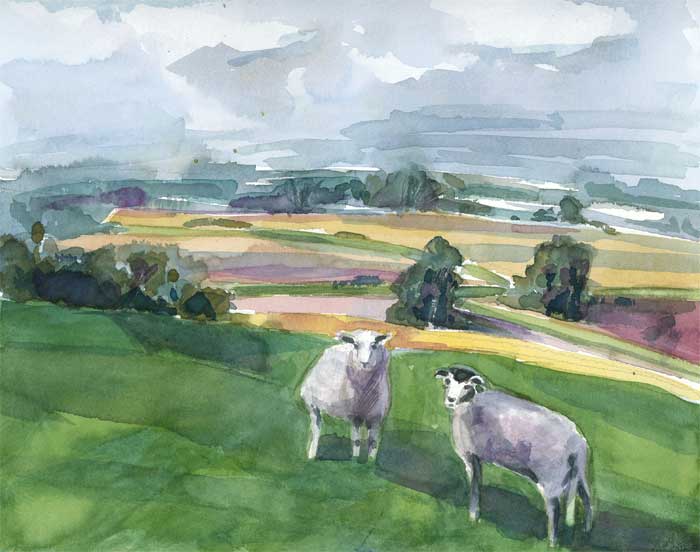
11″ x 9″ Watercolor on 140# paper. Available.
This was my (very) early morning project for Wet Canvas’ weekend drawing event, in which reference photos are provided to draw or paint from. One’s work or work in progress must be posted within 2 hrs of starting.
Well, I had a dilemma. I liked parts of two photos but I wasn’t sure either one would make a good painting on their own. So I composited the two in Photoshop and used that as my ref.
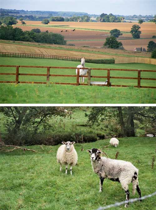
Something I observed this week at LACMA when I wandered through the 18th century landscape galleries. Almost all of the skies were full of interesting cloud formations – and the reason appeared to be so that certain landscape elements could be highlighted by the sun, and other, less interesting parts thrown into shadow. Hmm, pretty clever those Dutch. So it occurred to me that I could make a more interesting pattern of light and darkness on the ground if I put some clouds up into the sky. (Look at the horse photo and you’ll see it’s a clear day.) The fluffy clouds I experimented with in Photoshop were my way of seeing if that solution would work. I also wanted some strong diagonals in the composition so I exaggerated that with color and shadows.
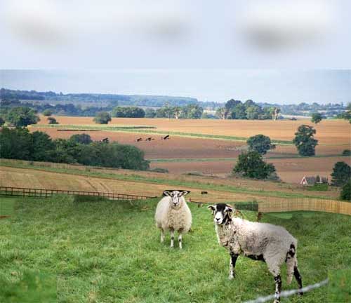
Here are the two source photos which were taken by Deepat’s friend June

wagonized
November 4, 2006
Clever mix of pictures, Karen. You could never tell looking at your painting — you blended the two so well.
Pamela
November 4, 2006
huh… I neer thought about taking two photo’s and using backdrop of one, for the other
sure made a nice watercolor scene
Belinda
November 4, 2006
This is simply STUNNING! I looked on Ebay…. when will it be listed?
Christine Mulholland
November 4, 2006
This is a beautiful painting.
carole
November 5, 2006
I would never have thought of doing that – I must try it. I always think I need to paint a photo just as it is – but why should I?
It’s also really clever how you decide where the light source is coming from, and then manage to stick to it. I’d have shadows all over the place if I tried that, I think.
Tami
November 5, 2006
Beautifully blended, Karen! It looks so pastoral! They look much better up on a hill top!!
rhonda hurwitz
November 5, 2006
very clever, I like the combination of pictures much better than either alone, and the painting is lovely
Karen
November 5, 2006
Thanks, everyone. Carole, yes, why should you paint from a photo as it is! Artists agree that a photo ref is only a starting point. I’ve seen people work with black and white shots and invent their own color wonderfully – I’ve seen others completely rearrange items or turn night into day or put the sun in a different position. Anything goes when your goal is to make a painting. And, in my opinion, the needs of the painting override all other concerns. Now, that’s not the same as when I’m trying to paint something exactly for the purpose of eye-hand training … but that’s a different purpose. I think it’s important to be clear on your purpose and then you can bend the rules any way you like. Painting your lovely aunt in a dress that’s an ugly color? Change it? And paint a complementary background while you’re at it.
Create your own new reality.
Ujwala
November 5, 2006
great composition and watercolor. and thank you for sharing and opening up new avenues.
Casey Toussaint
November 6, 2006
This is really a beautiful job Karen. I wish I could do landscapeslike that.
andrea
November 6, 2006
Great painting Karen… and this is just like the scenery out of my window!