Procrastination vs. Incubation
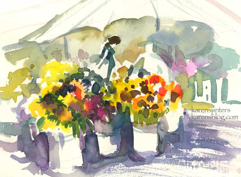
“Market Flowers” – watercolor on paper – About 8″ x 6″ – Fabriano Artistico 140# cold press
I’m working on a big painting project right now – a full sheet watercolor that incorporates most of the different techniques I regularly know and use and a few new ones. It’s an ambitious project and I’m dedicated to seeing it through, even if I have to paint it multiple times. Right now, I’ve done the design and color studies, I’ve tested the colors I’m going to use on a separate sheet of paper and labeled them all to know what’s mixing with what. I’ve even abandoned one paper surface in favor of another. Ordinarily I would call this hesitation to jump right in “procrastination” – but the more I wait the more I’m working out other design issues, coming up with new solutions and so on. I think it is more like a period of gestation as the ideas take shape. All the while I read voraciously; I review my notes from class and from demonstrations I’ve seen. I test different ways of moving paint; I practice watching the sheen leave the paper for the exact right time to scrape away a highlight or to drop in a dollop of thick pigment. . I am like an actor rehearsing my timing, watchful that I don’t make awkward entrance too soon or an exit too late. Or like a juggler trying to keep all the plates spinning. My brush is a tentative dancer, exercising at the barre, trying to develop muscle memory so the moves become both spontaneous and automatic. I wait. I think. I test.
So while my project is percolating in the back of my mind, I did this brief and loose wc sketch of a flower vendor’s booth at Sunday’s farmer’s market. As you can tell, I’m thoroughly enjoying painting negative shapes (such as around the buckets and umbrella ) … and alternating warm and cool colors in one continuous passage – and even throwing in a few calligraphic brushstrokes for umbrella poles and bucket details. Any minute now I’m going to return to that big piece of 22 x 30″ paper – perhaps charged with a few new ideas about lights and darks and linking of shapes and colors.
Huntington Lilypond

Lily Pond Sketch – a small portion of a water lily pond at Huntington Gardens – painted on location last Tuesday in my Raffine Sketchbook.
Most of the lilies were white but there was one plant that sported a magenta/alizarin colored bloom. I saw this exercise as a way to just capture some loose colorful patterns – not to be too literal about veins and waterdroplets and such.
Arroyo Rose – Daily Painting
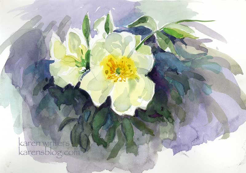
“Arroyo Rose” – 9 x 12 Raffine paper – plein aire
After I painted the Casita garden and the sun became too strong to continue … I moved to a shadier area and saw this rose coming over a wall. Some of the petals were backlit, which posed an interesting challenge. This practice watercolor sketch gave me some experience painting a flower while the light was changing quickly. New gamboge was my primary yellow .. with various greens, blues and mauve colors mingled in the background.
Casita Del Arroyo Garden Plein Air
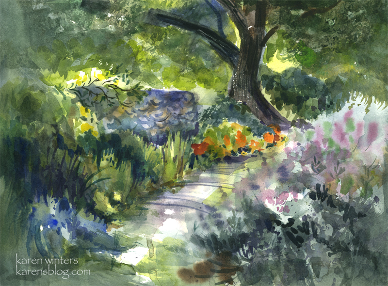
SOLD Casita Del Arroyo Garden – 15″ x 11″ quarter sheet 140# D’Arches coldpressed paper
Today our Wednesday paintout group went to a charming location in the Pasadena Arroyo Seco area called Casita Del Arroyo. This little clubhouse was built in 1933 as a way to provide employment during the Depression. The stones came from the arroyo and the wood came from bicycle tracks used in the 1932 Olympic Games. The casita was made a cultural landmark in the 70s and a drought-tolerant garden was put in not too long ago.
This view is down a few steps from the driveway, looking toward a small path in the garden. The nasturtiums caught my eye in the morning sun, and I also liked the look of the cool stone retaining wall.
To say this was a challenge would be an understatement. Although the scene is shady, my viewpoint was out in the bright sun – which has been pretty hot lately in LA. In order to keep the sun off the paper, I needed to tip the paper to a near vertical position, which is a different way of working for me. (But that’s ok, I find that when nature throws me a curve it sometimes leads to new discoveries.)
The breeze and sun conspired to dry out my palette within minutes, so I found myself misting it with my spray bottle quite frequently. The puddles of paint would literally dry in the mixing area as I was watching!
This was painted between 9:20 and 11 in the morning, and the light was changing quite rapidly, meaning that shadows were moving and areas were coming into light that had previously been in shade. To accommodate that, I did several large background washes to block in areas of light and shade, and I painted the basic dark tree shape at the same time.
On the right is a honeysuckle vine and a clump of purple sage. Instead of getting caught up in a lot of small detail, I let gravity help me and I laid in several washes of soft mauves, blues and grays and let them run on the paper. I think this helped to suggest the softness of the large mass.
My painting friend Ginny said that that area looked like the light was coming through the paper, and when I stood back for a long look I think it does look quite bright in that region.
There’s a lot of negative painting in this one – on the tops of the honeysuckle bush, between the different kinds of foliage on the left.
If you look closely you’ll see evidence of:
wet into wet painting on the path
spatter – in the clump of foliage on the right
saving whites and other light areas – behind the tree and at the top of the wall where the rose is climbing
calligraphy – defining the stones of the wall and in the rose climbing over it and the slashed shadows of weeds across the path
scraping out – the textured highlights on the bark of the tree
the use of warm against cool, cool against warm
use of diagonals to add movement
Edited to add (in response to comments)
Where I usually begin is with a value sketch, if there’s time, but in this case, there wasn’t, so I needed to hold the image of the lights and darks in my head where I worked. In my faint underdrawing on the paper I placed the tree offset from the middle, on a line about 1/3 of the way from the right margin. I made the path to the tree diagonal because it’s more dynamic than straight ahead. With those two landmarks I drew in the wall but tilted it so that I could see more of it – I wanted it to be a place for roses to climb over. I made the nasturtiums much more prominent because that was what attracted me to the scene in the first place – the contrast of deep cools vs. hot bright colors where the sun came through.
I broke some rules here by having things in sharp focus all around the paper rather than confining them to one center of focus. If I had it to do over, I would correct that.
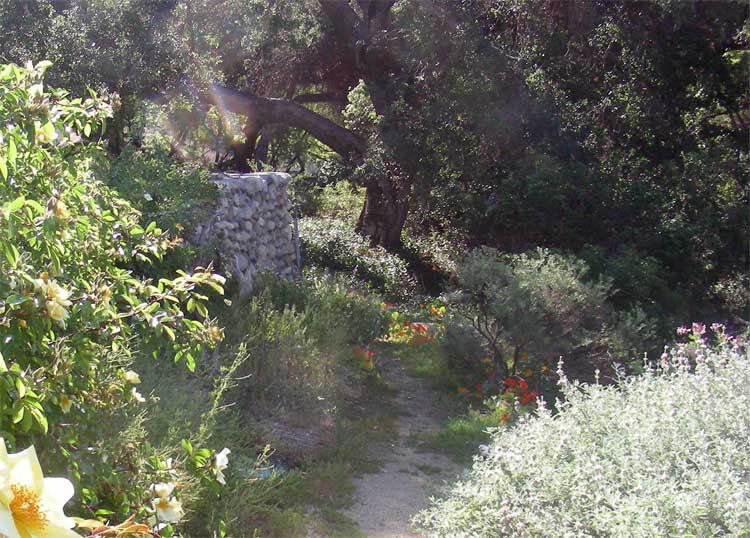
In case you are curious … this is what the scene actually looked like in real life. I didn’t paint from a photo, however …
Seed Fields

Seed Fields – sketchbook page – SOLD
There was no time to paint today, so before I head off to bed I did this quick watercolor sketch of one of the seed growers field that we pass by on our way up the coast to Santa Maria. The agricultural economy is changing and many of the growers now grow for seed (I think these are marigolds) instead of growing cut flowers.
This is another of those abstraction experiments, just playing around with color and shape – and pushing the intensity as far as I could. It’s in my Raffine sketchbook, but is not a full page. I managed to get in some time today for spring cleanup in our yard, so I’m really tuckered out – there was a lot of digging, clipping, ivy removal and weed pulling to do. I’m going to get some sunflower seeds strewn tomorrow so I’ll have material for cutting and painting later in the season.
Radiant Rose – Daily Painting

Radiant Rose – 9.5″ x 7.5″ watercolor.
Almost every day for the past five weeks or so, my dh and I have been taking walks of a half hour or an hour – within about 5-10 miles of our area. The benefits of this extra activity is many-fold. Not only do I feel healthier and more energetic (if that was possible – I was a pretty high-energy person as it was) but it takes us through different neighborhoods where we take time to smell the roses. No, I mean literally. If we see some really great roses in bloom we take a break from our walk to admire them. Because it’s impossible for me to go ANYwhere without a camera, I can often be seen with my new little digital hanging around my neck, and grabbing shots of things that I see when the light strikes them “just right.” I figure if it catches my eye, it might catch others’ too, when translated into watercolor. This is the result of one of those moments – caught about 10 am in some lucky gardener’s front yard in Glendale.
If you’re not a walker, I strongly recommend it. I used to walk a lot when I was in college – not only back and forth to class, but I’d take a 3 mile loop every day through the hills of Bel Air, just a few blocks off the Westwood campus. But I got out of the habit due to busyness and a few scary encounters while out walking alone. I’ve walked on and off through the years, but I realize now how much I’ve missed it. I envy those in walkable cities like New York and San Francisco. Here in LA we are so car-focused and things are so spread out that simply walking doesn’t occur to us.
If you’re in the Northern Hemisphere, spring has arrived and it’s a good time to get out and smell, shoot or draw the roses on your daily walk. You’ll return home both creatively and physically charged up.
This rose was painted with WN Bright Red, Holbein Opera and New Gamboge, with a few touches of cadmium orange and perm. alizarin crimson.
California Poppies
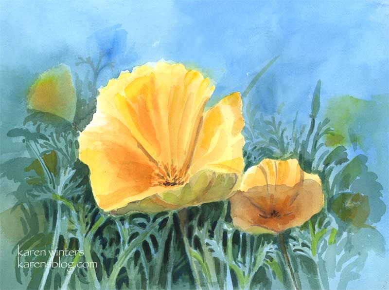
California poppies – 11 x 15 quarter sheet watercolor
SOLD
Come April, drifts of poppies, our state flower, burst into bloom in everyone’s yard. These cheerful blooms start to close around 4 pm, but in the middle of the day they are glorious.
Art thought of the day
Edgar Payne wrote: ” If the student will adopt the habit of putting much time on the preliminary compositional pencil sketches – the preparation for painting – he will have gained aid that will benefit him for as long as he paints. Additionally, the pleasure derived from doing pencil skteches is second only to that of painting.”
Amen to that!
Yellow Rose sketch

Sketchbook Rose – 7 x 10
While I work on some larger projects to prepare some paintings for shows, here’s a page from a Canson Montval sketchbook with a full blown Descanso rose. I didn’t spend a lot of time working on the subtle turn of each petal and leaf – I just wanted to get the colors of the late afternoon light falling on the blossom and leaves.
In retrospect, I see that I need to push back some of the petals so the bloom doesn’t look quite so separate from the background (even though it did look crisp with hard edges in real life.) I could use some complements to glaze over and do that, but I think I’d just risk overworking it too much. I’ve made a mental note of what I need to do, so this sketch has served its purpose. I used a lot of new gamboge, bright red, prussian blue and mauve for this one, and too many other colors to recall. Look for this in a larger version, coming soon.
Art thought of the day from Frank La Lumia, plein air painter, as interviewed by Molly Siple in American Artist:
The way you see things must be different from the way the average person sees the world. It’s important to be able to mentally break down nature into patters of color and value relationships. Until you can think abstractly, you will be at the mercy of leaves, branches and other details of nature.”
Yup, that’s the rub … where is the sweet spot that’s right for me between abstraction and realism? This is my koan of the moment. If you’re a painter, it yours, too?
Cactus Cottage –
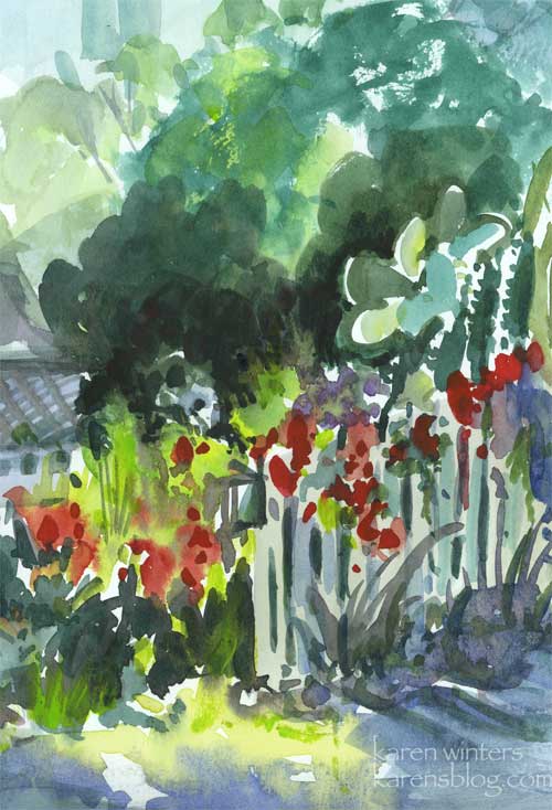
Cactus Cottage – 5.5″ x 8″ watercolor
Here’s an impressionist sketch of a cottage garden with a picket fence- inspired by a street we walked down in Capistrano.
Very quick and loose, with a minimum of explicit detail. I like the rambunctious feeling of it. In the midst of all the cottage flowers mixed with California natives there was a large beavertail cactus and some other tall, ridged kinds. I like the feeling of new world meets old, duking it out for visual superiority.
Wistaria branch
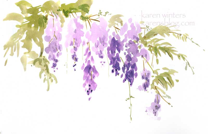
Wistaria Branch – 9 x 12″ on paper
Today’s paintout outing took us to a house in Sierra Madre where the world’s largest Chinese wistaria vine is growing. Sprawling, that is, over two homes. The perfume from the flowers was intoxicating as we painted the vine in all its springtime finery.
This was direct-painted primarily with a large, flat one-inch brush with no preliminary pencil drawing . The tiniest springs and trailing vines were added later with a very thin brush.
I think it has somewhat of an Asian feeling to it, appropriate to a plant that is native to China. What do you think?