Illo Friday – Citrus
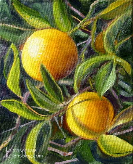
“Twin Oranges” – 6 x 8 – oil on canvas panel, mounted on hardboard – SOLD
These small oranges were spotted at the Old Mill in San Marino, home of the California Art Club.
I loved the way they were shining in the sun, so reminiscent, to me, of the California I remember from my childhood when the northern end of the San Fernando Valley was still filled with orange groves, not strip malls.
This is my entry for this week’s Illustration Friday theme – “Citrus”
Fulmer Lake in Idyllwild
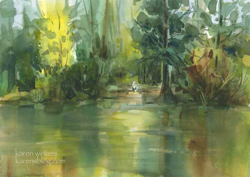
“Fulmer Lake” – 15″ x 11″ – watercolor on paper
I don’t have the opportunity to paint water too often, so this weekend was a special treat as we went, among other places, to Fulmer Lake in Idyllwild, California as some members of our watercolor class convened for a weekend plein air paintout.
It was a weekend of intense learning, practicing and friendship, and I loved every minute of it. This painting, which was done relatively quickly as the sun was setting behind the trees of Lake Fulmer, was both fun and challenging. Parts of it were painted wet into wet, while others were glazed wet over dry.
One of the biggest challenges was the constant breeze off the lake, which dried the paper very quickly. There was little time to dawdle or deliberate.
To answer a question that someone asked recently “calligraphic brushstrokes” are the final marks put on a paper that suggest branches, trees, weeds, iron railings, crevices in rocks, phone lines … just about anything that is a darker linear accent. They may be curving, staccato, dot-like, straight – any shape that serves the purpose. In this ainting, the branches in the yellow tree are calligraphic in nature.
The limited palette of warm and cool colors were chosen to convey calmness and serenity, with a late afternoon glow.
Arroyo Rose – Daily Painting
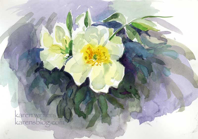
“Arroyo Rose” – 9 x 12 Raffine paper – plein aire
After I painted the Casita garden and the sun became too strong to continue … I moved to a shadier area and saw this rose coming over a wall. Some of the petals were backlit, which posed an interesting challenge. This practice watercolor sketch gave me some experience painting a flower while the light was changing quickly. New gamboge was my primary yellow .. with various greens, blues and mauve colors mingled in the background.
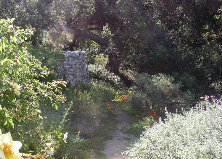
Casita Del Arroyo Garden Plein Air
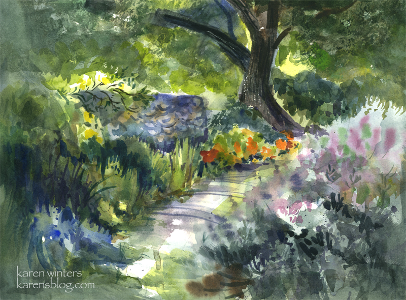
SOLD Casita Del Arroyo Garden – 15″ x 11″ quarter sheet 140# D’Arches coldpressed paper
Today our Wednesday paintout group went to a charming location in the Pasadena Arroyo Seco area called Casita Del Arroyo. This little clubhouse was built in 1933 as a way to provide employment during the Depression. The stones came from the arroyo and the wood came from bicycle tracks used in the 1932 Olympic Games. The casita was made a cultural landmark in the 70s and a drought-tolerant garden was put in not too long ago.
This view is down a few steps from the driveway, looking toward a small path in the garden. The nasturtiums caught my eye in the morning sun, and I also liked the look of the cool stone retaining wall.
To say this was a challenge would be an understatement. Although the scene is shady, my viewpoint was out in the bright sun – which has been pretty hot lately in LA. In order to keep the sun off the paper, I needed to tip the paper to a near vertical position, which is a different way of working for me. (But that’s ok, I find that when nature throws me a curve it sometimes leads to new discoveries.)
The breeze and sun conspired to dry out my palette within minutes, so I found myself misting it with my spray bottle quite frequently. The puddles of paint would literally dry in the mixing area as I was watching!
This was painted between 9:20 and 11 in the morning, and the light was changing quite rapidly, meaning that shadows were moving and areas were coming into light that had previously been in shade. To accommodate that, I did several large background washes to block in areas of light and shade, and I painted the basic dark tree shape at the same time.
On the right is a honeysuckle vine and a clump of purple sage. Instead of getting caught up in a lot of small detail, I let gravity help me and I laid in several washes of soft mauves, blues and grays and let them run on the paper. I think this helped to suggest the softness of the large mass.
My painting friend Ginny said that that area looked like the light was coming through the paper, and when I stood back for a long look I think it does look quite bright in that region.
There’s a lot of negative painting in this one – on the tops of the honeysuckle bush, between the different kinds of foliage on the left.
If you look closely you’ll see evidence of:
wet into wet painting on the path
spatter – in the clump of foliage on the right
saving whites and other light areas – behind the tree and at the top of the wall where the rose is climbing
calligraphy – defining the stones of the wall and in the rose climbing over it and the slashed shadows of weeds across the path
scraping out – the textured highlights on the bark of the tree
the use of warm against cool, cool against warm
use of diagonals to add movement
Edited to add (in response to comments)
Where I usually begin is with a value sketch, if there’s time, but in this case, there wasn’t, so I needed to hold the image of the lights and darks in my head where I worked. In my faint underdrawing on the paper I placed the tree offset from the middle, on a line about 1/3 of the way from the right margin. I made the path to the tree diagonal because it’s more dynamic than straight ahead. With those two landmarks I drew in the wall but tilted it so that I could see more of it – I wanted it to be a place for roses to climb over. I made the nasturtiums much more prominent because that was what attracted me to the scene in the first place – the contrast of deep cools vs. hot bright colors where the sun came through.
I broke some rules here by having things in sharp focus all around the paper rather than confining them to one center of focus. If I had it to do over, I would correct that.
In case you are curious … this is what the scene actually looked like in real life. I didn’t paint from a photo, however …
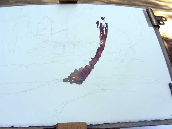
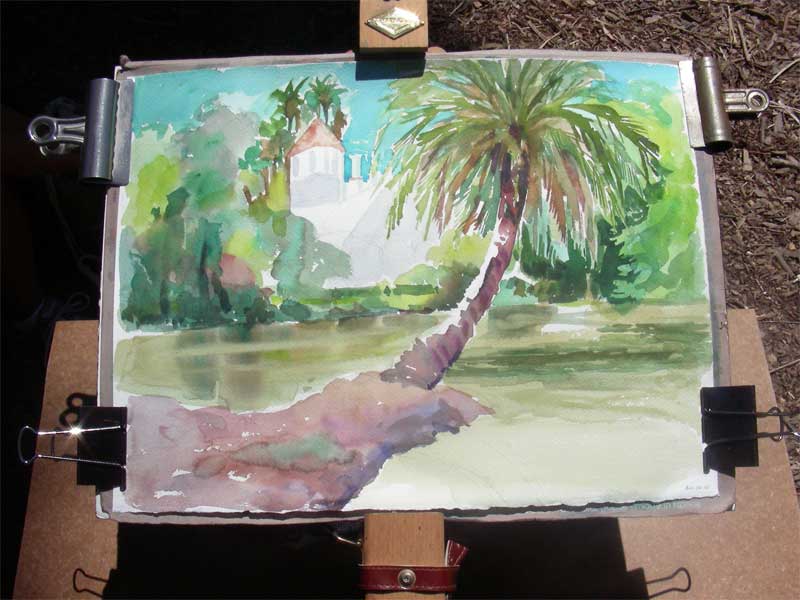
Arcadia – Fantasy Island House
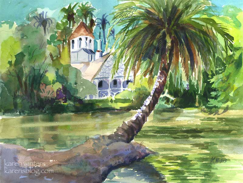
“Queen Anne Cottage” 15″ x 11″ (quarter sheet) – SOLD
Today my art pal Wendee and I went to the LA Arboretum in Arcadia for some plein air sketching and painting. We found a shady relatively cool spot in the tropical lagoon area, made famous by the 70s anthology series “Fantasy Island”
(Alright, let’s just say it and get it out of our systems, shall we? “Da Plane, Da Plane.”)
I took some digipix of the work in progress this time. After doing a quick value sketch, I drew some light outlines on the paper of where I wanted the main features to go. In this picture I’ve already started putting in the trunk of the palm, which I knew would be the featured item. I’m using burnt sienna and a mauve to get that warm/cool feeling where the trunk turns from light to shade.
Next , I’m moving around the page with a big round brush, putting in some of the background colors, and making up quite a few also. I’ve done a lot of work on the palm, not only because it was fun but because the light was changing and I wanted to get it to some degree of completion so I could evaluate the values of other things in the picture.
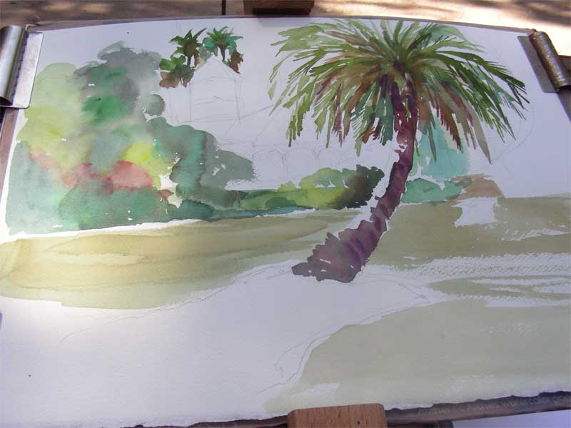
At this point it was probably an hour and a half after I began, give or take a bit, and the morning sun had become overhead noontime sun. It was time to call it a day on location. I took the painting home to check the photo I had taken at the beginning of the day, and to decide where the reflections would go. Most of the hard work is done at this point – what remains are putting in the darkest darks, details and calligraphic brushstrokes.
Cobb Estate Cypresses
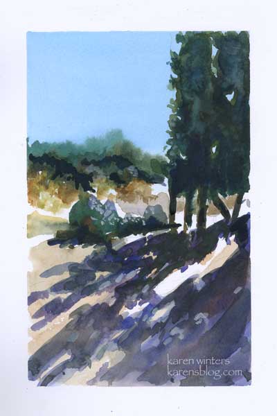
Cobb Estate Cypresses 5″ x 8″ – watercolor
The Cobb Estate in Pasadena is a wonderful resource for artist, hiker and nature lover (also dog walkers.)
These evergreens line the old driveway which is now crumbling slowly.
The plants were not my main interest here – it was the strong pattern of lights and darks created by the shapes of the italian-looking trees.
I can only imagine how stately they looked before the land was reclaimed by the chapparal.
This was painted with a limited palette of raw sienna, burnt sienna, prussian blue and mauve, with a swath of thalo blue for the sky wash.
The illusion of bright sunshine is all about value – the strong contrasts that happen during mid day when the noon sun washes out surfaces to white, and creates the deepest darkest shade.
Santa Barbara Botanic Garden Cottage
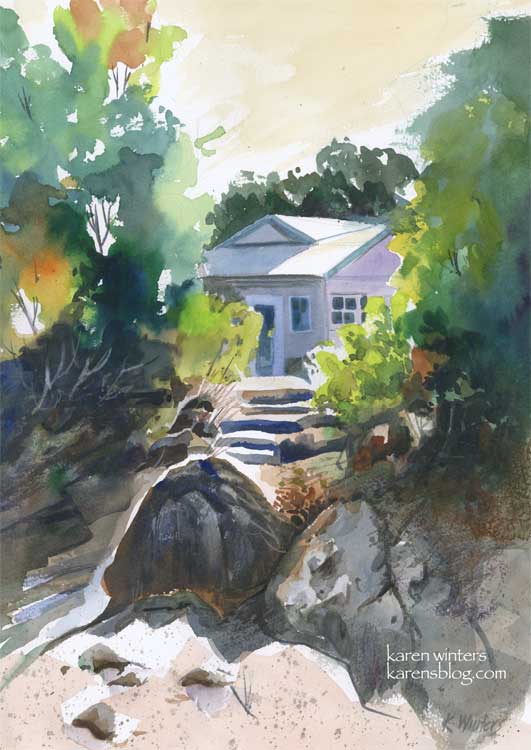
“Santa Barbara Botanic Garden Cottage” 11 x 15″ 140 lb. paper
These past few days have been very busy, and I have not been painting quite as many pieces as usual, but I did spend quite a bit of time with this one on Sunday, experimenting with a variety of techniques and concepts to come up with what I hope is a pleasing composition.
This painting was inspired by a scene I saw last summer when visiting the Santa Barbara Botanic Gardens. We walked down a path to a Japanese teahouse, and on the way back saw this view of a small cottage through the trees. I loved the contrast between the dazzling sun and the deep shade under the trees.
I’d like to highlight a few different things, for those readers who like to know details. I’m one of them, too. I like to get into the painter’s head when I can.
First off, I did a very light sketch on the paper with a 2H pencil. This was little more than the general shape of the trees, the roofline of the house, the shape of the steps area and the prominent foreground rocks.
I started painting in the upper left hand corner, painting the trees on dry paper with a juicy brush loaded with leaf green paint. Immediately, while the paint was still wet, I rinsed my brush and picked up some orange, and then some deeper green, letting them mix on the paper. I continued painting down the left side in this way, paying attention to variety of color and leaving some skyholes here and there.
Next, I put some initial light washes under the large foreground boulders, reserving a white edge for the sun highlight, then started at the top right and painted a solid medium green wash for the large mass of trees. Notice that I didn’t mirror the two tree shapes. The edge of the tree mass on the right is ragged, making use of the roughness of the paper with a drybrush technique.
When these layers were all dry, I went back in and glazed some other colors over them. Dark tones for the shadowed bushes on the left, and medium greens into the small bushes on the right. I started molding the shape of the rocks at this time, also, using a “palette” gray composed of the leftovers of other colors I’d been using. I put in the foreground color very loosely.
About this time I started laying in the first washes of the house, cool blues and lavenders to contrast with the warms of the foliage. I “saved” the whites of the roof and the tops of the steps to suggest the hot mid day sun.
When all of this was dry, I went back in to carve out detail in the shadows, model the different shapes of the rocks with a variety of neutral washes. I added some splatter to the foreground to suggest dry crumbling granite and sand.
Toward the end of the painting I added details of the windows and doors on the house, I “lifted out” the shapes of some bushes in the underbrush on the left, added deep crevices to the rocks and a few grasses and twigs here and there with a ‘rigger’ brush.
Finally I decided on a very light warm sky wash, instead of blue. I think that it adds to the feeling of sunny California warmth. Skies don’t have to be blue – they can be any color you like.
I used a number of different colors in this, including new gamboge, prussian blue, orange, mauve, ultramarine blue, burnt sienna, leaf green and raw sienna.
Did you find this interesting? Helpful?
Best of Show update
“Hard Rock Cafe” 9″ x 13″ watercolor – framed 16 x 20
May 4 Update
I submitted this painting to an annual show at the local college where I’m attending the watercolor class I’ve mentioned from time to time. I was delighted to find out today that it won Best of Show. So, I’m a happy camper tonight and each small victory just fuels my creative fire to keep studying, keep practicing, keep working harder, day by day.
====================================================
previously posted
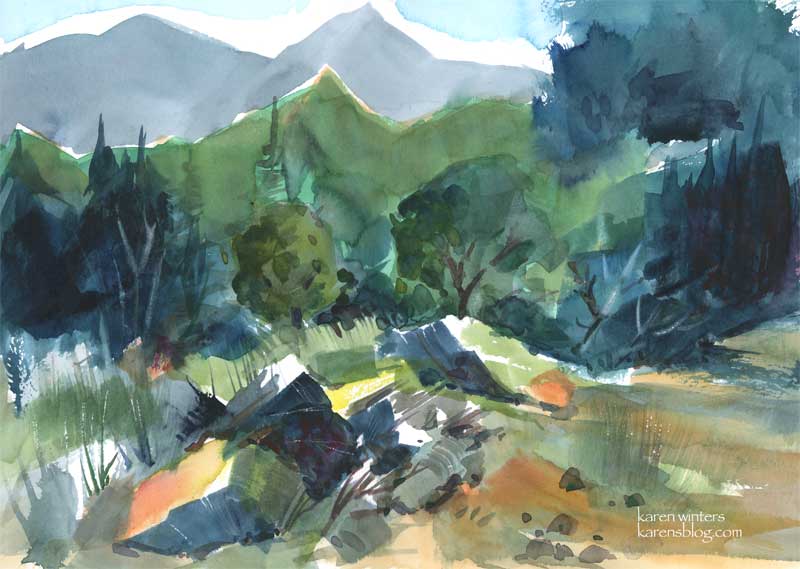
We live in the foothills of the San Gabriel Mountains – a seismically active range which is crossed at one place by the famous San Andreas Fault. It’s not near us, thankfully, but any movement on that fault would certainly be felt far and wide. The “basement rock” of the San Gabriels is said to be more than a billion years old. Through those eons it has intruded, metamorphosed and sedimented into gneiss, basalt, limestone, marble, shale, quartzite, sandstone, slate and all kinds of good schists. If there’s any sort of rock you want, you can probably find it up there. This scene is of a rocky clearing in the Angeles National Forest, where enormous broken rocks, not yet worn down by erosion, lay tumbled in casual disarray .
The evergreens keep things looking verdant year round, and the chapparal is abloom with every kind of native shrub and flower. It’s absolutely gorgeous any time of year, but spring is the best.
Because I’m an insatiably curious person about art, nature, science – well, just about anything – I found a link on the geology of the San Gabriels for any locals who might be interested.
http://seis.natsci.csulb.edu/deptweb/SkinnyCalSites/TrnsverseRng/SanGabriels/SanGablOview2.html
My favorite part was the discussion of the Precambrian Basement. I have a feeling there aren’t any good bargains there, though. I kept hoping with a billion years of compression and folding there’d be a diamond or two to talk about – but no luck.
Oh, and this is my entry for this week’s “Draw or paint something green” challenge.
Malibu morning
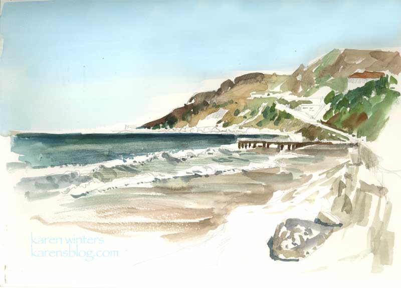
“Malibu Morning” 9 x 12 watercolor on paper
This morning I had a reason to be in Malibu while my husband was taking care of some business nearby. The sky was clear and a light breeze was blowing on a picture-perfect day. After taking a brisk walk up and down the shore a few times, I settled to paint this view in my Raffine sketchbook, en plein air. It might become the basis for a larger oil painting back in the studio. I used a large Niji waterbrush for everything but the sky, which was added with a wash brush when I got home. The slight discoloration in the sky is from the unevenness of my journal on the flatbed scanner. In fact it’s a nice even thalo blue all the way across.
The location of this watercolor is about a quarter mile north of Gladstone’s – along Pacific Coast Highway. The headlands in the distance is close to where Topanga Canyon comes out to the coast, I think.
Seed Fields

Seed Fields – sketchbook page – SOLD
There was no time to paint today, so before I head off to bed I did this quick watercolor sketch of one of the seed growers field that we pass by on our way up the coast to Santa Maria. The agricultural economy is changing and many of the growers now grow for seed (I think these are marigolds) instead of growing cut flowers.
This is another of those abstraction experiments, just playing around with color and shape – and pushing the intensity as far as I could. It’s in my Raffine sketchbook, but is not a full page. I managed to get in some time today for spring cleanup in our yard, so I’m really tuckered out – there was a lot of digging, clipping, ivy removal and weed pulling to do. I’m going to get some sunflower seeds strewn tomorrow so I’ll have material for cutting and painting later in the season.